
Most signage choices hinge on visibility, facade style and brand voice; ask yourself: does your storefront want subtle elegance or bold presence? Trimless letters give a clean, low-profile look that can boost curb appeal if your building and budget align, here’s how to tell if they fit you.
Key Takeaways:
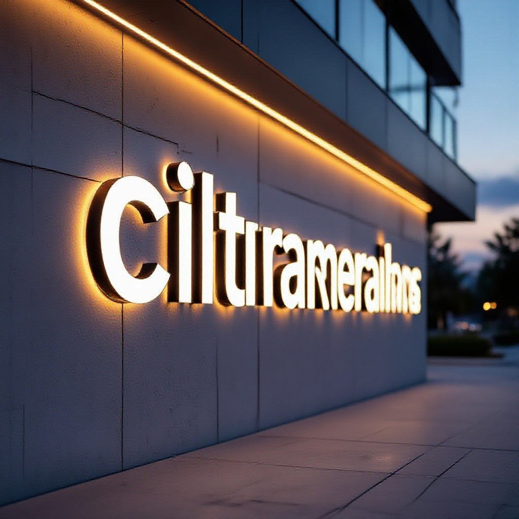
- Want a sleek, modern look for your storefront? Trimless channel letters sit flush to the wall for a clean, architectural appearance and they read really well at night when backlit.
- Is your building surface flat and solid? Trimless needs good substrate because there’s no trim to hide gaps – uneven walls or thin EIFS often require backing or repairs first.
- Worried about installation and maintenance? These signs can be trickier to install and service since wiring and mounting are recessed, so plan for access panels or more upfront labor.
- Are local sign codes strict about illumination or depth? Check permits early because some jurisdictions limit halo lighting, sign projection, or mounting methods.
- Does your brand aim for a high-end, minimalist identity or a budget-friendly option? Trimless gives a premium, pared-down look but usually costs a bit more in fabrication and precision – pick it if the aesthetic matters.
What’s the big deal with trimless anyway?
Wondering if trimless channel letters actually matter? You get cleaner sightlines, less visual clutter, and a modern edge that makes signage read better from a distance, so if you want your building and brand to feel fresh, they’re often worth considering.
Getting rid of those clunky plastic borders
Could you ditch those clunky plastic borders and actually boost curb appeal? You’ll get flatter profiles, fewer grout-lines to trap dirt, and signs that read cleaner at night. It’s a small swap that makes your storefront look sharper, period.
Why the smooth look is taking over right now
Curious why the smooth look is everywhere? It strips away busy framing so your logo reads clear, it plays nice with modern facades, and odds are your customers notice quicker – which is what you want, right?
Because a clean profile actually makes a huge difference in how your sign performs: light spreads more evenly, letters look brighter at night and your logo shows up without competing trim stealing attention. You’ll also find maintenance is easier since there are fewer ledges for grime, and installers can integrate signage into cladding for a tucked-in look that reads premium. Cost-wise you might pay more up front, but if you want a long-term, refined presence that matches contemporary builds, it often pays off.
Why I think they’re a total game-changer for your brand
Compared to flat plastic signs, trimless channel letters make your logo pop like a shop window on steroids; you get clean edges, shadow depth, and a premium feel that sticks in people’s heads.
Making your business look way more high-end
Think of your storefront like jewelry; trimless letters sit flush with the wall so your brand reads as intentionally designed, not slapped-on. You get crisp silhouettes and a softer glow that says high-end without shouting, customers notice and you look like you mean business.
Why they’re actually easier to read from the street
Unlike backlit boxes, trimless letters give each character its own halo so your logo reads cleanly at distance; drivers and pedestrians spot you faster, even in rain or glare, because shapes stay true instead of bleeding together.
Rather than neon or box signs that blur at speed, trimless letters keep letterforms intact so you can be read in a blink. You can tweak color and intensity to cut glare, sharpen contrast, and make your name pop against any facade. Want proof? Walk past one at night-you’ll see how quick recognition turns into foot traffic.
The honest truth about durability and maintenance
You might’ve passed a storefront with spotless channel letters and assumed they’re low-maintenance, but trimless faces show weather and wear differently. You should inspect seams, LED mounts and acrylic faces regularly; small fixes now stop bigger headaches later, and routine care keeps that premium look intact.
Can they really handle a rough winter?
Last winter you probably noticed signs caked in salt and ice, and trimless letters held up if you chose tougher materials and good seals. You should expect occasional condensation or gasket wear; plan seasonal checks so frozen LEDs or water intrusion don’t surprise you when customers arrive.
Keeping those sharp edges looking fresh over time
A neighbor’s sign got dinged by a delivery truck and you noticed how quickly edges show damage, that’s the reality. You can buff, re-polish or replace acrylic panels, tighten mounting clips and touch paint small nicks; regular spot fixes keep the crisp profile without a full overhaul.
When a downtown cafe asked you to approve a trimless sign you watched the install and then watched passersby, it looked slick-until a bike brushed the corner. You can specify thicker acrylic, chip-resistant coatings and protective mounting details for high-traffic spots. Check seals and LED housings twice a year, touch up tiny scrapes fast, and you won’t be replacing whole panels down the road.
Will they actually look good on your storefront?
Believe it or not, trimless channel letters often read cleaner on busy facades, giving you a sleek, upscale feel without the bulky frames. You can make them pop or blend them in depending on colors and lighting – want to stand out or play subtle?
Matching the vibe of your building’s architecture
Ask if your storefront’s materials and lines will work with floating letters; glass and smooth stone love the minimalist look, while ornate brick sometimes fights modern letterforms. You decide whether contrast makes a statement or just looks off, and don’t be shy about testing samples.
Don’t forget to check those pesky local sign codes
Check local ordinances early, since size, illumination hours and mounting setbacks vary a ton; you don’t want a permit snag that costs time and money. Talk to your sign installer and the building manager before you order anything.
Local code quirks can surprise you – some towns ban illuminated signs after sunset, others limit brightness or require specific mounting distances. You should request code excerpts, check historic-district rules if applicable, and factor permit timelines into your project schedule. Can’t stress it enough: a quick code check saves you headaches and cash later.
Let’s get real about the price tag
Price can surprise you: trimless channel letters cost more because you’re paying for custom tolerances, hidden mounts and cleaner finishes – weigh that against the benefits in this primer Trimless Channel Letters: When and When Not To Use.
Why you’re paying a bit more for that sleek finish
Materials and skilled labor drive the premium: thicker faces, precision trims, concealed returns and exact mounting take longer to build and install, so the tidy look you want carries extra hours and cost.
My take on whether the investment is worth it
If your brand trades on polish and your facade can show it off, trimless letters often pay back in perception; if you need cheap and quick, stick to simpler styles that still get the job done.
Last summer a corner coffee shop swapped an aging lightbox for trimless letters and people stopped to stare – really, they did, customers started snapping photos. You won’t always get instant miracles but you’ll get a cleaner silhouette, less glare and a sharper message that says you care about detail. But you should ask yourself how long you plan to be in that space and whether you can handle the upfront cost and occasional maintenance; if you can, that tidy, modern sign will quietly work for you for years.
Conclusion
To wrap up, don’t assume trimless channel letters only suit sleek glass storefronts; you can make them work on many buildings if you want a modern, understated look that still reads from the street. Ask yourself: does your brand need subtlety or big personality? If subtle, you’ll likely be very happy.
FAQ
Q: What are trimless channel letters and when are they most effective?
A: You’re walking past a storefront and the sign looks like it grew out of the wall – no bulky trim, just clean letters that sit flush in a routed channel. Trimless channel letters are cut and mounted so the face is level with the facade, making the hardware invisible and the sign read as part of the building.
They work best on modern facades, retail strips with flush surfaces, and brands that want a minimalist, high-end look. Want something that reads as architecture rather than a sticker? This is a great pick.
Q: How will trimless channel letters change my building’s look and my brand’s message?
A: Imagine your logo integrated into the wall instead of pasted on top – that sends a quiet, confident message. The result is subtle elegance; the sign doesn’t scream for attention, it earns it.
Front-lit or halo effects add character at night and make your identity readable without shouting. If your brand is understated, premium, or design-forward, trimless letters match that tone like a tailored suit.
Q: Can trimless channel letters be used on historic or textured buildings?
A: If you’ve got a brick or ornate facade, you can still use trimless letters, but planning matters. Routing into historic materials may require permits and careful repair work so the building isn’t damaged.
Sometimes inset plaques or raised panels are smarter – they give a clean mounting surface while keeping the historic fabric intact. Talk to a sign pro and a preservation officer before you cut anything into an old wall.
Q: What should I expect for installation and upkeep?
A: Installation usually takes longer than standard mounted lettering because of routing, sealing, and aligning the faces flush to the wall. Electric and weatherproofing details need close attention so water doesn’t sneak behind the letters.
Simple maintenance is mostly cleaning and checking seals; if a letter gets bumped you might need patching where it was routed. Good installation minimizes future headaches.
Properly sealed and installed signs last a long time and look cleaner than edge-trimmed options.
Q: Are trimless channel letters cost-effective compared to other sign types?
A: Upfront costs tend to be higher because of custom routing, finishing, and skilled labor, but the payoff can come from a stronger brand impression and fewer visual anchors that date quickly. Think long-term: one clean, modern sign can serve a brand for years.
If budget is tight, consider a hybrid approach – trimless on the main logo area and simpler letters for secondary text. That saves money while keeping the look you want.