
With your pop-up wall facing a busy street and a sloppy banner threatening your image, you want clean edges, good material and smart placement. Want tips that actually work? You’ll get practical, no-nonsense fixes you can try today.
Key Takeaways:
- Retail pop-ups and hybrid events are making temporary wall banners more common, so you gotta make them look intentional not throwaway – choose matte premium vinyl, print full-bleed high-res artwork, and avoid glossy glare.
- Good typography matters. Too many fonts or tiny type scream amateur; stick to one or two fonts, big readable headlines, and consistent alignment. And keep white space generous – it makes designs feel expensive.
- Finish and hardware sell quality: hemmed edges, reinforced corners, tidy grommets or hidden pocket mounts look pro. Tension the banner flat so it hangs smooth – wrinkles ruin everything.
- Use proper files and proofs. Vector logos and 300 dpi images at final size stop pixelation and weird color shifts. Want it to look custom? Get a sample – don’t skip the proof.
- Lighting and placement matter as much as the print; mount level, keep sightlines clear, and use soft angled lighting to cut glare.
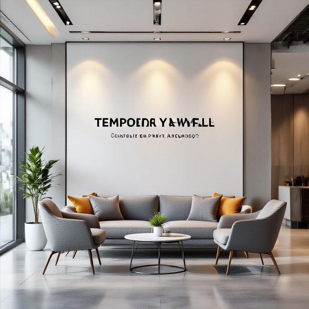
Proper installation makes or breaks perceived quality.
What’s the deal with those annoying wrinkles?
Ever notice your temporary banner gets creases that scream cheap, even if the print looks great? They usually come from uneven tension, dusty backing or a rushed hang – with a bit of prep and the right hardware you can make it look pro, not slapped-together.
The trick to getting that perfectly flat finish every time
Want a perfectly flat finish every time? Mount on a rigid, clean surface, stretch the vinyl evenly while you fasten it, squeegee out air and use low heat to relax stubborn creases so the whole piece sits smooth and taught.
Why you shouldn’t just slap tape on the corners
Think slapping tape on the corners will hold it? Tape concentrates stress, peels in wind and leaves sticky residue that ruins prints – grommets or reinforced corners spread the load and keep the edges tidy.
Because tape damage goes deeper than looks: when wind tugs a single corner you risk a tear that spreads, and residue soaks into the material causing ghosting or dirt buildup. You save time and money by using grommets, corner patches or a pole-pocket, testing methods on a scrap so you don’t learn the hard way.
Here’s why your design might look a bit “budget”
Once you noticed a fair banner with five fonts, jagged edges and cramped copy, you knew it read cheap. You may be using clip art, cluttered layouts or garish colors; those small choices make a temporary wall banner scream budget instead of looking sharp.
Keeping it simple is the real deal for professional vibes
At your last event you likely admired a banner that used one clear message, lots of breathing room and two colors; it felt grown-up. Keep typography simple, ditch the clutter and let negative space do the heavy lifting, then your temporary wall looks intentional, not throwaway.
Don’t even think about using low-res images
Last time you blew up a phone photo and it went blocky, you felt the cringe. Avoid low-res images entirely; they make textures muddy and colors bleed, and no amount of filters will hide jagged edges on a six-foot banner, so use high-res files or vector art.
You once tried to upscale a tiny logo and it turned into mush, right? For print, aim for files at least 150 DPI at final size, but if people will be close to the banner shoot for 300 DPI; vector art is ideal for logos. Skip screenshots, export originals as TIFF or PNG, ask your designer for print-ready CMYK files, and check at full size before you hit order.
It’s all in the details, honestly
Compared to big, flashy prints, you notice the small fixes: clean hems, squared corners, crisp print alignment and consistent material tension. If you tidy trim, hide hardware, and pick a muted palette, your temporary banner reads like a deliberate design choice, not a cheap throw-up.
Hidden grommets and pole pockets are total game-changers
Rather than bulky eyelets, hidden grommets and pole pockets keep hardware out of sight so you focus on the message, not the mounts. You get a flatter, neater surface and easier installs, plus fewer wrinkles – simple, clean, pro-looking. Who wants bulky eyelets shouting ‘temporary’ anyway?
My take on using standoffs for a temporary setup
Unlike flush-mounted options, standoffs lift the banner off the wall and add depth; you get a higher-end vibe that still comes down in minutes. You can show you care about presentation without committing to permanent installs.
While standoffs do cost a bit more, you can use lightweight aluminum ones and plastic anchors so they stay temporary and safe. You pick finishes that match your space – matte black reads modern, brass feels upscale – and mount at eye level with even spacing; the gap creates shadow and depth that screams professionalism. You can swap banners without stripping paint, and if you want, use a simple template to pre-drill so every install looks tidy.
Can we talk about lighting for a second?
Compared to flat overhead light, a few well-placed lamps make your temporary banner read like installed signage, and you can snag layout ideas from Creative Ways to Use Decals in Pop-Up Shops and ….
How a little spotlighting changes everything
Like a stage cue, a tight spotlight makes your logo jump off the banner, so you control focus, hide creases and add perceived value – you’d be surprised how cheap banners feel premium with the right beam.
Dealing with that cheap-looking glare on plastic surfaces
Unlike matte prints, glossy vinyl throws nasty hotspots that scream plastic, so you should soften light with diffusers, shift angles or choose satin finishes to calm reflections and keep your message readable.
Rather than fighting reflections head-on, try shifting the light source to grazing angles that reveal texture not glare. Use inexpensive softboxes, poly diffusers, or polarizing film over prints. If you can’t change lighting, swap to satin laminate or reposition the banner a few degrees
that alone kills the mirror effect. Try it; you’ll see the difference.
Where you put it actually matters a ton
Lately you’ve probably noticed brands using temporary banners like pop-up ads and event backdrops more, so placement now makes or breaks how professional they look. Put your banner where people pause, not where they rush past, since angles, background clutter and lighting all shift perceived quality-test sightlines from main approaches.
Making sure the banner fits the space just right
Measure the wall and sightlines before ordering, since a slightly oversized banner reads sloppy and an undersized one vanishes; match proportions to nearby signage and leave breathing room so your design doesn’t feel jammed or like it’s fighting for attention.
Why eye-level is usually the sweet spot for impact
Place key messaging at eye-level where people naturally glance so they read it in a second; that gives faster comprehension, nicer photos and a cleaner, more professional vibe-aim slightly lower if crowds include kids or seated viewers.
Think about how people actually scan a space, you’ve got maybe a second before they look away and your banner either lands or fades into the background. Who doesn’t stop for a good photo?
Your headline should sit squarely in the viewer’s line of sight.
That tiny tweak makes your message pop and feels deliberate, like it belongs there not just tacked on.
Summing up
On the whole you can make temporary wall banners look professional instead of cheap by choosing high-resolution graphics, durable materials and a simple, consistent design; keep type large, colors limited, hems neat and mounting tidy so the banner reads like intentional branding, not a quick fix.
FAQ
Q: How much does material and print quality affect whether a temporary wall banner looks professional?
A: 300 DPI printing and dye-sublimation on fabric are standard for crisp, professional-looking banners; people notice blurry text or pixelation almost immediately. Good materials hide wrinkles, resist glare, and hold color longer, so the banner reads like a sign instead of looking like a poster someone slapped up.
Vinyl at low resolution or cheap plastic will scream “temporary” in a bad way. Go for matte or low-gloss finishes to avoid hotspots from lights, and get the file proofed before printing so text and small logos don’t soften.
High-quality printing costs more up front but saves you from looking amateur.
Q: What design choices make a temporary banner look polished rather than cheap?
A: 65% of people judge a brand by its visual clarity, so stick to clear hierarchy: one main headline, one supporting line, and minimal clutter. Big, readable type beats fancy script every time when you’re seen from a distance – choose typefaces with strong letterforms and avoid stacking too many fonts.
Use a limited color palette and give elements breathing room – white space looks intentional, not empty. Need a focal point? Use a single strong image or bold shape and let everything else back off.
Keep messaging short. Long paragraphs make a wall banner feel like a flyer and nobody reads that at a glance.
Q: Which finishing and mounting options prevent a banner from looking cheap?
A: 70% of professional event banners are finished with clean hems and reinforced corners – that stops fraying and sag. Hemmed edges with hidden stitching or a neat folded pocket look intentional; cheap grommets spaced oddly or ragged cut edges betray low quality.
Tensioned banner frames or pole pockets give a flat, taut look that reads premium.
Use proper hardware matched to the display method – clamps, rails, or a lightweight frame will make a big difference.
Q: How should I handle lighting and placement so a temporary wall banner reads as professional in a room or at an event?
A: Bad lighting ruins a great design; even a well-printed banner can look washed out under uneven lights – test the display under the illumination you’ll actually use. Front soft lighting or indirect uplighting reduces reflections and keeps colors true.
Place banners at eye level and avoid cluttered backdrops that compete for attention.
Make the banner the star of the wall.
Q: What maintenance and prep tips keep temporary banners looking sharp for multiple uses?
A: Fabric banners that are machine-washable or can be steamed will keep wrinkles out and stay reusable; many events reuse the same banner dozens of times if cared for. Roll, don’t fold, for storage when possible – folding creates creases that catch the light and scream cheap.
Inspect seams, hardware, and print color before each use and touch up scuffs or replace small parts if needed. A little prep goes a long way – a clean, flat banner always reads professional.