
Many factors shape your pole sign decision, but you should focus on height, wind load and visibility – they affect safety, code compliance and whether drivers see you; which matters most for your location?
Key Takeaways:
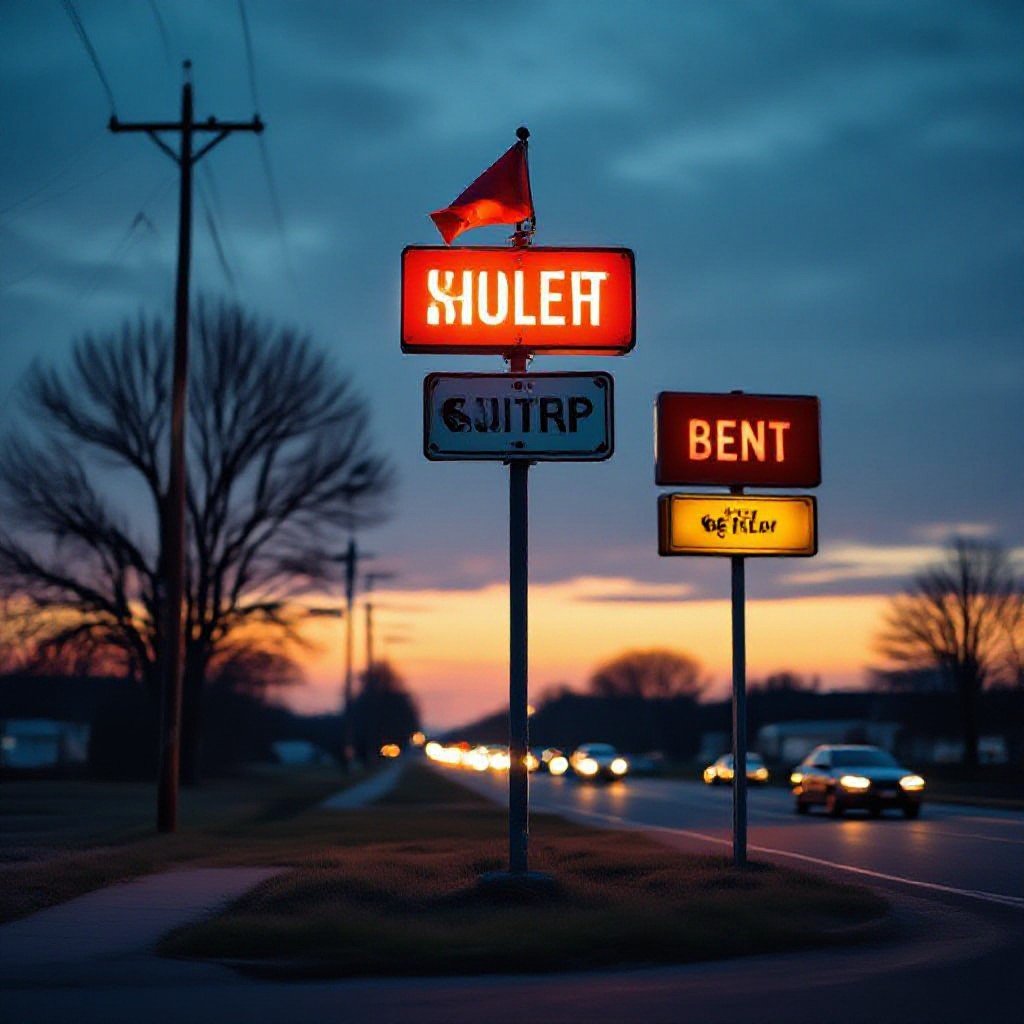
Picture this: you’re pulling up to a busy intersection and squinting at a tiny sign tucked behind a tree. You want drivers to see your message from far away, and you don’t want the whole pole to wobble in a storm.
- Height: Match sign height to sight-lines and the type of road-local streets usually 12-25 ft, arterial roads higher, highways much taller-check local zoning and sight-triangle rules before you set it.
- Wind and structure: Account for local wind speeds, pole diameter, wall thickness, foundation size and anchoring; engineering and proper materials cut down on sway and failure, so get calculations for your site.
- Visibility and legibility: Use big, simple copy, high contrast, and lighting for night; faster traffic means larger letters and greater mounting height so people actually read it at speed.
- Maintenance and access: Plan for lighting service, panel replacement, corrosion protection and safe access for technicians-what’s easy to service stays looking good longer.
- Permits and long-term cost: Factor permitting, utility conflicts, foundation expenses and insurance into the budget-cheap upfront choices often cost more over the life of the sign.
Why visibility is actually the whole point
Why should visibility trump height or wind ratings when picking a pole sign? If drivers can’t spot you, none of the specs matter. You want clear sightlines, readable copy and contrast that catches attention fast – everything else is just supporting detail.
Catching eyes from way down the road
Can someone reading at 45 mph actually get your message in time? You need bold type, high-contrast colors and a tight headline that lands fast, otherwise you get a glance and then gone.
Don’t let trees or buildings hide your brand
Don’t you hate it when trees or buildings swallow your sign? You lose impressions, and no clever engineering will fix poor placement; pick pole height and sightlines to avoid blockers so people actually see you.
Because placement is often a local puzzle – you’ll want to walk the site at different times and from multiple angles, note driver approach speeds and sightlines, and map seasonal foliage.
Line-of-sight wins. If a tree blocks those few seconds, raise the pole, shift the sign face, or trim foliage (with permission) so your message isn’t invisible.
Is going super high really worth it?
Questioning whether going super-high is worth it matters to you because taller poles cost more, face bigger wind loads and often trigger strict permits; you want your sign seen, not just a tower.
My take on the “taller is better” myth
Sure, taller grabs attention, but you pay in permits, wind engineering and maintenance; smaller heights often give better visibility to the people who actually drive by, so you should pick placement over pure height.
Dealing with those annoying city height rules
When city height rules show up they shape your options: setback requirements, sight-line limits and zoning quirks, so get the code early, talk to planning and factor permit time into your schedule.
If you want your permit approved faster, hire a local expeditor, get structural wind calculations and sizing done up front, and budget for extra engineering – you’ll thank yourself later. Some cities require public notices or hearings and that can add weeks, even months, so contact planning early and bring good sign mock-ups. Don’t skip pre-application meetings; they cut surprises and make inspectors less grumpy.
The real deal about wind and why it’s scary
How can a gust turn a tall sign into a missile? You see, wind pressure climbs with height, and once sway starts it multiplies – bolts fatigue, panels flap, things fail; you could end up with a sign in the road, or worse.
Making sure your sign doesn’t blow away
What keeps your sign from blowing away? Use proper mounting, wind-rated panels, the right pole stiffness, and regular inspections; pick hardware sized for expected gusts and check welds and bolts every season, because tiny rust will bite you later.
Engineering stuff that actually keeps you safe
Can engineering actually keep you safe? Get wind calculations for your site, specify fatigue-rated connections, design foundations for overturning moments, and you’ll have a sign that moves a bit but won’t come down – that’s the goal.
Why do engineers fuss over gust factors, exposure categories, and dynamic response? Because those details set the design wind pressure, which drives foundation depth, anchor bolt size and embedment, pole section choice and whether you need a dampener – it’s the math that keeps your sign put where it belongs.
Right sized foundation + correct anchors = predictably safe.
You’ll want stamped calculations, a qualified installer, and a seasonal check; it’ll save you headaches later.
What’s the secret to a design that pops?
You want a sign that grabs attention fast, so focus on bold contrast, one clear message, and scale that fits viewing distance. Keep clutter low; if drivers only have two seconds, make that count.
Colors that people can actually see
Pick high-contrast pairs and test them at street speed; bright colors can wash out in sun, so you’ll want to stick to two readable hues and avoid fancy gradients that blur at distance.
Why simple fonts are honestly your best friend
Keep fonts simple and bold so you’ll make words legible at a glance; avoid scripts and tight letterspacing, and pick weights that hold up in low light.
When you pick a simple sans, you’ll want to focus on letter shapes, stroke width and x-height because those decide how letters read from 50 or 200 feet. Try mockups at the real viewing angle, squint a little, ask yourself: could a driver read this while moving? If not, bump the size, choose a heavier weight, increase spacing, or cut words – clarity beats cleverness, every time.
Why your sign’s night life seriously matters
Think night lighting’s optional? Your sign works around the clock – if it’s dark, you still need drivers to spot you. Match illumination to your site and learn about pylon options like Pylon, Hi-Rise, and Monument Signs for Visibility so you get attention after sunset.
Picking LEDs that won’t die on you
Some people think LEDs last forever, but you still need quality drivers and proper heat management. Pick brands with solid warranties, ask about lumen depreciation and replacement plans, and don’t skimp on installation – or you’ll be swapping modules sooner than you’d like.
Making sure the glow isn’t too much
People often assume brighter is always better, but glare and light spill can hurt legibility and annoy neighbors. Aim for even face lighting, use shields or trims, check local codes, and test at road speeds – you want clarity, not eyeball-searing brightness.
Careful – thinking a blinding sign makes you pop is a myth. You want contrast, readable type and even illumination, not just raw lumens. Ever squint at a billboard at night? Test at dusk and at the posted speed, tweak trims and louvers as needed.
Too much glow ruins readability.
What you’ll honestly spend on keeping it up
Last winter you watched the town pole sign wobble in a storm and thought “that’s not cheap” – expect routine inspections, bulb and face replacements, and occasional paint or foundation work; budget 3-8% of the sign’s purchase price annually, more if you face frequent high winds or permits. You’ll pay more over time than upfront.
Fixing things before they fall apart
When your neighbor ignored a loose bracket you noticed it tilt slowly over months; small bolts, repainting, and sealant now save you from a full post replacement. You keep a checklist, call a welder or electrician early, and avoid ugly emergency fees – tiny fixes keep the sign standing and your costs sane.
Why cheaping out now hurts you later
A friend skimped on anchors and saved a few hundred, then spent thousands after a storm bent the pole; you feel that pain. Cheap materials corrode faster, warranties evaporate, installers cut corners, and you end up paying for replacement, downtime, and reputation hits.
Once a client tried to shave costs by buying thinner-gauge steel and a no-name controller, thinking “how different can it be?” You ended up footing permit rework, replacing corroded panels, and covering lost sales while the sign was down – and that’s before the higher insurance premium.
That short-term saving turned into a long-term tax on your time and brand.
To wrap up
Conclusively, 68% of motorists spot pole signs at 15-25 ft, so you should pick height and wind-rated structures first, then worry about visibility details like lighting and color. You’ll want it tough enough to stand up to wind, and visible enough to catch eyes – simple, practical choices win every time.
FAQ
Q: Why do height, wind resistance and visibility matter when choosing a pole sign?
A: If you want people to actually find your business from the road, those three things decide whether the sign works or just looks pretty. Sign height affects who can see it and from how far away. Wind resistance affects safety and long-term costs because a flimsy pole will need repairs or replacement after a season of bad weather. Visibility covers legibility, lighting and placement – without that, no one reads your message. You want a sign that brings customers, not a constant maintenance headache.
Q: How do I choose the right height for a pole sign?
A: Height choices come down to sightlines, road speed and local codes. If you’re on a slow street, eye-level signs work fine; on a busy highway you want the sign higher so it clears other clutter and reaches drivers earlier. A quick rule of thumb for letter size is roughly 1 inch of letter height for every 10 feet of viewing distance – so plan accordingly. Check setbacks and maximum heights in your zoning rules before you fall in love with a 40-foot idea. Visibility is king.
A: If you can, drive the route at the busiest times and note where a sign would first become readable – that tells you your needed height better than guesses.
Q: What should I know about wind loads and structural design?
A: Wind load is what makes poles bend, bases fail and signs rip off. Local building codes and engineers specify the wind speed and factors your sign must be built for, so you’ll typically need a structural drawing stamped by an engineer for permitting. Pole diameter, wall thickness, base plate size and anchor bolts all scale up with sign area and wind exposure. If your site is on a ridge, near a bridge or in an open field expect higher requirements and higher costs. Ask your sign company to show calculations or the code used – if they shrug, walk away.
Q: How do I maximize visibility and readability for my pole sign?
A: Keep the message short – three to seven words is a good target. High contrast between text and background wins; dark letters on a light background or the opposite will read faster. Use simple, bold fonts and avoid tight tracking or ornate scripts that blur at distance. Lighting can make or break night visibility – internal face-lit, backlit, or well-aimed external fixtures each have pros and cons depending on power access and maintenance. Viewing angle matters too; aim slightly toward the main traffic flow so drivers see the face square-on where possible.
Q: What about permits, maintenance and budget trade-offs?
A: Permits and zoning often dictate sign height, placement and even illumination hours, so plan that cost and lead time into the project. Taller signs and heavier wind-rated structures cost more up-front but usually save money over time by avoiding repairs and replacements. Maintenance tasks include cleaning, light replacement, painting and corrosion protection; build a simple inspection schedule so small issues don’t turn into big ones. Warranties and service agreements vary, ask for them in writing and compare total life-cycle cost, not just the sticker price.