
With traffic whipping by at 60 mph, you’ll need bold type, high contrast and minimal words to grab drivers’ attention fast, so how will you make your pylon sign readable?
Key Takeaways:
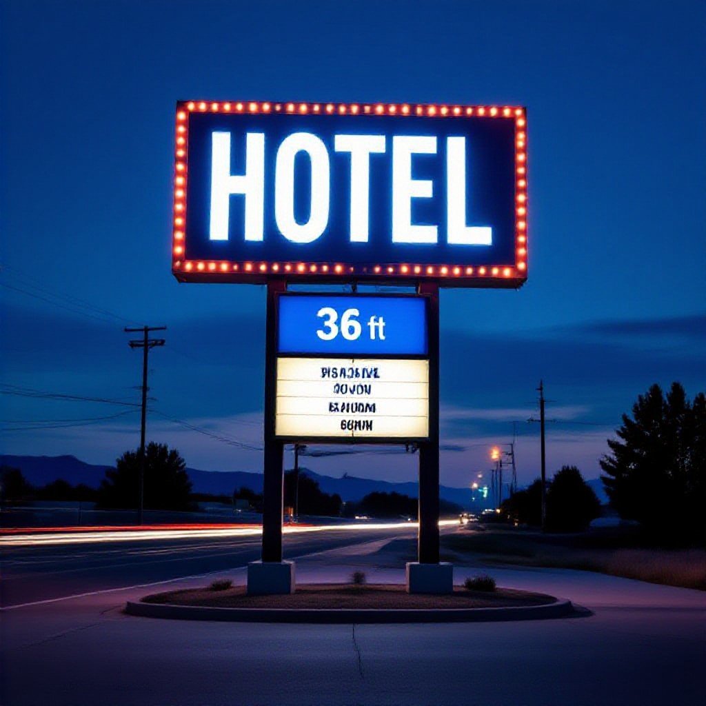
I drove past a pylon sign last week that made me slam on the brakes – it was packed with text, tiny type, and a busy background. Ever wonder why some signs hit you at 60 mph and others just blur by?
Big, clear type wins.
- Prioritize legibility: use large sans-serif fonts, bold strokes, and limit text to 3-6 words so drivers can read it in a glance.
- Optimize size and spacing: aim for about 1 inch of letter height per 10 feet of viewing distance, increase letter spacing, and keep short line lengths.
- Keep contrast and color simple: pick dark-on-light or light-on-dark combos, avoid patterned backgrounds, and test readability in daylight and at night.
- Design for glance time: make the headline dominant, drop extra details, and place the brand or call-to-action where the eye naturally lands.
- Mind placement and lighting: mount the face perpendicular to traffic sightlines, set height for driver eye level, use steady illumination or backlighting, and clear nearby visual clutter.
What’s the deal with height and location anyway?
You’d think taller is always clearer, but if your pylon climbs above drivers’ normal sightlines or blends into a cluttered skyline, people simply miss it. Place height to match road type and nearby obstructions so your message actually gets read.
Why I think being too tall is actually a bad thing
Too tall and drivers look right past your sign because their eyes aim lower; then it’s just extra cost and a bland silhouette against the sky.
Finding that sweet spot where drivers won’t miss you
Lower placements often beat taller pylons on city streets, so don’t assume more height will grab attention; instead match height to speed and sightlines.
Consider sightlines, vehicle speed and typical eye height when you set pylon elevation. At highway speeds you need taller signs and bigger letters; in town, lower heights and tighter copy win. Want proof? Mock the driver’s view from several distances, test at night with your lighting, and tweak until drivers read it on the first pass.
Let’s talk about fonts that won’t make people squint
You’re barreling down the highway at dusk, headlights glaring and a pylon sign blurring by – can you read it? Use bold, sans-serif fonts with tall x-heights, open counters, and high contrast so your message lands in a single glance.
Honestly, just stay away from those fancy script fonts
Skip ornate script styles; they look classy up close but turn into an unreadable mess at speed. Pick clean strokes, open loops, and a steady baseline so you don’t lose customers in a blink.
The real deal on letter spacing and why it matters
Spacing decides legibility: tight letters smear together at distance, loose ones break recognizable word shapes. Aim for modest tracking that preserves word recognition when drivers have only seconds to read.
If you test the sign at full scale you’ll catch kerning quirks a phone mockup hides, so print a giant proof and step back a few yards.
Don’t cram letters together.
You can nudge tracking a bit for thin strokes, tighten tricky pairings, and always view from a driver’s angle to confirm words read cleanly.
Why contrast is actually your best friend on the road
Lately there’s a push back to bold, high-contrast pylon signs as driver distraction rises, so you need clarity at a glance; good contrast wins. Check examples in this guide: Pylon/Totem Signage: Maximizing Roadside Visibility for Brands.
My take on the best color combos for quick reading
Try white on dark blue, black on yellow, or white on rich red – high luminance contrast and simple palettes let you read in a blink. You don’t need more than two colors for the main message, and keep fonts bold and wide.
Seriously, don’t let your brand colors ruin visibility
Don’t force your exact brand hues if they vanish at speed; muted pastels or low-contrast gradients kill legibility. You can keep brand spirit by using an accent color while switching primary sign panels to high-contrast alternatives.
Because you want drivers to grab your message in a blink, test signs at real speeds – take a phone video from a car or snap a photo while cruising past at 40-50 mph, then squint: does your headline pop? If your palette fades, keep the logo color but switch backgrounds to stark contrasts, boost LED brightness at night, and ditch gradients that blur edges. Little tweaks like that make the sign readable from far away and turn passersby into customers, not confused glances.
How much info is too much info?
How much can a passing driver actually process? You should aim for one bold headline, one clear action and a phone or direction – anything beyond that gets lost. Quick glances mean quick decisions, so keep it sharp and readable.
The “less is more” rule for drivers going 60 mph
Driving 60 mph, what can you read in two seconds? Strip the sign to a giant headline, a simple icon and a single contact or direction. Use large type and high contrast so drivers catch it without slowing down.
What’s the one thing you actually want them to remember?
Which single message cuts through all the clutter? Pick the one action you want drivers to take – call, turn, or stop by, and make that idea enormous, clear and painfully simple so it sticks with a glance.
If you force yourself to choose one thing, everything else goes. Big type, a short verb and a reachable phone or clear direction win. Icons help, color contrast helps, and spacing beats fancy fonts. Think like you’re squinting and pressed for time – make that single action impossible to miss.
Making sure your sign doesn’t disappear when the sun goes down
About 72% of drivers miss signage at night when illumination is poor. You need consistent brightness, color temperature and glare control so your pylon stays readable; aim for uniform face lighting, test from roadway angles and schedule regular maintenance.
Here’s what happens when your LEDs start acting up
When LEDs flicker or shift color, you confuse drivers fast. You lose contrast, letters wash out and sections go dark – inspect power supplies, replace failing modules, and keep spare parts handy so fixes are quick.
Internal vs. external lighting – which one is better?
Which option you pick affects visibility, maintenance and upfront cost. You get even, glare-free faces with internal lighting but accessibility and heat can be issues; external lighting is cheaper to service but may cause hotspots and uneven reading.
Lighting choice really comes down to where your sign sits and how hands-on you want to be. You might prefer internal LEDs for a clean, uniform look that drivers parse faster, but if moisture or heat are common you’ll be swapping modules more often – are you prepared for that? If you want quick access for fixes, external fixtures win, they let you target hotspots and swap bulbs without opening the cabinet, plus you can tweak beam angles on site; it’s a trade-off, so weigh service costs against the look you need.
Keeping things fresh so you don’t look like you’re closed
You pull up on a rainy night, headlights catching streaks on an old pylon sign that looks like it’s been asleep for years, you wonder if the place even opens, right? If your sign’s shabby, customers bail fast, so keep it clean and current; it’s your first handshake.
Why a dirty sign is basically a “keep out” signal
Grime on your pylon makes drivers think you don’t care, and they’ll drive past, fast. You want people to trust you’re open and ready, so a filthy face, faded letters or bugs on the lightbox says closed before they even stop.
Simple fixes that’ll keep your sign looking brand new
Small routine touch-ups, a quick wash, bulb swap and replacing warped vinyl keep your sign crisp and readable at speed. You don’t need a crew; a monthly walkaround and a couple of spare bulbs go a long way.
Make a short checklist you can actually follow: wash the face with mild soap and a soft cloth, swap burned-out bulbs for LEDs, touch up peeling paint and reseal seams where moisture sneaks in. Walk the site monthly, tighten loose bolts, trim branches hiding the sign, and snap a photo after each visit so you can spot fading over time, it’s low effort and pays off in pull-ins.
Final Words
So you increase legibility by using big, simple type, high-contrast colors and minimal words; place the sign at drivers’ sightline, test readability at speed, and keep lighting consistent. Want people to read it in a glance? Make every element count and strip away fluff.
FAQ
Q: How come optimizing a pylon sign for roadside readability even matters?
A: This matters because drivers get only a few seconds to spot your sign, read it and act. Missed reads mean missed customers – plain and simple.
People don’t slow down to study your font or color palette, they glance. If the message isn’t grabbed in that split second, it’s gone. Good sign design pays for itself by turning passing traffic into real visits, calls or brand impressions.
Q: What fonts and text sizes actually work when cars are moving?
A: Pick a clean sans-serif with big open counters and steady stroke widths – think Helvetica, Futura, or similar; narrow or ornate faces are out. Mixed-case words read faster than ALL CAPS for longer messages, so use caps only for very short words or acronyms.
A practical sizing rule: plan roughly 1 inch of letter height for every 10 feet of typical viewing distance – test it though, real-world conditions vary. Tight letter spacing will blur at speed, so loosen tracking a bit and keep the main message to one or two lines tops.
Q: How do color and contrast affect legibility from the road?
A: High contrast is the single biggest visual shortcut – dark text on a light background or vice versa works best. Black on yellow, white on dark blue, or black on white are classic combos that read fast.
Avoid flashy combos that vibrate like red on blue or small, multicolor gradients that melt together when you’re moving. Reflective or front-lit faces help at night, but even then simple color blocks beat fancy effects every time.
Q: What about sign size, height and placement – any quick rules?
A: Place the sign where drivers’ sightlines naturally fall – usually between 4 and 7 feet above the ground for passenger cars, higher if trucks are a primary audience. Set the sign face perpendicular or just slightly angled toward approaching traffic so drivers don’t have to turn their heads.
Bigger faces = bigger lettering = more legible at speed, but don’t cram content. Keep the face uncluttered – one strong message, a logo if needed, maybe a phone number. If the road speed is high, increase letter size and sign area accordingly.
Q: How should lighting and maintenance be handled to keep readability consistent?
A: Use even, glare-free illumination – diffuse front lighting or well-designed LED modules work best. Don’t use overly bright spots that wash out letters or cause reflections on rainy nights.
Maintain the sign: clean the face, replace burned bulbs, trim foliage and fix tilted mounts. Do a drive-by at real driving speeds after installation – if you can’t read it from the road, your customers won’t be able to either.