
signs in historic districts often face size, illumination and material limits; you usually need permits and design review, and must follow placement, color, mounting and period-appropriate material rules to protect architectural character.
Key Takeaways:
- This matters if you run a shop or manage property in a historic district – a wrong sign can mean permit rejection, fines, or wasted cash and time.
- Size and placement get tight scrutiny: expect strict limits on square footage, height, setback from the street, rules for projecting or hanging signs, and many districts ban rooftop signs.
- Materials and style are controlled: traditional wood, metal, and painted signs are preferred; plastic panels, neon and full-motion electronic displays are often prohibited. Want LEDs? Ask first – subtle backlighting may be OK, flashing is usually not.
- Design review is common: most signs need a certificate of appropriateness or approval from a historic commission, with drawings, photos and sometimes a public hearing – plan for weeks or months, not days.
- Temporary signs and upkeep are regulated: banners, sandwich boards and event signs usually face size, placement and time limits, and poorly maintained signs (peeling paint, loose hardware) can trigger enforcement.
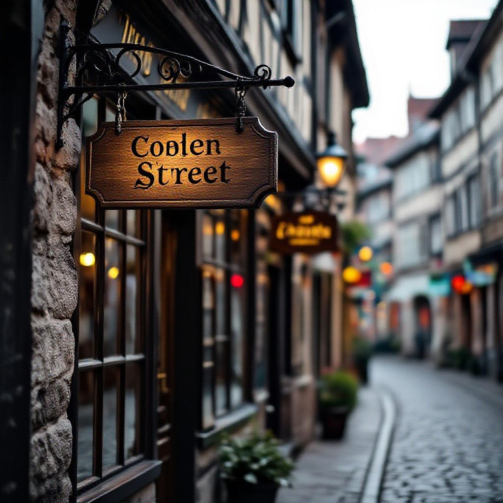
Seriously, size actually matters more than you think
Picture a storefront forced to shrink its sign until it’s unreadable; size rules mean your message vanishes. You need to check local limits like sign area and placement – see 14.4 – Sign Guidelines | Historic Landmark Commission for specifics.
Don’t go blocking the cool architecture
Blocking historic details with oversized signs will get you shut down; your sign should sit clear of cornices, windows and ornamentation so the building still reads, not dominated by your logo.
The real deal on those height limits
Height limits usually cap how tall pole or projecting signs can be, measured from grade, so you can’t slap a towering sign up without approvals; expect strict clearances and measured setbacks.
When you plan a tall blade sign on a busy street, you’ll have to measure from the curb, factor in pedestrian clearance and sight lines, and probably deal with a handful of measurements that seem arbitrary but matter. Want visibility or to block a window? pick one, because the commission will favor the streetscape every time.
Sign height often becomes the dealbreaker.
Let’s talk about lighting without ruining the mood
Lighting in historic districts has to stay low-key; you can’t go flashy, and regulators often reject overtly bright signs. Aim for warm, dim accents that show materials and lettering without stealing the scene, so the building still reads as historic when people walk by at night.
Why internal glow just isn’t gonna happen
You won’t be allowed internal backlit signs in many districts because that flat glow reads modern and erases texture, so pick routed faces, individual letters, or subtle halo lighting to keep the period look while still being visible after dark.
Using gooseneck lamps like a pro
Gooseneck fixtures give you a focused, warm wash that feels period-correct and avoids light spill; aim the lamp to graze the sign, not blast it, and keep hardware simple so attention stays on the copy, not the mount.
Positioning matters: mount the gooseneck a bit above the sign so light washes downward and shadows fall naturally. Angle the head so the beam just kisses the face, use 2700K bulbs for a cozy tone, and add a dimmer or timer if nights are bright-keeps things friendly for neighbors and inspectors alike.
Dealing with the board isn’t as scary as you’d think
Picture you standing before the board with a bold sign mock-up; they squint, point at materials and placement, and ask if it fits the district’s look. You’ll face rules on color, size, illumination and attachment methods, plus limits on modern materials – so you might have to tweak the design more than you expected.
Getting your paperwork in order first
Get your permit packet, diagrams, photos, and a short cover letter ready before the hearing. The board likes tidy, clear stuff, and showing how your sign respects historical character makes approvals faster. You won’t need fancy renderings – just clear measurements and examples of similar approved signs.
What happens when they actually say no
So they say no – now what? You can ask for specific changes, propose an alternate design, or request a continuance to revise. Many boards deny the first draft but approve tweaks, and you can appeal or apply for a variance if required.
You should ask the board for written reasons, then target those points directly; sometimes swapping materials or lowering the sign height wins approval. Talk to the preservation officer, collect a neighbor support note or two, and bring tightened drawings back to the next meeting. If denial holds, appeals have set time windows and fees, or you can file for a variance – both take patience and a little persistence.
Final Words
On the whole, about 70% of historic districts restrict sign size, materials, color, illumination and placement, so you must get permits, follow design guidelines, avoid oversized or brightly lit modern signs and aim for compatible materials and mounting to preserve character; ask your local preservation board before installing anything.
FAQ
Q: Compared to modern commercial areas, what size and placement limits apply to signs in historic districts?
A: Compared with new suburban strips, historic districts almost always force signs to be smaller and more carefully placed. Local rules will usually cap maximum sign area, limit how high a sign can sit on a facade, and restrict how far a projecting or hanging sign can extend into the sidewalk zone, so you can’t just slap a big billboard above a storefront and call it a day.
Storefronts often get a percentage rule – only a certain percent of a window or wall can be covered with signage – and some districts set different limits for primary facades versus alleys or secondary elevations.
Most places prefer blade or wall-mounted signs that fit historic proportions rather than huge roof-top signs. Anchoring into historic masonry may be prohibited or require special techniques to avoid damage, so placement is as much about preservation as visibility.
Q: Unlike new developments, how are materials, colors, and overall design controlled in historic districts?
A: Compared to contemporary shopping centers, design guidelines in historic areas push for traditional materials and hand-crafted looks. Common rules favor wood, metal, hand-painted lettering and historically appropriate fonts and trim, and they’ll frown on modern plastics, glossy PVC panels, or big vinyl wraps that scream out of place.
Color palettes are usually muted or taken from a local historic palette – bright neon pink or garish gradients usually won’t fly. Sign faces may need to show how they relate to original architectural features, and mounting hardware is expected to be discreet.
You can still be creative. Small-scale, well-executed modern signs are often approved if they respect scale, material, and sight lines.
Q: How are lighting and electronic signs treated differently in historic districts?
A: Compared with downtowns built in the last few decades, most historic districts strictly limit illumination types and intensity. Internally illuminated plastic box signs and large animated electronic displays are commonly banned; permitted options tend to be low-intensity external up-lighting, gooseneck lamps, or subtle halo lighting.
Neon might be allowed in modest amounts if it fits the district’s character, but full-color LED video walls and scrolling message boards usually get a hard no. Timing rules sometimes apply too – lights may need to be dimmed at night or turned off after certain hours to reduce glare.
Simple, appropriately scaled lighting wins more approvals than anything flashy.
Q: What permitting, review, and approval processes should owners expect for signs in historic areas?
A: Compared with places with only zoning staff review, historic districts typically require an extra layer of oversight – think Historic Preservation Commissions, design review boards, or a Certificate of Appropriateness process. Applicants usually submit drawings, materials samples, location photos, and mounting details, and the review can include public meetings, so plan for a longer timeline.
Fees and timelines vary – some towns have streamlined staff approvals for small projects, while others require formal hearings for anything visible from the street. If you get denied you can often appeal, but the appeal process takes time and sometimes money.
Start the permit conversation early. It saves heartache and ugly re-dos.
Q: What rules apply to temporary signs, banners, sandwich boards, and window displays in historic districts?
A: Compared with permissive commercial zones, temporary signage in historic districts is usually tightly controlled. Many places allow short-term banners or event signs with strict size, placement, and duration limits – like a banner up for 14 days for an event – and they may require attachment methods that don’t damage historic fabric.
Window signs often have a percent-of-glass limit, and sandwich boards are permitted in some districts but only if they meet size and placement rules and don’t block sidewalks or sightlines. Seasonal decorations are usually fine if they’re tasteful, but permanent-looking temporary signs or excessive vinyl lettering will draw a citation.
If you’re unsure, ask the local preservation office before you hang anything; it beats a fine or having to remove and replace work you already paid for.