
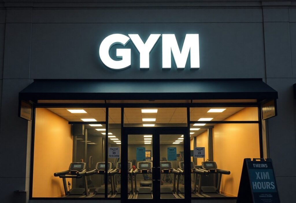
There’s no substitute for high-contrast, illuminated signage that makes your gym visible day and night; you should pair a bold channel-letter logo with clear hours and a simple call-to-action, add window graphics and a blade sign for pedestrian sightlines, use an A-frame for promotions, select durable, low-maintenance materials, and ensure legibility from distance and compliance with local codes so your brand draws the right members.
Key Takeaways:
- Prioritize high-contrast, large-type lettering and clean, sans-serif fonts for legibility at a distance.
- Use illuminated signs or LED channel letters to maintain visibility and brand presence after dark.
- Feature bold fitness imagery and short action verbs (e.g., “Train,” “Lift,” “Move”) to convey purpose instantly.
- Keep messaging minimal-facility name, hours, and one clear USP (24/7, personal training, etc.)-for quick comprehension.
- Match sign scale and placement to the storefront architecture and add window graphics for promotions and entrance wayfinding.
Importance of Effective Signage
Effective signage directly affects foot traffic and perceived value: apply the 1 inch per 10 feet legibility rule so passersby can read your name from the curb, favor backlit channel letters or LED halo lighting for 24/7 visibility, and choose high-contrast palettes for quick recognition. You should match materials to brand – raw steel and matte finishes read premium, neon or bright vinyl read energetic – and place directional signs for parking and entry to reduce friction and boost first-time conversions.
First Impressions Matter
Passengers and pedestrians form opinions in seconds, so your storefront should signal what kind of training you offer; bold, minimalist lettering and dark tones communicate serious strength training, while colorful, illuminated graphics suggest high-energy classes. You get a short window-often 3-7 seconds-to influence someone’s decision to stop, so prioritize visibility at eye level, clear hours, and a concise tagline that states benefits like “24/7 access” or “no-contract memberships.”
Brand Recognition
Consistent exterior signage anchors your gym’s identity across channels: keep the same logo proportions, Pantone colors, and typeface as your website and social media so members instantly connect signage to your brand. Repetition matters-marketing often cites several exposures before recall-so coordinate pole banners, window graphics, vehicle wraps, and digital ads to reinforce familiarity along common commute routes.
On a practical level, you should standardize file specs and color codes (Pantone, CMYK, hex) for every sign vendor to avoid hue shifts that dilute recognition. Test variations by running two storefront treatments in similar locations or using unique promo codes on different signs to measure walk-ins; small changes in contrast, font weight, or logo sizing can yield measurable differences in recall and membership inquiries.
Types of Storefront Signs
You’ll pick from channel letters, dimensional letters, lighted cabinets, blade signs and window graphics based on visibility, budget and brand tone; channel letters read well from 50+ feet and cabinet signs are cost-effective for large logos, while vinyl graphics cost under $10/sq ft for promos. Many gyms boost evening walk-ins by prioritizing facade lighting and bold typefaces. Thou prioritize contrast and legibility above ornate detail.
| Channel Letters | High visibility, 30-100 ft effective, LED-driven |
| Dimensional Signs | 1-3 in depth, metal/acrylic, strong brand presence |
| Lighted Cabinet Signs | Cost-effective for large art, 6×4 ft common size |
| Blade/Projecting Signs | Pedestrian-level, improves sidewalk sightlines |
| Window Graphics | Affordable promos, $5-15 per sq ft, easy to update |
- Channel letters for roadway visibility
- Dimensional letters for brand solidity
- Lighted cabinets for backlit artwork
- Blade signs for foot traffic
- Window vinyl for offers and schedules
Dimensional Signs
You’ll often choose 1-3 inch thick letters in aluminum, acrylic or high-density foam; 2-inch aluminum is common for outdoor durability and powder-coat finishes withstand salt and UV. Designers use 3-5 inch spacing and bold sans-serif fonts to maintain legibility at 25-50 feet, and raised logos create shadow contrast that reads even in daylight.
Lighted Signs
You can select front-lit cabinets, halo-lit channel letters or LED face panels; LEDs cut energy versus neon and commonly last ~50,000 hours. Typical gym cabinet sizes run 4×6 to 8×12 ft, and integrated dimmers or photocells keep overnight glare under local ordinance limits while maintaining brand visibility.
Thou ensure LED modules have a CRI ≥80 and a color temperature between 3000-5000K, specify modules rated ~50,000 hours with 3-5 year warranties, install photocell or timeclock controls to limit run hours, plan annual lens cleaning and transformer checks, and confirm local sign codes for brightness (nits) and setback to avoid fines.
Messaging Strategies
Shift your messaging to concise value statements that read in three to five words; pair the 1 inch per 10 feet legibility rule with punchy copy so passersby get the offer at a glance. Use concrete offers like “24/7 Access,” “7‑day Free Trial,” or “10% Off First Month,” and rotate messages by time of day (commuter vs. evening classes) so you target the right audience when they walk by.
Call-to-Action Phrasing
Use direct verbs and clear actions such as “Join Today,” “Book a Free 20‑min Assessment,” or “Claim 10% Off First Month”; you should keep CTAs to one per sign and make them scannable with a single phone number or QR code. Add a short time anchor like “This Week Only” or “Limited to 12 Spots” to increase immediacy without cluttering the design.
Highlighting Unique Offerings
Spotlight what sets you apart with short, specific labels so you communicate real value instantly: “Small Groups – max 12,” “HIIT + Recovery Room,” “Infrared Sauna,” or “Kids Care On‑Site.” Pair each label with an icon and, where space allows, a single metric (class size, session length) so potential members can quantify the benefit in seconds.
When you detail offerings, present tangible packages like “10 PT Sessions,” “30‑minute Express Classes,” or “Memberships from $29/mo” to lower friction for sign-readers. Use QR codes linking to schedules, instructor bios, or short testimonials, and rotate featured perks monthly-specialty class nights or seasonal promos-to give repeat passersby new reasons to step inside.
Placement and Visibility
You want your sign where people naturally look: near the main entrance, at curb-facing angles, and aligned with pedestrian sightlines; follow the 1 inch of letter height per 10 feet of expected viewing distance and verify local codes-see Commercial Building Signage for commercial placement standards and examples that affect visibility and permitting.
Strategic Locations
You should prioritize corner-facing blade signs, storefronts next to high-foot-traffic walks, and parking-lot-facing façades; place directional wayfinding signs every 30-50 feet in plazas, and mount window vinyl between 3-6 feet above the sidewalk for eye-level reads-these choices increase the chance a passerby spots your brand within a 3-6 second glance.
Height and Size Considerations
You’ll use the 1 inch per 10 feet rule to size letters: for a sign intended to be read from 100 feet, choose ~10-inch letters; channel letters frequently run 12-24 inches for storefronts, while single-line logos may need 3-5 feet of width to maintain legibility from the road.
You must also account for mounting clearance and viewing angles: keep the bottom of pedestrian-facing signs at least 7 feet above sidewalks (8-10 feet reduces vandal risk), and position building-mounted signs 10-15 feet above curb level for drivers; pair correct sizing with high-contrast colors and LED illumination to preserve legibility at dusk and from 50-200 feet.
Color and Design Elements
Color choices and design details directly shape perception: high-contrast combos (dark letters on light backgrounds or vice versa) maximize legibility and follow the 1 inch per 10 feet rule for viewing distance. Use bold accents-orange or red-for HIIT and functional studios to signal intensity, while blues and greens suit recovery, yoga, and physical therapy. Match materials and finishes (matte vs. glossy, illuminated vs. flat) to the tone you want to project.
Psychological Impact of Colors
Colors change how potential members feel before they step inside: red and orange elevate energy and urgency-ideal for bootcamps and cycle studios-while blue and green reduce arousal and foster trust, working well for wellness and rehab centers. You can combine a vibrant accent with a calming base to balance motivation and approachability; for example, an orange trim with a navy field keeps intensity readable and brandable.
Cohesive Branding
Keeping your exterior colors, logo, typography, and materials consistent across signage, windows, staff apparel, and digital presence builds instant recognition. Use defined Pantone or hex codes and a single primary typeface family so your channel letters, blade signs, and window vinyl all read as one brand, and ensure your wordmark follows the 1 inch per 10 feet legibility guideline at typical curb distances.
Go further by documenting a simple brand spec: primary/secondary colors with hex/Pantone, font weights for headlines and body, acceptable logo lockups, and preferred finishes (backlit acrylic for modern, brushed metal for premium). This prevents mismatched vinyl, inconsistent lighting, or competing graphics on multi-tenant façades, helping you convert curbside recognition into trial memberships.
Legal and Regulatory Considerations
Local codes, zoning rules and ADA requirements directly shape what you can install: many municipalities cap sign area at roughly 10-25% of the storefront or set absolute limits (often 50-200 sq ft), restrict flashing illumination and require tactile/contrast signage for accessibility. You should verify façade area calculations, lighting-hour limits, and any licensed-electrical requirements before ordering a fabricated or illuminated sign.
Local Signage Laws
Zoning designations determine allowed sign types and sizes: commercial corridors typically permit larger wall or blade signs while mixed‑use or residential zones impose tighter limits. Many codes cap projecting signs to 8-12 ft above the sidewalk, limit projection depth to ~4 ft, and require a minimum 8 ft pedestrian clearance; historic districts add design-review standards and material approvals.
Permitting Processes
You generally file with the city planning or building department, submitting scaled elevations, site plans, lighting/electrical schematics and owner authorization. Expect permit fees commonly between $100-$800 and review times of 2-8 weeks; illuminated signs require an electrical permit and licensed electrician for final inspection. Some jurisdictions offer online or expedited review for an extra fee.
For larger or engineered signs you may need structural calculations and a stamped engineer’s drawing; exceeding local limits triggers a variance or conditional-use process that can add 4-12 weeks and $500-$2,500 in application costs. Inspections on installation and wiring are typical, and noncompliance can lead to fines or ordered removal, so factor permitting and inspection milestones into your rollout timeline.
To wrap up
Following this, the best gym storefront signs make your brand visible and legible from distance: bold channel letters or illuminated LED signs, high-contrast colors, large readable fonts, and a clear logo. Complement with window graphics showing services and durable materials suited to weather. Placement, lighting and consistent branding ensure you attract the right traffic and convey professionalism day and night.
FAQ
Q: What types of storefront signs are most effective for gyms?
A: Channel letters (front- or back-lit) and illuminated box signs deliver high visibility day and night; blade or projecting signs catch pedestrian attention; large vinyl window graphics and frosted film communicate services and class schedules; digital LED displays allow rotating promotions and schedule updates. Combining a primary illuminated identification sign with secondary window/door graphics and a blade sign creates layered visibility for both drivers and walkers.
Q: How should color, contrast, and typography be chosen for a gym sign?
A: Use high contrast between text and background-light text on dark or dark on light-to ensure legibility at a distance. Choose bold, geometric sans-serif typefaces with generous letterspacing and avoid thin strokes or overly decorative fonts. Limit colors to a strong brand palette and reserve bright accent colors for calls-to-action or key information to improve quick recognition.
Q: What size and placement work best for storefront gym signs?
A: The primary sign should be sized to be legible from typical approach distances: larger for curbside visibility, smaller if the street is narrow. Mount the main identification sign above the entrance at a height visible from the road; add a blade sign at about 7-9 feet for pedestrian sightlines. Ensure signage doesn’t conflict with sightlines, awnings, or neighboring businesses and check local sign-code height and square-footage limits before fabricating.
Q: Are illuminated or digital signs worth the extra expense for a gym?
A: Yes when extended visibility and flexible messaging are priorities. LED-illuminated signs improve nighttime presence and brand perception; digital displays let you rotate class schedules, promotions, and social proof without reprinting. Factor in higher upfront cost and electrical/permit requirements, but energy-efficient LEDs and modular digital content often deliver better membership-driving ROI over passive static signs.
Q: Which materials and maintenance practices are best for high-traffic gym storefronts?
A: Durable, low-maintenance materials like powder-coated aluminum, acrylic face letters, polycarbonate lightboxes, and UV-stable vinyl perform well in high-traffic locations. Use anti-graffiti coatings or tamper-resistant fasteners where vandalism risk exists. Establish a quarterly inspection for lighting, fasteners, and graphics fading; clean surfaces with manufacturer-recommended products and keep replacement parts or bulbs on file to minimize downtime.