
When it comes to Sign Visibility distance directly determines how large, bright, and legible a sign must be for your audience; use viewing distance formulas and contrast standards to set letter height, luminance, and placement so your message is readable at speed and in varied lighting. Apply clear spacing, obstruction checks, and consistent typography to maximize recognition and safety.
Key Takeaways:
- Letter height guideline: allow about 1 inch of letter height per 10 feet of typical viewing distance, increasing size for highway speeds or long-range visibility.
- Maximize contrast and lighting: use high-contrast color combinations, non-glare finishes, and supplemental illumination or backlighting for low-light conditions.
- Prefer clear typography and spacing: simple sans-serif fonts, adequate stroke width, and generous letter/word spacing improve quick recognition.
- Optimize placement and orientation: mount signs perpendicular to primary sight lines, unobstructed, and at appropriate height for the intended audience.
- Factor viewer speed and environment: use larger letters or pictograms for fast-moving viewers, account for weather/landscape, and validate by testing from actual viewing distances.
Importance of Sign Visibility
Visibility directly determines whether your sign performs as intended; if someone can’t decipher the core message within their available glance time, the sign fails. A practical design rule you can apply is 1 inch of letter height for every 10 feet of expected viewing distance-so a message meant to be read from 100 feet should use roughly 10-inch letters-combined with high luminance contrast and anti-glare surfaces to preserve legibility in varying light conditions.
Investing in appropriate size, illumination and material pays off in reduced replacement costs and fewer missed opportunities: for example, on a 200-foot sightline a 20-inch letter height (per the 1″ per 10′ rule) and prismatic retroreflective sheeting will keep your message readable at dusk and under vehicle headlights. You should also factor in speed of approach-at 30 mph you cover about 44 feet per second, so placement and letter sizing must match the actual seconds a viewer has to process the sign.
Sign Visibility Impact on Audience Engagement
Audience engagement rises when your sign communicates the single most important element-brand name, directional cue or call-to-action-within the first half-second of glance. Because typical visual fixations are brief (often under 300 milliseconds), you need concise wording, bold letterforms, and prioritized hierarchy: one dominant line, one secondary line and minimal ornamentation to ensure rapid comprehension.
Practical outcomes are measurable: wayfinding upgrades that increase letter height and contrast reduce hesitation and misroutes, which in retail or transit environments translates to higher conversion or on-time arrivals. You can quantify impact by A/B testing different letter heights or materials and tracking metrics such as walk-in rate, dwell time or customer complaints about missed signage.
Sign Visibility Legal Regulations and Standards
You must design to applicable standards: for interior accessible signage the ADA Standards (section 703) mandate tactile characters and Braille and set minimum character heights (commonly cited as 5/8 inch minimum) along with requirements for non-glare finishes and mounting locations. For exterior and roadway signage, the Manual on Uniform Traffic Control Devices (MUTCD) specifies minimum letter heights, sign dimensions and retroreflectivity levels-6 inches is a commonly referenced minimum for many regulatory signs, with larger sizes required on higher-speed roadways.
Local building codes and zoning ordinances add another layer-permitting procedures often require scaled drawings showing letter heights, sightlines and illumination levels, and many jurisdictions will require retroreflective or illuminated materials that meet ASTM or state agency standards. Noncompliance can lead to mandated replacement, denial of occupancy, or fines, so you should verify both federal guidelines and local amendments before fabrication.
To act on this, check ADA 703 for tactile sign specs, consult the MUTCD for any signs affecting vehicular traffic, and request product data sheets showing ASTM or state retroreflectivity ratings (Type III/high-intensity or better where required). Also confirm permit submittal requirements-plans typically need scaled elevations with proposed letter heights and a visibility/legibility statement-so you can avoid costly rework and ensure your signs meet both functional and legal expectations.
Sign Visibility Factors Affecting Viewing Distance
Several interdependent variables determine how far away your audience can comfortably read a sign: letter height, stroke width, x‑height, color contrast, ambient illumination, mounting height, viewing angle, message complexity, and viewer speed. Practical guidelines you can apply immediately include the common legibility rule of thumb-1 inch of letter height for every 10 feet of viewing distance (so a 10‑inch letter is legible at roughly 100 feet)-and choosing mixed‑case type for recognition rather than ALL CAPS. Field examples: retail storefront signs intended for pedestrians often use 2-6 inch letters (20-60 feet of legibility), while roadside billboards routinely specify letters measured in feet for visibility from several hundred feet.
- Typography / font size and spacing
- Color contrast, luminance and glare control
- Sign size, placement height and viewing angle
- Ambient lighting, time of day and weather
- Viewer speed (walking vs. driving) and message complexity
Environmental factors like direct sun, wet pavement glare, or backlighting can cut effective viewing distance dramatically, and individual viewer factors-age, vision acuity, and whether they’re scanning at 30 mph versus walking-change your design targets. Perceiving signage at a distance depends on a matrix of these variables.
Typography and Font Size matters when it comes to Sign Visibility
You should prioritize letterform clarity: choose fonts with large x‑heights, open counters, and consistent stroke widths. For distance legibility apply the 1″ per 10 ft rule as a baseline-if you expect drivers to read from 200 ft, aim for ~20‑inch letters. Also prefer humanist or grotesque sans‑serifs (the FHWA fonts or similar clearface families) for wayfinding; avoid condensed or decorative typefaces which lose recognizability as serif details close up or break down at distance.
Adjust tracking and stroke width for the expected illumination: increase inter‑letter spacing by 10-20% for small sizes or low contrast situations, and use slightly heavier strokes in bright daylight to overcome specular reflections. If your sign will be read by fast‑moving traffic, simplify the message to short words and use mixed‑case for quicker word‑shape recognition rather than forcing all caps.
Color Contrast and Lighting
Your contrast targets should exceed web accessibility minima when possible: WCAG defines 4.5:1 for normal text and 3:1 for large text, but on signage you’ll typically aim higher because ambient light and viewing angles vary widely. Retroreflective sheeting, direct backlighting, or high‑intensity LEDs can increase effective luminance at night; plan for both full daylight (10,000-25,000 lux) and dusk/dark (<50 lux) conditions so the sign reads across extremes.
Avoid relying on hue alone-luminance contrast is what the eye uses at distance and under low contrast viewing. For audiences with color vision deficiencies steer clear of red/green pairings for critical info, use bold borders or high‑contrast outlines to separate text from background, and test signs under common glare angles and wet conditions to validate legibility.
Further refinement comes from testing: FHWA and DOT evaluations show that mixed‑case white text on dark backgrounds and the use of retroreflective materials significantly improve nighttime legibility, and you can quantify gains by photographing prototypes at the expected viewing distance and measuring luminance contrast with a light meter to confirm ratios meet your target under both 10 lux and 10,000 lux scenarios.
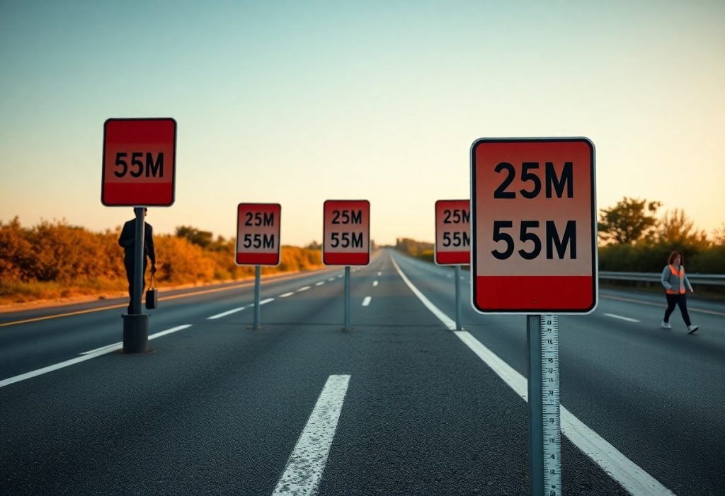
Optimal Viewing Distances
You should design signs using practical ratios rather than guesswork: a common rule of thumb used by sign professionals is 1 inch of letter height for every 10 feet of viewing distance. For example, if drivers need to read a message from 100 feet, plan on roughly 10-inch letters; for a storefront viewed from 25 feet, aim for about 2.5-inch letters. Applying this simple formula lets you scale quickly across projects and gives a reliable baseline for legibility.
Always build in safety margins for real-world conditions. If lighting is poor, the font is decorative, or the viewing angle is oblique, increase letter height by 20-30% and test with actual sight-lines. Field checks with a tape measure or photos from the most-common vantage points will catch problems that drawings alone often miss.
General Guidelines for Sign Visibility
You should differentiate indoor, pedestrian, and vehicular contexts: for close indoor wayfinding (5-20 ft), letters from 0.5″-2″ usually suffice, while roadside and freeway applications routinely require letters measured in inches to feet. Contrast and letterform matter as much as size-high-contrast color pairs (dark on light or light on dark) and mixed-case letterforms improve recognition at a given size compared with low-contrast palettes or all-caps stylized fonts.
Use spacing and simplicity to extend effective viewing distance without oversizing: increase x-height, avoid condensed fonts, and keep messages to one or two words for moving viewers. In practice, a 3-word retail sign at 50 ft should use at least 5″ type and bold weight; a directory meant for standing readers at 6-8 ft can stay legible with 1″-1.5″ type but benefits greatly from larger pictograms and clear headings.
Situational Considerations when it comes to Sign Visibility
You must factor viewer speed and dwell time into sizing decisions. At 30 mph you cover about 44 ft per second, and at 60 mph about 88 ft per second, so drivers often have only 2-3 seconds of effective reading time for a single sign. Translating that into design, a sign intended to be read while passing at 60 mph should have letters large enough to be legible from 176-264 ft away (roughly 17-26″ letters using the 1″ per 10 ft rule), plus additional margin for reaction and decision-making.
Mounting angle, height, and sight-line clutter change viewing distance in ways you can measure: if a sign sits 20° off the viewer’s approach line, upsize type 10-20% or move the sign closer to the path. Weather and nighttime conditions also alter needs-retroreflective sheeting or backlighting can cut required letter size by improving contrast, while fog or heavy rain means you should increase size or reduce message complexity.
Consider two quick comparisons to apply these principles: a mall directory placed 6 ft from standing readers works well with 1″-1.5″ text and a large headline, whereas an overhead highway lane sign intended to be perceived from 500-700 ft will need letters measured in feet (50-70″ by the simple ratio). Use these situational checks during mockup and post-install surveys to validate that the sign performs for typical user speeds, angles, and lighting.
Placement Strategies for Sign Visibility
Position signs to enhance natural sightlines: set primary identification signs so their vertical centerline matches typical viewer height – about 48-60 in (1.2-1.5 m) for pedestrians and 60-72 in (1.5-1.8 m) for curbside drivers. For storefronts, place the bottom edge 8-10 ft (2.4-3 m) above the sidewalk to clear awnings, parked cars and sight obstructions; overhead freeway guide signs normally require 15-20 ft (4.5-6 m) clearance. For a practical checklist on balancing visibility, hierarchy and local constraints consult Design & Placement of Signs.
Stagger and space signs to avoid visual clutter: place advance directional signs 100-300 ft before decision points in slow urban zones and 500-1,000 ft on roads where speeds range 45-65 mph. When grouping multiple messages, prioritize hierarchy – the highest-priority message should be largest, closest to the approach, and separated by at least 6-8 ft from secondary panels to preserve legibility.
Height and Angle of Signs
Set letter height using a simple rule: roughly 1 inch of letter height per 10 ft of expected viewing distance, so 24-inch letters are legible at about 200 ft. Mount pedestrian-facing signs with the centerline between 48-60 in, while curbside and drive-up signs typically center between 60-72 in; for retail façades position the bottom edge at 8-10 ft to clear common obstructions. Angle plays a role too – a slight downward tilt of 5-15° for signs mounted above 8 ft reduces skylight glare, and blade signs angled 10-30° toward the primary approach increase frontal readability for passing pedestrians.
When drivers are the primary audience, keep sign faces within ±15° of vehicle approach; larger offsets force head turns and reduce safe legible distance. You can validate settings with temporary mockups: many operators trial two centerline heights (for example 6 ft vs 9 ft) and two angles during peak periods to measure which configuration provides the cleanest sight triangles and fewest blocked views.
Sign Visibility Environmental Considerations
Account for solar geometry, seasonal foliage and reflective surfaces when siting signs. Orient faces to minimize direct low-angle sunlight during peak viewing times and avoid planting fast-growing trees directly in front of critical sightlines; a seasonal solar shift of 20-40° can turn a high-contrast sign into a glare source. Specify matte or anti-reflective materials and consider internal illumination or backlit letters to preserve contrast in bright daylight.
Design structural and electrical components for local environmental loads: follow ASCE 7 wind maps and municipal code (many coastal/plains regions require designs for 90-120 mph wind speeds), use through-bolted, hot-dip galvanized anchors and weatherproof electrical enclosures rated IP65 or better for exposed installations. Also place transformers and control boxes above base flood elevation-commonly at least 1 ft (0.3 m) higher than the 100-year flood level where applicable.
Maintain visibility through scheduled inspections and seasonal adjustments: inspect after major storms, trim vegetation every 3-6 months as growth dictates, and implement LED dimming profiles for nighttime to balance legibility and glare. Municipal pilot programs that combined placement optimization with a standing maintenance schedule reported significant reductions in visibility complaints within the first year, illustrating that good siting plus upkeep preserves long-term effectiveness.
Maintenance of Signage to ensure Sign Visibility
Ongoing maintenance extends the usable life of your signs and preserves the sightlines and contrast that drivers depend on. Establish a written schedule that ties inspection frequency to environment and function – for example, monthly checks for high-speed corridors and arterial routes, quarterly for commercial streets, and semi‑annual reviews for local residential areas – and log each action to track degradation trends over time.
Allocate a parts inventory and budget for predictable replacements: reflective sheeting typically performs well for 7-10 years in temperate climates, LED modules often reach L70 around 50,000 hours (roughly 5-6 years of continuous operation), and fast corrosion zones like coastal or industrial sites will demand more frequent panel and fastener swaps.
Regular Inspections
Use a standardized checklist during inspections that includes legibility at critical viewing distances, mounting integrity, illumination uniformity, retroreflectivity (measured with a retroreflectometer when possible), vegetation encroachment, and evidence of vandalism or graffiti. High-priority items such as missing hardware or non-operational lighting should be tagged for repair within 72 hours on major routes and within 7-14 days on lower-volume streets.
Tailor inspection triggers to events as well: schedule extra checks within 48-72 hours after storms, snowplow operations, or construction near signs. You can also employ spot audits using handheld luminance meters or retroreflectometers; if readings drop by 30-50% from baseline or fall below manufacturer-recommended values, plan for immediate remediation or phased replacement.
Upkeep of Visual Elements
Clean sign faces on a regular cadence: in urban or dusty environments clean every 1-3 months, while cleaner rural settings may move to a 6-12 month cycle. Use pH-neutral detergents, soft microfiber cloths, and low-pressure rinsing (generally under 500 psi) to avoid etching acrylics or stripping retroreflective sheeting; avoid ammonia-based cleaners on vinyl and polycarbonate substrates to prevent crazing and loss of adhesion.
Repair or replace damaged elements based on measurable loss of performance rather than age alone. For example, replace reflective sheeting when you detect visible loss of nighttime return or when manufacturer-specified retroreflectivity thresholds are no longer met; similarly, swap LED modules when lumen output measurement or driver complaints indicate a marked drop, and document each replacement to forecast future maintenance cycles.
Maintain spares for high-failure components (face panels, mounting brackets, common LED modules) and keep a digital log of serial numbers, installation dates, and measured photometric values; doing so lets you move from reactive fixes to planned lifecycle replacements, reducing downtime and keeping your signs within compliance tolerances.
Technological Advances in Signage that Affect Sign Visibility
With microLED, OLED and high‑brightness LCD panels becoming more affordable, you can now specify displays that deliver legible, high‑contrast content across a wider range of lighting conditions. Manufacturers are shipping indoor pixel pitches as low as 1.2 mm for close‑up video walls and 3-10 mm for general purpose indoor/outdoor walls; outdoor modules commonly reach 2,500-5,000 nits so your message remains visible in direct sun, while typical LED lifespans of 50,000-100,000 hours reduce replacement cycles. At the system level, cloud content management systems (CMS) plus edge caching let you push targeted campaigns, schedule brightness profiles to comply with local light ordinances, and roll back updates automatically if an error is detected.
At the same time, sensor fusion and AI have moved from pilot projects into production: you can pair cameras and thermal/proximity sensors with machine‑learning models to adapt content to crowd size, time of day, or detected demographics without manual intervention. Integration with inventory systems and point‑of‑sale (POS) feeds enables dynamic pricing and stock‑aware messages, and real‑world deployments-like stadium ribbon boards and transit hub video walls-now routinely combine 1-2 ms input latency panels with synchronized audio and networked playback to create cohesive, timed experiences.
Digital Displays
You should match display technology to viewing distance and environment: for retail window displays that will be read at 3-10 m, choose 1.5-3 mm pixel pitch; for mall atrium or roadside billboards visible beyond 15 m, 6-10 mm (or larger) is more economical. Brightness and refresh specs matter for perception and camera‑capture: indoor signage typically runs 300-1,000 nits, while outdoor faces require 2,500+ nits and refresh rates of 1,920-3,840 Hz to avoid flicker on smartphone video. Also specify IP65‑rated enclosures, temperature control and redundant power where uptime matters-many outdoor systems include remote health telemetry so you can see LED module temps, power supply voltages and fan status in real time.
For content delivery, you can use a cloud CMS with edge players that cache media, support 4K H.265 playback and report playback logs back for attribution. Practical deployments often pair programmatic content rules (time of day, weather triggers) with A/B testing; for example, retailers commonly run alternate creatives during evening hours when window glare is highest and measure dwell time via integrated people‑counting to select the better performer. When you plan installations, budget for serviceable front access, spare panels, and a maintenance SLA-these reduce mean time to repair for high‑visibility locations.
Interactive Signage Solutions
Touch kiosks, gesture and voice interfaces let you convert passive viewers into engaged users; typical public kiosks range from 22″ wayfinding screens to 55″ retail discovery panels with projected capacitive multitouch and vandal‑resistant glass. You can augment touch with proximity sensors that wake the display at 1-2 m, NFC for instant coupon exchange at under 4 cm, and Bluetooth Low Energy beacons for push messages within ~30 m when users opt in. Hardware choices matter: PoE or PoE+ simplifies wiring for smaller units, while larger systems often require 100-300 W dedicated circuits and active cooling to maintain reliability in continuous‑use environments.
Analytics are where interactive signage pays back: you can capture anonymized dwell times, touch heatmaps and funnel paths, then integrate those signals with CRM or POS to measure attribution for campaigns. Airports and large malls frequently deploy interactive wayfinding that logs thousands of interactions daily; by analyzing session lengths and common routes you can optimize placement, signage wording and staffing. Security and privacy practices-on‑device anonymization, opt‑in prompts for camera use, and regular firmware patching-are imperative to maintaining public trust and compliance with GDPR/CCPA regimes.
Operational details often determine success: choose modular kiosks with swappable compute modules to reduce onsite downtime, specify tempered or anti‑microbial glass for high‑touch locations, and plan for routine calibration of touch sensors and brightness to maintain legibility. You can also leverage real‑time personalization-showing product info tied to a scanned QR or a past purchase profile-but be sure to implement clear consent flows and data retention policies so the analytics you collect remain actionable and compliant.
Summing up Sign Visibility
Hence you must match sign size to viewing distance (a common rule of thumb is about 1 inch of letter height per 10 feet of clear sight distance), maximize contrast and simple typography, and provide adequate illumination and mounting angle so characters are legible without obstruction. Use generous letter spacing, avoid decorative fonts, and position signs at natural sightlines for motorists or pedestrians while accounting for viewer speed and approach angles.
You should verify legibility on site at expected distances and lighting conditions, factor in environmental clutter, and plan maintenance to keep reflectivity and contrast effective. Apply local regulations and testing-if a sign is not rapidly readable from the intended viewing point, increase character size, simplify content, or relocate the sign until it meets your visibility objectives.
FAQ about Sign Visibility
Q: How do I calculate minimum letter height for a sign based on viewing distance?
A: Use a practical rule of thumb: 1 inch of letter height per 10 feet of viewing distance (letter height in inches = viewing distance in feet ÷ 10). Determine the distance at which the viewer must be able to read the sign (detection + recognition + reaction), then apply the formula and round up. For signs read by drivers at speed, increase the letter size (factor 1.5-2.0) or follow local traffic standards (MUTCD/AASHTO) for exact minimums. Example: a 200 ft viewing distance → 20″ letters; for high-speed roads increase further to allow extra reading time.
Q: What font, contrast, and spacing choices improve sign legibility?
A: Choose simple, sans-serif or humanist fonts with open counters and uniform stroke widths; use mixed case (capitals for starts of words, lower case for bodies) for longer text. Provide high foreground/background contrast (light text on dark background or vice versa) and matte finishes to reduce glare. Keep stroke width proportional to letter height (neither too thin nor overly heavy), use adequate inter-letter and inter-word spacing, avoid condensed or decorative fonts, and limit word length to what can be read quickly.
Q: How should viewing distance be estimated for moving traffic and how does speed affect sign size?
A: Determine the design speed, then calculate required sight distance using a perception-reaction time (commonly 2 to 2.5 seconds for reading and initial reaction). Convert speed to feet/second (1 mph ≈ 1.467 ft/s) and multiply by chosen reaction time to get distance. Example shortcut: distance ≈ speed (mph) × 3.67 for a 2.5 s reaction. Use that distance to size text (divide feet by 10 to get inches). Higher speeds increase required distance and therefore letter height; place regulatory or warning signs farther upstream on high-speed routes.
Q: What lighting and reflectivity standards help maintain visibility at night and in poor weather?
A: Use retroreflective sheeting rated for the application (higher-grade sheeting for highways) or provide uniform external illumination to maintain luminance contrast at night. Minimize specular glare by selecting matte or semi-matte surfaces and positioning luminaires to avoid direct reflections into viewers’ eyes. Ensure sheeting and lamps are maintained clean and replaced when reflectivity drops. Consider photometric design for tunnels, intersections, or locations with frequent fog or precipitation to preserve detectability and readability.
Q: Where should signs be mounted and how do I prevent obstructions or visibility loss over time?
A: Mount signs so their face is roughly perpendicular to the primary line of sight and at a height appropriate for the audience (pedestrian signage should allow at least 7 ft clearance under the lowest edge; roadside signs should align with typical driver eye height and local code). Keep the approach corridor free of vegetation, parked vehicles, poles, and other obstructions that block sight lines. Implement a maintenance schedule for cleaning, trimming, and replacing faded or damaged signs and reflective sheeting to preserve intended visibility and viewing distance.