
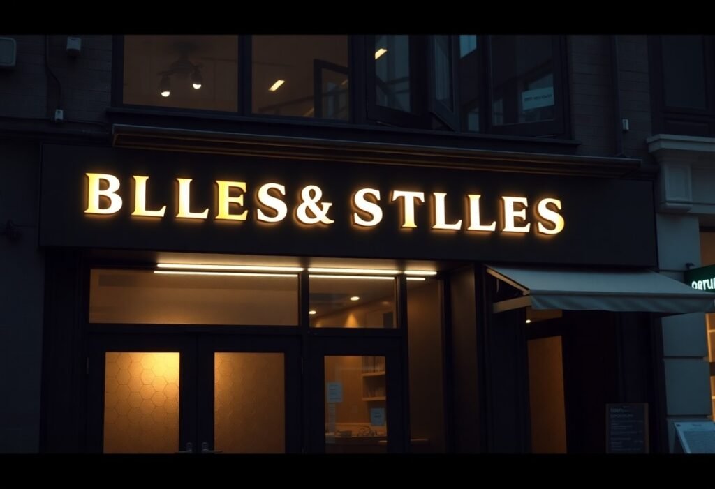
Over the past decade, you’ve seen storefront signage evolve toward clean typography, illuminated channel letters, minimalist backlit panels, dimensional logos and integrated digital displays; this guide helps you choose materials, color contrast, scale and lighting to reinforce your brand identity and pedestrian visibility.
Key Takeaways:
- Bold, simple typography and minimal layouts boost legibility and convey a contemporary aesthetic.
- Illumination-backlit channel letters, LED halos, neon or edge-lit acrylic-enhances visibility and curb appeal day and night.
- Mixed materials and finishes like brushed metal, natural wood, and frosted acrylic add tactile depth and a premium look.
- Consistent branding-color palette, logo treatment, and modular elements-keeps signage cohesive and adaptable for updates.
- Digital and interactive features (programmable LED, motion-triggered displays, QR integration) enable dynamic messaging and customer engagement.
The Importance of Storefront Signage
Your storefront sign is a persistent salesperson: studies indicate 70-80% of first-time walk-ins are influenced by visible signage, so design decisions translate directly into foot traffic and perception. Prioritize legibility, contrast, and placement-investments in durable materials or illumination often pay back through sustained visibility and lower replacement costs compared with frequent ad buys.
Branding and Recognition
When you align sign color, typography, and iconography with your broader identity, customers recognize you faster-brands that maintain visual consistency can see revenue gains of up to 23%. For example, channel-letter signs with a signature color (think Tiffany blue or McDonald’s arches) instantly convey brand promise at a glance, boosting recall across repeat and new visitors.
Attracting customers
You can convert passerby into customers by choosing formats that match context: blade signs and window decals catch sidewalk traffic, while illuminated channel letters and digital displays extend visibility after dark. Many retailers report 10-30% increases in evening foot traffic after upgrading to backlit or LED signage, especially on streets with mixed pedestrian and vehicle flows.
For measurable impact, apply practical rules: use at least 1″ of letter height per 10 feet of viewing distance, favor bold sans‑serif faces for quick legibility, and maximize contrast between text and background. Place blade signs perpendicular to the curb for cross-traffic, consider motion or timed LED animations for attention spikes, and always verify local sign codes and mounting heights before fabrication.
Types of Modern Signage
You can choose from halo-lit channel letters, face-lit acrylic panels, modular LED video walls, projecting blade signs, and sustainable-material installs; each balances visibility, durability, and cost. Many designers favor modular systems for faster swaps during seasonal campaigns, and LED modules commonly exceed 50,000 hours, cutting long-term maintenance. After assessing footfall, sightlines, and local codes, prioritize the format that maximizes impressions for your storefront.
- Channel letters – high visibility for road-facing façades
- Backlit acrylic panels – clean, uniform illumination for branded graphics
- LED video walls – dynamic content for promotions and wayfinding
- Blade/projecting signs – pedestrian-level impact on sidewalks
- Sustainable substrates – recycled or reclaimed materials for brand alignment
| Channel Letters | You get strong night-time read and precise typographic control for logos. |
| Backlit Acrylic Panels | You achieve even illumination for photographic or color-rich branding. |
| LED Video Walls | You can schedule targeted content; ideal for promotions and real-time updates. |
| Blade / Projecting Signs | You capture pedestrian attention and increase sidewalk visibility. |
| Eco-friendly / Reclaimed Materials | You signal sustainability and can reduce embodied waste with recycled substrates. |
LED and Digital Signs
You should specify outdoor LED at roughly 3,000-7,000 nits for daylight readability and IP65 cabinets for weatherproofing; modular SMD panels with 50,000+ hour lifespans minimize downtime. Many retailers use content schedules to rotate promos, and studies indicate dynamic signage can lift dwell time and conversion-often cited around a 20-30% range-so plan creative assets and playback software when you design the layout.
Eco-friendly Materials
You can switch to recycled aluminium (fully recyclable), FSC-certified wood, recycled PETG, and low‑VOC paints to lower embodied waste and appeal to eco-minded customers; suppliers now offer bio-based composites for short-term campaigns, and modular, repairable construction reduces disposal each rebrand.
You should request Environmental Product Declarations (EPDs) or post‑consumer recycled content figures from fabricators to quantify impact; many manufacturers report 20-40% reductions in lifecycle waste when reclaimed or recycled substrates replace virgin plastics. Also evaluate durability-choosing materials that are repairable and easily disassembled extends service life and simplifies end‑of‑life recycling for your future projects.
Typography Trends in Sign Design
Type choices increasingly define storefront identity, so you should prioritize legibility and personality together: use high x-height sans-serifs for distance readability, reserve display scripts for logos, and apply the 1″ = 10 ft readability rule when sizing letters. Aim for contrast ratios near 4.5:1 for night and day legibility, test at actual sightlines, and consider variable fonts to adapt weight and width across illuminated and non-illuminated applications.
Bold and Unique Fonts
You can command attention with bold, bespoke lettering-think thick-stroked sans-serifs like Gotham or custom hand-lettering for artisanal brands-while keeping letterforms uncomplicated so readers decode quickly. Use weights that occupy roughly 8-12% of letter height for stroke width, pair unique display caps with a neutral body face, and test at 30-50 feet to ensure decorative details don’t blur into noise under LED or halo lighting.
Minimalistic Approaches
When you strip typography back, clarity increases: limit yourself to one or two typefaces, reduce copy to a single word or short name, and space letters generously to improve recognition from 20-40 feet. Combine a monochrome palette with push-through acrylic or brushed metal for subtle texture, and position lighting to emphasize counters and apertures rather than ornate serifs.
To deepen minimalism, you should map viewing distances to letter height-pedestrian-facing signs work well at 3-6″ letters, while roadside requires 8-12″+-and use tight brand grids so signage aligns with in-store typography. Prioritize negative space, maintain consistent letter-spacing rules (opt for +10-20 tracking on wordmarks), and choose finishes that reduce glare; this ensures your pared-back sign reads instantly and supports cohesive brand recall.
Color Psychology in Signage
Color choices shape how customers perceive your store: green signals eco-friendly or calm (Starbucks), red with yellow drives appetite and urgency (McDonald’s), and blue conveys stability and trust (many banks). Studies suggest color can boost brand recognition by up to 80%, so you should align hue, saturation, and brightness with your brand persona while testing how those colors read at typical viewing distances and under varying daylight and evening conditions.
Choosing the Right Palette
Adopt a 60-30-10 rule-60% dominant, 30% secondary, 10% accent-and limit your palette to 2-3 core hues plus one accent. Map personality to hue: high-energy brands use saturated reds/oranges, premium brands favor deep navies, emeralds, or muted golds. You should specify Pantone/HEX values, test samples on materials (metal, acrylic, vinyl), and view mock-ups in both sunlight and artificial storefront lighting.
Contrast and Visibility
Prioritize luminance contrast and legibility: aim for WCAG-like ratios (4.5:1 for normal-size copy, 3:1 for large text) as a baseline, and follow the 1 inch of letter height per 10 feet of viewing distance rule to size type. You can improve visibility with high-contrast combos (yellow on black, white on navy) or backlit reverse contrast, while avoiding low-contrast pairs like light gray on white that lose legibility at 20-30 meters.
Account for real-world conditions by testing full-scale mock-ups at 10, 25 and 50 feet and at dusk; add stroke or halo effects to separate letters from busy backgrounds, choose bold sans-serif typefaces with generous x-height, and avoid relying solely on hue-use shape, texture, and brightness to help color-blind viewers distinguish signage elements.
Innovative Lighting Solutions
Backlit Signs
For strong nighttime presence you can use backlit channel letters or push-through acrylic logos with SMD LED modules, which deliver even illumination and lifespans of 50,000+ hours; a 30-50 mm shadow gap behind halo-lit letters adds depth, while diffused acrylic faces eliminate hotspots-expect higher upfront costs but typical energy and maintenance savings often pay back within 2-3 years, making this ideal for retail facades, restaurants, and service storefronts.
Neon and Vintage Styles
When you want a retro vibe, glass neon provides authentic warm glow and handcrafted character, while LED neon-flex replicates that look with up to ~80-90% lower energy use and easier installation; pick warm color temperatures (2,200-3,000K) for nostalgia or combine neon accent lines with modern backlit elements for contrast.
Glass neon can last decades if maintained, but you should weigh fragility and high-voltage transformer needs against LED neon-flex’s lower maintenance and 50,000+ hour rated life; permitting and historic-district guidelines often dictate material choices, so plan for mounting clearance, transformer placement, and dimming/DMX control if you want animated effects-many brands retrofit old glass signs to LED neon-flex to preserve appearance while cutting operating costs.
Case Studies of Successful Storefronts
Across recent rollouts you can see concrete returns: one apparel retailer upgraded to halo-lit channel letters and dynamic window LEDs, reporting a 22% increase in evening foot traffic and a 14% boost in monthly sales; a suburban grocer used large backlit wayfinding panels to reduce customer confusion by 40%. Smaller operators often hit a 6-12% same-store sales lift within three months after switching to higher-contrast, face-lit signage. For implementation ideas consult Innovative Signage Solutions for Modern Spaces – Impact Signs.
- 1) Urban fashion retailer – Intervention: replaced painted 3D letters with halo-lit aluminum channel letters and 4K LED window panels; Result: +22% evening foot traffic, +14% monthly revenue, installation ROI achieved in 8 months; sign dimensions: 10′ storefront span, 18″ letter height.
- 2) Neighborhood grocer – Intervention: installed 6 backlit wayfinding panels (24″x36″) and illuminated aisle headers; Result: 40% reduction in customer wayfinding complaints and a 7% increase in average basket size over 12 weeks.
- 3) Quick-service restaurant chain – Intervention: added illuminated blade sign (3’x2′) and upgraded to high-contrast digital menu boards (700 cd/m²); Result: 11% faster order throughput during peak hours and a 5% rise in order accuracy.
- 4) Independent café – Intervention: swapped bulky awning for slim LED-lit blade sign and neon-accented logo; Result: 18% increase in sidewalk conversions and 9% longer dwell time; energy use cut 35% by switching to SMD LEDs.
- 5) Specialty bookstore – Intervention: introduced subtle backlit logo halo and programmable window messaging; Result: +15% evening visits, +8% membership sign-ups in 3 months; typical sign power draw: 40-60W per linear foot.
Retail Examples
You should prioritize legibility and context: independent retailers that adopted clean sans-serif type, 12-24″ letter heights, and 3000-4000K warm-white backlighting reported measurable sales uplifts-typically 6-15% within the first quarter-while maintaining brand warmth; combine this with window content rotating every 2-4 weeks to sustain curiosity and repeat visits.
Restaurant Inspirations
You can drive both curb appeal and operational gains by layering illuminated signage: fast-casual concepts that installed 3’x2′ illuminated blade signs plus high-contrast digital menu boards saw a 20% reduction in perceived wait time and a 5-8% increase in average check size during the first two months.
When you refine restaurant signage, focus on contrast, viewing distance, and lumen output: use 600-900 cd/m² for exterior face-lit panels and 700+ cd/m² for outdoor-facing digital menus, keep letterforms bold with 60% positive space for readability, and place blade signs 8-12′ above sidewalk level to capture sightlines from 30-120 feet; these specs consistently improve visibility and conversion.
To wrap up
With this in mind, choose clean, readable typography, bold contrast, and scalable materials like acrylic or aluminum; integrate energy-efficient backlighting and minimalist digital displays; use cohesive color palettes and tactile finishes; prioritize placement and visibility so your sign communicates your brand, attracts attention, and adapts as your storefront evolves.
FAQ
Q: What modern lighting techniques can make a storefront sign stand out?
A: Use backlit channel letters for clean, even illumination; halo-lit (reverse-lit) letters for an elegant glow against the facade; and edge-lit acrylic for a crisp, contemporary look. Integrate programmable RGB LEDs for color shifts during events, but set limits to preserve brand clarity. For historic districts, consider subtle warm LEDs and dimming schedules to meet local rules. Prioritize even diffusion, proper heat management, and easy access for maintenance to ensure consistent performance.
Q: How should typography and minimal design be applied to modern signage?
A: Choose a strong, legible typeface with distinct letterforms and generous spacing to read at distance; sans-serif or clean modern serifs often work best. Use scale and negative space to create impact rather than overcrowding with information. Combine shallow 3D letters or flat-cut metal with limited color palettes to reinforce a premium, minimalist aesthetic. Test legibility at typical viewpoints and lighting conditions before finalizing the design.
Q: When is it beneficial to use digital or dynamic signage in a storefront?
A: Employ digital panels to display promotions, real-time inventory, or wayfinding when content needs frequent updates or movement helps attract attention. Optimize content for short viewing windows: bold type, simple animations, high contrast, and clear calls-to-action. Ensure screen brightness and anti-glare treatments suit outdoor daylight, and plan for weatherproofing, power, cooling, and secure mounting. Balance digital areas with fixed branding so the core identity remains constant.
Q: What materials and fabrication approaches suit sustainable, modern storefront signs?
A: Use recycled or responsibly sourced metals, FSC-certified woods, high-durability composites, and low-VOC coatings to lower environmental impact. Specify long-life LEDs and modular components that can be repaired or updated rather than fully replaced. Work with local fabricators to reduce shipping footprint and choose finishes that age well to minimize maintenance cycles. Document material choices and a maintenance plan to extend useful life and reduce waste.
Q: How do I integrate a sign with a building facade while meeting regulations and practical needs?
A: Design signage proportions to complement architectural lines-align edges, maintain appropriate setbacks, and avoid obscuring key features. Check local zoning, historic district rules, and permit requirements early to determine allowable sizes, illumination types, and mounting methods. Plan for secure mounting, wiring access, and service clearance; use mockups or CAD overlays to visualize at scale and test sightlines at different approach angles and times of day. Coordinate with facade specialists or structural engineers for large or heavy installations.