
Most storefront signs act as 24/7 salespeople for your business, communicating your brand, highlighting offers, and guiding passersby into your space; when you design them for visibility, legibility, and audience fit, they increase recognition and entice spontaneous visits, boosting your walk-in traffic and revenue.
Key Takeaways:
- Eye-catching design and strategic placement boost visibility and improve wayfinding for pedestrians and drivers.
- Consistent branding and clear messaging create a strong first impression that helps passersby recognize and choose your store.
- Prominent promotion of sales, new arrivals, and limited-time offers drives impulse visits and increases foot traffic.
- Readable typography and effective lighting extend visibility into evening hours and attract after-dark customers.
- Professional, well-maintained signage signals trust and quality, making passersby more likely to walk in.
The Importance of Visibility
Visibility drives spontaneous visits: research shows high-contrast, well-lit storefront signs can boost walk-ins by as much as 30%. If you optimize placement-letters readable from typical sightlines of 30-50 feet and mounted near intersections or transit stops-you capture both pedestrians and passing drivers. You should also use LED backlighting or halo illumination to extend visibility after dark and maintain consistent sightlines across awnings, windows, and canopy signs.
Attracting Attention
Bright colors, motion, and distinctive shapes increase noticeability: human peripheral vision responds to movement up to three times more than static elements, so digital displays or subtle motion dangles can raise entry rates. You can aim for at least a 70% color contrast ratio and large, simple graphics; a retail test found dynamic window elements lifted entries by roughly 20% compared with static displays.
Branding and Identity
Consistent signage strengthens recognition-using the same logo, color palette, and type across awnings, vinyl, and channel letters helps customers spot you faster; brands with uniform visual systems are identified up to 80% quicker in crowded streetscapes. You should feature a short, clear tagline (3-6 words) and keep the visual hierarchy simple so passing traffic grasps your offer within 2-3 seconds.
Apply practical specs: scale your logo so each letter is at least 1 inch per 10 feet of typical viewing distance (a 3-inch letter is legible from ~30 feet). Avoid decorative scripts and keep stroke widths bold for contrast. Use materials that match your message-brushed aluminum for premium retailers, vinyl for promos, and illuminated channel letters for 24-hour visibility. In one cafe case, swapping a small vinyl banner for backlit channel letters and consistent color led to a 15% rise in morning walk-ins over three months.
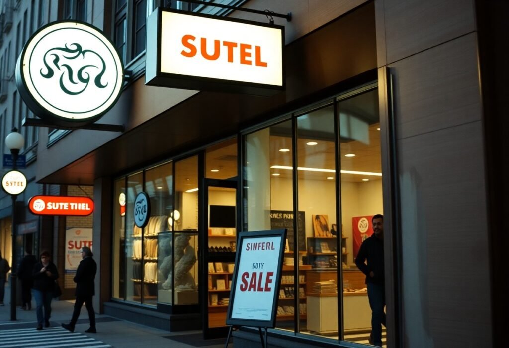
Types of Storefront Signs
You’ll choose among five common sign families that each target different walking audiences and times of day; channel letters and LED boxes prioritize long-range brand visibility, neon and window graphics drive evening and impulse interest, while A-Frames capture curbside foot traffic within 10-30% lift in short campaigns, depending on placement and messaging.
| Channel Letters | High-visibility branding; visible from up to 200 ft |
| Neon Signs | Eye-catching contrast for evenings; ideal for bars and cafés |
| LED Lightboxes | Energy-efficient, uniform illumination for long façades |
| A-Frame Signs | Portable sidewalk promos; strong for directional offers |
| Window Graphics | Low-cost seasonal messaging and product highlights |
- Visibility: maximize readable distance and contrast
- Placement: anchor signs at eye level or sidewalk sightlines
- Timing: use illumination for evening and awnings for daytime
- Durability: choose materials for local climate and wind loads
- Messaging: keep copy under 7 words for quick comprehension
Neon Signs
You can deploy neon to create high-contrast focal points that draw the eye after dusk; tubes typically last 8-15 years and are visible from 50-150+ feet depending on size, so bars and eateries often use neon for “OPEN” or logo accents that measurably increase evening dwell time in adjacent seating areas.
A-Frame Signs
You’ll use A-Frames for flexible, daypart-specific offers-standard sizes are 18″×24″ or 24″×36″ and durable sandwich boards with chalk or printed inserts convert passersby at intersections into customers when placed 3-6 ft from the curb.
Place your A-Frame where sightlines naturally pause-near transit stops or at crosswalks-and rotate messages every 1-2 weeks; choose weighted bases for windy streets, use bold typography at 120-200 pt for legibility at 10-15 ft, and test a simple call-to-action like “20% off coffee, inside” to measure lift.
Any sign change you make should comply with local permitting, sidewalk-usage rules, and ADA clear-path requirements.
Design Elements That Enhance Appeal
Scale and material choices determine whether your sign reads at a glance; apply the rule of thumb-1 inch of letter height per 10 feet of viewing distance-to set size. Use durable materials like aluminum or acrylic for weather resistance, and balance texture with clean typography. You should maintain brand consistency across awnings, window vinyl, and channel letters, and consider contrast and lighting so pedestrians can decode your message in under 2-3 seconds to increase walk-ins.
Colors and Fonts
Choose high-contrast palettes (dark on light or vice versa) so the human eye catches your sign from 50-100 feet and pair a dominant brand color with a neutral background. Favor sans-serif faces such as Helvetica or Futura for primary copy, and keep stroke width at least one-tenth of letter height for legibility. You should reserve scripts or decorative fonts for logos and test readability at full scale and intended viewing distance before production.
Lighting and Placement
Illumination extends storefront hours: backlit channel letters, halo-lit faces, and LED edge-lighting are common options, with letter heights typically between 6-24 inches for storefront visibility. Mount perpendicular blade signs roughly 7-9 feet above the sidewalk to catch cross-traffic, and position your primary sign within 15-30 feet of the curb so approaching pedestrians can read without obstruction.
Match lighting color temperature to brand tone-2700K-3000K for warm hospitality, 3500K-4000K for neutral retail-and use photocells or timers to switch lights at dusk. Specify fixtures with an IP65 rating for outdoor durability, pilot brightness levels (many retailers target about 300-600 lux at the sign face) to avoid glare, and verify sightlines from principal approaches during peak hours.
Psychological Impact on Consumers
First Impressions
On crowded sidewalks you typically have 2-3 seconds to signal value, so your sign’s clarity and contrast matter: high-contrast type and a clear offer increase legibility at a glance. For example, a downtown boutique that switched to backlit channel letters and simplified copy measured a 15% rise in walk-ins within a month. Use bold geometry and one strong message so passersby can read and decide instantly.
Emotional Connection
Color and typographic choices shape how customers feel about your brand-color can boost brand recognition by up to 80%, so you should pick hues that align with the mood you want to evoke. Warm tones and hand-lettered scripts invite intimacy for cafés, while cool palettes and clean sans-serifs convey professionalism for services. Matching tone to expectation helps turn curiosity into entry.
Dig deeper by using materials and microcopy to tell a tiny story: reclaimed wood and brass signal craft and sustainability, neon suggests nightlife and fun, and a brief tagline like “Made Fresh Daily” reduces cognitive friction. Test combinations-A/B a chalkboard vs. printed panel for a week-and track walk-ins or QR scans; small tactile cues and concise emotional triggers often deliver 10-30% lifts in engagement when aligned with your audience.
Case Studies: Successful Signage
In practice you can measure clear gains: a downtown café reported a 28% rise in weekday walk-ins in six weeks after installing illuminated channel letters and a high-contrast window decal; a suburban boutique saw evening footfall jump 42% eight weeks after adding a backlit blade sign-these examples show how materials, placement, and messaging combine to move immediate traffic and lift average ticket values.
- Independent bakery (urban core): installed 3D channel letters + sidewalk A-frame; walk-ins +37% over 10 weeks, average basket +6%, payback on sign investment in ~14 weeks.
- Clothing boutique (suburban strip): switched to illuminated blade sign and seasonal window displays; evening footfall +42% in 8 weeks, conversion rate up 12%, monthly sales up 18% year-over-year for the quarter.
- Regional fast-casual chain (pilot, 15 stores): rolled out backlit logos and canopy lighting; average walk-ins +18% and same-store sales +3.5% across 12 weeks; typical cost $7,500 per location, projected payback 9 months.
- Community bank branch (downtown): added high-visibility wayfinding and promotional window vinyl; new account openings +22% in one quarter, pedestrian counts +15% during peak hours.
- Pharmacy chain (40 suburban locations): LED facade retrofit for nighttime visibility; measured pedestrian detect rates up 65% after retrofit, evening sales +9% over six months, installation cost range $5k-$12k per store.
Local Businesses
When you run a local shop, a single well-placed sign often delivers the highest ROI: small retailers in case studies reported walk-in lifts between 28% and 37% within 6-10 weeks after upgrading to illuminated channel letters, A-frames, or window vinyl, and many saw average transaction values rise 5-8% as new visitors converted at similar or higher rates than regulars.
National Brands
As you scale signage across multiple locations, pilots matter: national brands that tested standardized backlit signage in 15-40 stores recorded walk-in increases of 15-20% and same-store sales uplifts of 3-4% over 8-12 weeks, proving consistent design and night-time visibility translate to measurable traffic gains.
For your brand rollout plan, factor in per-store costs ($5k-$12k typical), permitting timelines (2-12 weeks depending on jurisdiction), and centralized A/B testing; brands that combined a 3-6 month pilot with POS and pedestrian-count metrics achieved faster payback and more predictable replication across 50+ locations.
Measuring the Effectiveness of Storefront Signs
To quantify impact, combine foot-traffic counts, sales lift and dwell-time metrics: A/B changeouts can show lifts of 10-40% in walk-ins within weeks, as one downtown café saw 28% growth. Use people counters, mobile-location panels and POS attributions, and correlate spikes to specific sign changes. For implementation tips and case studies, see Harnessing the Power of Signage to Drive Foot Traffic – YESCO.
Tracking Foot Traffic
You should deploy overhead infrared counters or video analytics-infrared units are often ~90% accurate-and compare week-over-week baselines. Pair with mobile-location data to map visitor origin; retailers combining counters with geo-data often identify that 60-80% of new visitors came from within 1 km after a sign update. Timestamped counts reveal peak-hour sign performance for staffing and promo timing.
Customer Surveys
You can capture attribution with short intercepts, QR-code micro-surveys or a one-question receipt query asking “What brought you in today?” Expect roughly 15-30% of respondents to cite signage when the change is obvious; track responses by time and offer a small incentive to reach reliable sample sizes.
Design surveys with one primary attribution question and a 3-point clarity scale, then segment answers by arrival time, device and purchase size; aim for at least 100 responses per campaign to approach a ±10% margin. Integrate prompts into your loyalty app and POS to automate collection and tie reported sign-driven visits to actual basket lift for clearer ROI calculations.
To wrap up
Presently your storefront sign acts as a 24/7 marketer, drawing attention, clarifying your offer, and building trust so passersby are more likely to enter; with bold design, clear messaging, strategic lighting and placement, you convert curiosity into foot traffic and reinforce brand recall that encourages repeat visits.
FAQ
Q: How do storefront signs increase visibility and attract passersby?
A: A well-designed storefront sign improves visibility by increasing size, contrast, and legibility so people can read it from a distance and while moving. High-contrast colors, simple typefaces, and concise messaging reduce cognitive load and let passersby understand your offering in seconds. Strategic placement (at eye level, above the entrance, or angled toward sidewalks) and use of movement or lighting help the sign stand out against competing storefronts and street clutter.
Q: In what ways do storefront signs communicate brand identity and build trust to encourage walk-ins?
A: Consistent use of logo, color palette, and typography signals professionalism and reinforces brand recognition. Durable materials and quality finishes convey that the business invests in its space, which increases perceived reliability. Clear messaging about what the store offers-specialty, price point, or experience-aligns expectations and reduces friction for potential customers deciding whether to enter.
Q: How can promotional and directional messaging on signs drive immediate foot traffic?
A: Time-sensitive offers (limited-time discounts, daily specials) and explicit calls-to-action (e.g., “Free tasting inside,” “Today: 20% off”) create urgency and a clear reason to enter now. Directional cues-arrows, “Entrance” or “Open” illuminated signs, sidewalk A-frames-remove confusion about where to go. Including QR codes or short promo codes on signs enables trackable offers tied directly to walk-ins and conversions.
Q: What role do lighting and nighttime visibility play in attracting after-dark customers?
A: Effective illumination extends your storefront’s presence after dark and attracts attention from drivers and pedestrians. Backlit channel letters, halo lighting, spotlights, and internally lit window displays increase contrast and readability in low light. Properly placed lighting also highlights merchandise or promotional areas, making the store feel safer and more inviting at night.
Q: How can a business measure whether its storefront sign is increasing walk-in traffic?
A: Establish a baseline by tracking average daily foot traffic and sales before sign changes. Use A/B testing (alternate sign designs or messages over set periods) and compare footfall, conversion rate, and average sale. Supplement sensors or manual counts with POS data, redemption rates of sign-specific promos or QR codes, and short exit surveys asking customers how they heard about the store. Iteratively optimize design, copy, and placement based on measured results.