
Warehouses are busy places filled with constant movement, heavy machinery, and large amounts of inventory. Without the right signage, these environments can quickly become dangerous and disorganized. Clear, professional signs guide workers, prevent accidents, and keep everything running smoothly.
When you design warehouse signs with purpose, you do more than follow regulations—you create a safer, more efficient workplace. The right signs protect your employees, reduce confusion, and support compliance with OSHA and industry standards.
Key Takeaways
- Designing warehouse signs improves safety, organization, and compliance.
- Clear fonts, bold colors, and strategic placement increase effectiveness.
- Warehouse signs prevent accidents and improve workflow efficiency.
- Durable materials ensure long-lasting, cost-effective signage solutions.
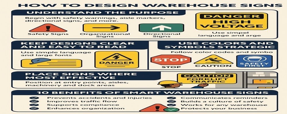
Understand the Purpose Before You Design Warehouse Signs
The first step in designing warehouse signs is knowing why they’re needed. Every sign should serve a clear purpose—whether it’s keeping workers safe, directing forklift traffic, or helping employees find products faster.
Safety signs warn workers about potential hazards like high-voltage areas, restricted zones, or the need for personal protective equipment (PPE). Organizational signs label aisles, zones, and storage racks to make inventory management easier. Directional signs guide both workers and visitors through complex layouts.
When you design warehouse signs with purpose, you eliminate confusion and create a workplace that flows naturally.
Tips:
- Identify the problem the sign needs to solve before designing it.
- Separate safety, organizational, and informational signs into categories.
- Always match the design to its primary function.
Keep Warehouse Sign Designs Clear and Easy to Read
Clarity is the most important part of sign design. A sign that is hard to read is as bad as having no sign at all. In warehouses, where workers operate forklifts or move quickly, signs must communicate instantly.
Choose bold, sans-serif fonts that can be read from 20–30 feet away. Keep text short and direct, using only the most important words. For example, instead of “Caution, be careful in this area because forklifts may be present,” a sign should read simply: “Caution: Forklift Traffic.”
Tips:
- Stick to 5–7 words per sign for maximum readability.
- Use consistent font styles across the entire warehouse.
- Test signs by viewing them from the actual distance workers will see them.
Use Colors and Symbols Strategically in Warehouse Signs
Color and imagery are universal languages. Workers can understand safety messages quickly without needing to read long text when you use standard colors and symbols.
In warehouse sign design, color coding is critical:
- Red = Danger or stop (fire equipment, restricted areas).
- Yellow = Caution (slippery floors, forklift zones).
- Green = Safety (exits, first aid stations).
- Blue = Mandatory actions (PPE required).
Symbols like arrows, hazard triangles, or PPE icons are vital for multilingual teams. They ensure communication is clear even if English isn’t a worker’s first language.
Tips:
- Always pair text with symbols for extra clarity.
- Follow OSHA and ANSI guidelines for color and symbol use.
- Ensure high contrast between background and text for visibility.
Place Warehouse Signs Where They Are Most Effective
A sign’s value is lost if workers can’t see it. Placement determines how effective a sign will be. Warehouse signs should always be positioned at eye level and in areas where workers make decisions or encounter risks.
Examples of effective placement:
- Safety signs near machinery, chemical storage, and high-risk zones.
- Organizational signs above aisles, on shelves, and at zone entrances.
- Directional signs at intersections, loading docks, and entry points.
By placing signs strategically, you design warehouse signs that actively guide employees and visitors through every step of their journey.
Tips:
- Conduct a walk-through to identify high-traffic and high-risk areas.
- Avoid placing signs behind shelving, doors, or machinery.
- Keep placement consistent for easy recognition.
Add Branding While You Design Warehouse Signs
While safety and clarity are the top priorities, branding can play a supporting role. Adding logos, company colors, or slogans to warehouse signs reinforces identity and culture.
For example, branded safety signs remind employees that safety is a company-wide value, not just a rule. Branded organizational signs make your facility look professional and consistent.
Tips:
- Use brand colors only when they don’t conflict with safety standards.
- Keep logos small so they don’t distract from the main message.
- Align signage tone with your company’s culture.
Practical Tips for Printing and Installing Warehouse Signs
Design is only half the battle—printing and installation determine how long your signs last. Warehouses are tough environments, with constant movement, dust, and heavy equipment. Signs need to be durable enough to withstand it all.
Tips:
- Choose materials like aluminum, acrylic, or industrial-grade vinyl.
- Use reflective or illuminated signs in low-light areas.
- Hire professionals for installation to ensure consistency and compliance.
When you design warehouse signs with quality materials and expert installation, you save money long term and avoid frequent replacements.
Common Mistakes to Avoid When You Design Warehouse Signs
Even the best-intentioned designs can fail if common mistakes are made. Avoid these pitfalls:
- Too much text: Workers don’t have time to read long sentences.
- Poor placement: Signs hidden behind equipment won’t help anyone.
- Small fonts: Signs must be visible from a distance.
- Ignoring compliance: OSHA and ANSI standards are non-negotiable.
Avoiding these mistakes ensures that your warehouse signs keep employees safe, organized, and confident.
10 Benefits of Learning How to Design Warehouse Signs
- Prevents accidents and workplace injuries.
- Improves navigation for workers and visitors.
- Supports OSHA and ANSI compliance.
- Reduces downtime caused by confusion.
- Boosts overall productivity and efficiency.
- Helps new employees adapt quickly.
- Reinforces company culture and professionalism.
- Protects your business from fines and legal issues.
- Works for both small and large warehouses.
- Builds a safer, more organized work environment.
Why Smart Design Warehouse Signs Keep Your Workplace Safe and Organized
Designing warehouse signs is more than a safety requirement—it’s a strategy for creating a safer, more productive workplace. Signs that are clear, durable, and well-placed protect your team, streamline operations, and reduce costly mistakes.
Smart design shows your employees that their safety matters. It also demonstrates professionalism to clients and visitors who step into your facility. By investing in proper signage now, you protect both your people and your business in the long run.
FAQs About How to Design Warehouse Signs
1. What is the best way to design warehouse signs for safety?
The best way is to use bold fonts, OSHA-compliant colors, and clear symbols so workers instantly understand the message.
2. How do I design warehouse signs for organization?
Label aisles, shelves, and zones with simple, consistent signage. Use large numbers, letters, and arrows for quick recognition.
3. What materials should I use to design warehouse signs?
Aluminum, acrylic, and industrial-grade vinyl work best. Choose reflective materials for dimly lit areas.
4. How often should I update or redesign warehouse signs?
You should audit signage at least once a year. Replace faded, damaged, or outdated signs immediately.
5. Can I add branding when I design warehouse signs?
Yes, but safety always comes first. Logos and colors can be added as long as the message remains clear and compliant.