
Retractable banner stands are one of the most reliable tools in event marketing, trade shows, and retail spaces. They’re portable, simple to set up, and cost-effective compared to larger displays. But here’s the truth: a retractable banner is only as strong as its design. A poorly designed banner blends into the background, while a smart design pulls people in, delivers your message instantly, and drives action.
When you learn how to design retractable banner stands the right way, you create marketing pieces that are powerful, reusable, and unforgettable.
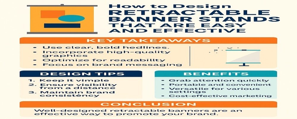
Key Takeaways
- Designing retractable banner stands with a clean layout and bold colors makes them easy to read.
- Adding branding and high-quality visuals improves recognition and trust.
- Smart design choices increase visibility, audience engagement, and conversions.
Understand the Purpose Before You Design Retractable Banner Stands
Attention
Every banner starts with a purpose. Ask yourself: What do I want this banner to achieve? If it’s for a trade show, the goal is to stand out in a sea of competitors. If it’s for a retail store, the banner might highlight a promotion or guide customers to a new product line.
Interest
Understanding the purpose keeps your design focused. Instead of throwing every message at the banner, you’ll prioritize what matters most. For example, a trade show banner should emphasize your company name, tagline, and booth number. A retail banner should spotlight the deal or new product, supported by your logo and branding.
Tips:
- Define the banner’s main goal before you start designing.
- Match the design to the environment — what works in a busy expo might not work in a quiet office lobby.
- Keep your target audience in mind so your message speaks directly to them.
Keep Your Banner Design Simple and Easy to Read
Desire
When you design retractable banner stands, less is more. Visitors walking by only have a few seconds to glance at your display. Too many words or busy graphics confuse the eye. Simplicity makes your banner easy to understand and more effective.
Use bold headlines with short, impactful phrases. Choose fonts that are clean and legible from a distance. Leave plenty of white space so the design feels open and approachable.
Tips:
- Limit your text to 3–4 key points.
- Avoid small fonts — stick with sizes that can be read at least 5 feet away.
- Use bullet-style spacing to make information digestible.
Use Strong Branding and High-Impact Visuals in Your Banner Stands
Your banner should look like it belongs to your brand family. That means including your logo, consistent brand colors, and typography. Branding builds trust and makes your display more memorable.
High-impact visuals are equally important. A single sharp image is better than a collage of low-quality photos. If you’re selling a product, feature it prominently. If you’re promoting a service, use visuals that represent the benefits.
Tips:
- Always use images at 300 dpi for crisp printing.
- Stick with 1–2 large visuals instead of many small ones.
- Match banner design with your website and business cards for brand consistency.
Focus on Layout and Flow When You Design Retractable Banner Stands
Design isn’t just about what you put on the banner — it’s about how you arrange it. The human eye naturally reads top to bottom, left to right. That’s why your most important message should be at the top, followed by supporting visuals and text, ending with your call-to-action at eye level.
A clean layout ensures your audience doesn’t get lost. The message flows naturally, guiding them from one point to the next.
Tips:
- Keep the logo at the top so it’s the first thing seen.
- Place your headline at eye level for maximum impact.
- Position your call-to-action at the bottom third of the banner.
Choose Colors That Work for Retractable Banner Stands
Colors set the tone of your message. Bright hues like red and yellow grab attention but can be overwhelming if overused. Blue and green feel trustworthy and calm but may not stand out in a crowded event hall. The trick is to use colors that fit your brand while maintaining high contrast for readability.
Tips:
- Use dark text on light backgrounds or light text on dark backgrounds.
- Limit your design to 2–3 main colors to avoid chaos.
- Test how your banner looks under bright lights to ensure readability.
Make Your Call-to-Action Clear on Retractable Banner Stands
Every banner should encourage the viewer to take the next step. A strong call-to-action (CTA) makes that possible. Whether it’s “Call Today,” “Visit Our Booth,” or “Scan the QR Code,” your CTA should be bold and direct.
Tips:
- Use large fonts for your CTA.
- Make sure the CTA contrasts with the background.
- Consider adding a QR code for easy digital engagement.
Practical Design Tips for Retractable Banner Stands
Retractable banners are meant to be portable, so your design should work in multiple settings. Always design at full size to ensure images and text don’t pixelate. Choose materials like matte vinyl, which avoids glare and makes the banner easier to read under harsh lights.
Tips:
- Use CMYK color format for printing accuracy.
- Leave a safe margin near the edges to prevent trimming errors.
- Keep portability in mind — lightweight banners are easier to travel with.
Mistakes to Avoid When You Design Retractable Banner Stands
Many banners fail because of common mistakes. Designers often overload the banner with too much text, making it unreadable. Others use stock photos that look generic. Some forget to leave white space, creating a cluttered and overwhelming look.
Tips:
- Stick to one main message instead of cramming in everything.
- Invest in professional photography rather than generic stock.
- Use white space to let your design breathe.
10 Benefits of Learning How to Design Retractable Banner Stands
- Easy setup and takedown saves time.
- Lightweight design makes it portable.
- Cost-effective compared to large displays.
- Works in multiple settings, from trade shows to offices.
- Boosts brand visibility and awareness.
- Flexible — can be updated or redesigned easily.
- Durable materials offer long-term use.
- Professional look builds trust with customers.
- Adds instant impact to marketing campaigns.
- Creates opportunities for lead generation and sales.
Smart Design Retractable Banner Stands for Lasting Impact
Designing retractable banner stands is more than creating visuals — it’s about building tools that tell your story, attract customers, and drive results. When you focus on purpose, clarity, branding, and usability, your banners stop being background noise and start becoming sales tools.
A smart design not only looks good but also communicates your value in seconds. That’s what makes a retractable banner truly powerful.
FAQs About How to Design Retractable Banner Stands
1. What is the best size to design retractable banner stands?
The most common size is 33″ x 80″. It’s tall enough to be seen and compact enough for easy transport.
2. How can I design retractable banner stands that attract people at trade shows?
Use bold colors, large fonts, and a clear call-to-action. Keep your design simple so people understand your message quickly.
3. What software is best to design retractable banner stands?
Adobe Illustrator and Photoshop are popular choices. For beginners, Canva offers easy-to-use templates for banners.
4. Can I design retractable banner stands with QR codes?
Yes, QR codes are great for linking customers to your website, social media, or product page instantly.
5. How much text should I use when I design retractable banner stands?
Keep it short — headlines, a subheading, and one call-to-action. Viewers should understand your banner in under 3 seconds.