
Getting lost in a building or event space is frustrating. Customers don’t want to waste time searching for the right floor, room, or service. That’s why knowing how to design directional signs is crucial. These signs quietly guide people, reduce stress, and make your space easier to navigate. When done right, they can even boost sales and build trust in your brand.
Why Design Directional Signs Is Essential for Customer Experience
Clear, professional directional signs do more than point the way. They improve customer satisfaction, reduce bottlenecks, and create a smoother flow. Whether you run a busy retail store, a hospital, or a stadium, customers expect clear directions that make their journey stress-free. Without them, frustration can cost you both time and business.
Key Takeaways
- Designing directional signs improves customer flow and reduces stress.
- Good signage leads to smoother navigation and more satisfied visitors.
- Placement, readability, and branding make a big difference.
- Regular updates keep your directional signs relevant and effective.
What Does It Mean to Design Directional Signs?
To design directional signs means more than printing arrows. It’s a process that blends creativity, usability, and brand identity into a tool that keeps your space running smoothly.
Directional signs come in many forms:
- Indoor Signs: Guide visitors to restrooms, checkouts, and exits.
- Outdoor Signs: Direct traffic, parking, and event entrances.
- Digital Signs: Provide flexible, updatable directions in busy locations.
Design Tip: Keep text short and use arrows or icons for quick understanding. Customers don’t want to stop and read long sentences.
Who Needs Directional Signs the Most?
Directional signage is valuable for almost every industry.
- Retail Stores and Malls: Help shoppers find stores, food courts, and restrooms.
- Hospitals and Clinics: Reduce stress for patients trying to find waiting rooms or labs.
- Airports and Hotels: Guide travelers to gates, check-ins, and baggage claims.
- Event Venues and Stadiums: Manage large crowds and keep traffic flowing.
- Corporate Offices: Direct guests to conference rooms or departments without confusion.
Quick Tip: If your location has multiple floors, departments, or entrances, professional directional signs are a must.
How Designing Directional Signs Makes Life Better
Think about the last time you were lost in a large building. It probably wasn’t fun. When businesses take the time to design directional signs, they reduce stress and make every visit more pleasant.
For customers, this means less wandering and more confidence. For businesses, it means better efficiency, fewer staff interruptions, and improved customer reviews.
Pro Tip: Walk your space as if you were a first-time visitor. Note where you’d naturally expect a sign — that’s where one should go.
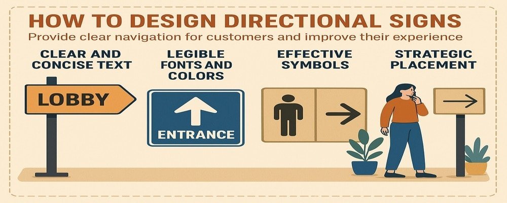
Key Elements to Consider When You Design Directional Signs
Readability
Use fonts that are bold and easy to read from a distance. Avoid fancy or script fonts. Bigger is better for quick recognition.
Contrast and Colors
High-contrast color combinations, like dark text on a light background, make words pop. Use your brand colors, but make sure they don’t reduce readability.
Icons and Symbols
Arrows, restroom symbols, and universal icons help all customers, regardless of language.
Consistency
Stick to the same style, color scheme, and font across all directional signs. Consistency reinforces trust and helps customers recognize your signs quickly.
Design Tip: Test visibility in different lighting. Signs that look clear in the day may be harder to see at night.
How to Design Directional Signs That Truly Guide Customers
- Place signs at decision points like hallways, elevators, and entrances.
- Use short, clear text with arrows.
- Make signs visible from different angles.
- Add lighting or reflective surfaces for nighttime visibility.
- Use floor graphics in crowded areas to reinforce guidance.
Pro Tip: Customers should always see the next sign before they reach the end of the current one. This keeps navigation smooth.
Mistakes to Avoid When You Design Directional Signs
Even well-intentioned signs can fail.
- Using small fonts that customers can’t read quickly.
- Overloading signs with too much information.
- Placing signs too high, too low, or in hidden corners.
- Skipping ADA compliance, which leaves some customers behind.
- Forgetting to update signs after changes to the layout.
Quick Fix: Review your signs quarterly to catch outdated content or visibility issues.
Placement Strategies for Effective Directional Signage
The location of your signs is just as important as the design itself.
- Put signs at entrances and key intersections.
- Position them at eye level for quick recognition.
- Place reminders along long hallways so customers feel guided.
- Use consistent spacing between signs in larger spaces.
Placement Tip: Don’t wait for customers to get lost. Put signs in the path they’ll naturally follow.
Maintenance and Updates for Directional Signs
Directional signs should always look clean, accurate, and professional.
- Wipe down signs regularly to remove dust and fingerprints.
- Check for fading, scratches, or peeling graphics.
- Update information after layout changes, new services, or rebranding.
- For digital signs, refresh content often with current info.
Pro Tip: Outdated signs are worse than no signs. They confuse and frustrate customers.
10 Benefits of Designing Directional Signs the Right Way
- Easier navigation for customers
- Reduced stress and confusion
- Faster movement through busy areas
- Better customer satisfaction and loyalty
- A more professional and polished business image
- Fewer staff interruptions to give directions
- ADA compliance for accessibility
- Smoother traffic flow during peak times
- Increased safety during emergencies
- Positive first impressions that build trust
Guide Customers with Confidence: Why You Should Design Directional Signs
Directional signs aren’t just helpful — they’re essential. When you design directional signs the right way, you give customers confidence, save them time, and improve their overall experience. At the same time, you protect your business from chaos, confusion, and negative reviews.
👉 Ready to design directional signs that guide your customers with ease and professionalism? Contact us today and let’s create a plan for your space.
FAQs About Designing Directional Signs
1. What materials are best when you design directional signs?
The best materials for designing directional signs are aluminum, acrylic, and durable plastics, which resist wear and stay professional-looking.
2. How big should directional signs be when you design them?
The size depends on viewing distance. When you design directional signs, larger areas require big, bold signs, while smaller spaces can use compact ones.
3. Can I design directional signs that match my brand?
Yes. You can design directional signs with your company’s colors, logo, and fonts so they guide customers while strengthening your brand identity.
4. How often should I update my directional signs?
Update your directional signs at least once a year or whenever your building layout, branding, or customer flow changes.
5. Do I need a professional to design directional signs?
Yes, it’s recommended. Professionals know how to design directional signs that are clear, compliant, and effective at guiding customers.