
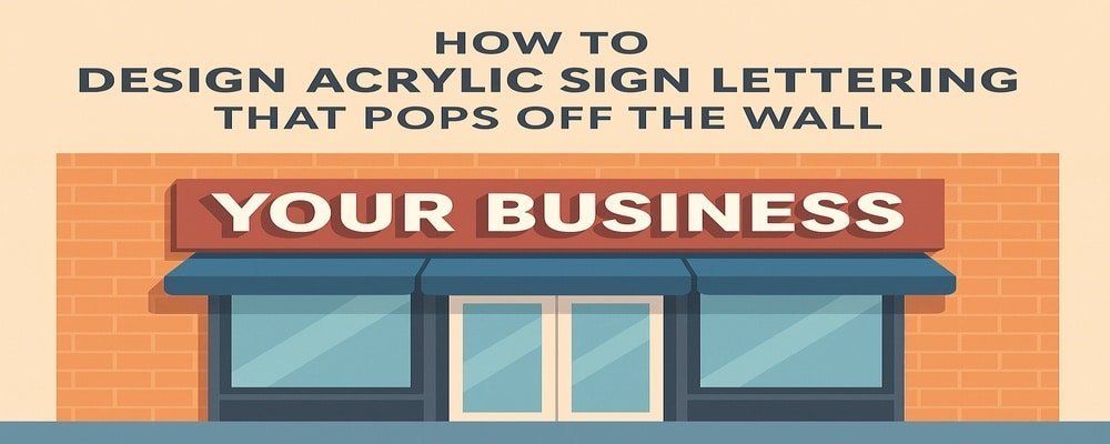
Make Your Business Stand Out with Acrylic Sign Lettering
Your sign is often the first impression customers have of your business. That’s why choosing the right style matters. Acrylic sign lettering gives your brand a bold, modern, and professional look. With the right design, these signs don’t just sit on a wall — they leap off it, catching the attention of everyone who passes by.
Key Takeaways
- Acrylic lettering makes your brand look polished and modern
- Proper design improves visibility and strengthens brand identity
- Fonts, colors, finishes, and lighting all play key roles
- Professional sign design saves time and prevents costly mistakes
- The right acrylic sign lettering will make your business unforgettable
Why Design Acrylic Sign Lettering Is the Secret to Bold Branding
When you design acrylic sign lettering, you’re investing in more than just signage — you’re investing in your reputation. Acrylic letters give businesses a crisp, clean appearance that works both indoors and outdoors.
Unlike flat vinyl graphics, acrylic letters have depth and dimension. This 3D look helps your sign catch light and shadows, which naturally draws the eye. That’s why you see acrylic lettering in busy places like medical offices, retail stores, restaurants, and corporate buildings.
Another benefit is durability. Acrylic is weather-resistant, meaning your sign won’t fade or warp easily. Whether installed inside a sleek lobby or outside on a storefront, your acrylic sign lettering will continue making a strong impression for years.
For businesses that want modern style and lasting quality, acrylic lettering is a perfect choice.
Key Elements to Consider When You Design Acrylic Sign Lettering
Designing acrylic sign lettering isn’t just about picking letters and putting them on a wall. Every detail matters — from font choice to lighting. Here are the most important elements to think about:
Font Choice Matters
Fonts control how easy your sign is to read. A bold, clean font makes your lettering stand out from a distance. Avoid fonts that are overly decorative, as they may look attractive up close but hard to read far away.
The Power of Color
Color is one of the first things people notice. When you design acrylic sign lettering, pick colors that represent your brand but also stand out against the wall. For example, white letters on a light wall won’t pop, but bright white against dark brick will.
Thickness and Finish
The thickness of your acrylic letters can change the way your sign feels. Thicker letters add more depth and durability. Finishes also play a role. A glossy finish reflects light for a bold look, while a matte finish creates a softer, modern vibe.
Add Lighting for Extra Impact
Lighting can make your sign come alive. Front-lit letters shine brightly, backlit letters create a glowing halo effect, and side-lit letters give your sign a sleek, modern touch. If your sign is outside or in a dim space, lighting is a must.
Design Tips That Make Acrylic Lettering Pop Off the Wall
Want your acrylic sign lettering to grab attention and keep it? Use these proven tips:
- Layer acrylic to add dimension and create a 3D look
- Use LED lighting for nighttime visibility and energy efficiency
- Combine frosted and glossy finishes for a stylish contrast
- Make sure letter sizes match the average viewing distance
- Choose colors that stand out against your wall material
- Space letters properly so they’re easy to read from afar
- Add your logo or brand icon for stronger identity
- Position the sign at eye level for maximum visibility
- Test design mockups before committing to a final order
- Always consider your brand personality when picking styles
These design choices ensure your acrylic sign lettering looks professional and truly “pops” off the wall.
Common Mistakes to Avoid When You Design Acrylic Sign Lettering
Even small mistakes in design can make a big difference in how your sign performs. Here’s what to avoid:
- Overly fancy fonts: They may look stylish but often kill readability.
- Poor color contrast: Light letters on a light wall or dark on dark make signs invisible.
- Ignoring spacing: Letters that are too close look crowded; too far apart feel disconnected.
- Choosing thin acrylic: Thin sheets can warp and make your sign look cheap.
- Skipping lighting: Without lighting, your sign loses impact at night.
- Forgetting permits: Many cities require approval for business signs. Missing this step delays installation.
Avoiding these pitfalls saves money, stress, and ensures your sign does its job.
10 Benefits When You Design Acrylic Sign Lettering
- Gives your business a modern, polished look
- Makes your brand instantly recognizable
- Works for both indoor and outdoor signs
- Stays clean and easy to maintain
- Offers endless customization options
- Provides a striking 3D appearance
- Can be illuminated for night visibility
- Lasts for years without fading or warping
- Fits any business style or industry
- Creates a strong first impression that attracts customers
How Professional Design Services Make Life Easier
While it may be tempting to design acrylic sign lettering on your own, the truth is, professional help makes all the difference. Experts understand how to balance font, color, spacing, and lighting for maximum impact.
Professionals also handle the technical side — from measuring your wall to ensuring safe installation. This prevents costly mistakes like buying the wrong size or drilling in the wrong spot. With professional design services, you get a sign that not only looks great but lasts longer.
Hiring a pro means you save time, reduce stress, and walk away with acrylic sign lettering that works exactly as intended.
Take Your Branding Higher with Acrylic Sign Lettering
Your business deserves more than just a name on a wall. With the right design, acrylic sign lettering can transform how customers see you. It builds trust, strengthens your brand, and makes your location stand out from the crowd.
Now is the time to invest in a sign that works as hard as you do. Our team is ready to help you design acrylic sign lettering that truly pops off the wall. Contact us today for a free consultation and see how we can bring your vision to life.
FAQs About How to Design Acrylic Sign Lettering
1. How much does it cost to design acrylic sign lettering?
The price depends on size, thickness, color, and lighting. Smaller signs may cost a few hundred dollars, while larger illuminated signs can cost several thousand.
2. How thick should acrylic be when you design acrylic sign lettering?
Most businesses choose acrylic between ¼ to ½ inch thick. Thicker letters add more dimension and are more durable outdoors.
3. Can LED lights be added when you design acrylic sign lettering?
Yes. Adding LED lights makes your sign shine day and night. Options include front-lit, backlit, and halo lighting.
4. Is acrylic better than metal for sign lettering?
Both are great, but acrylic is lighter, more affordable, and available in many colors. Metal offers a traditional, high-end feel.
5. How long does it take to design and install acrylic sign lettering?
Most projects take 1–3 weeks, depending on design details, permits, and installation schedules.