
This guide explains how channel letter height, depth, stroke width, mounting type, and viewing distance affect visibility and compliance so you can select the optimal size for your signage project. You’ll learn measurement standards, material impact, illumination considerations, and placement tips to balance legibility, brand presence, and local code requirements, enabling you to make confident, practical decisions.
Key Takeaways:
- Match letter height to viewing distance-use the common guideline that 1″ of letter height covers about 10 ft of readable distance and adjust for pedestrian vs. vehicular viewing.
- Verify local codes and permit requirements-zoning, maximum sign area, illumination limits and placement rules can dictate allowable sizes and mounting.
- Choose fonts and stroke widths for legibility-simple, bold letterforms with adequate stroke and spacing perform better at small or long-range sizes.
- Account for channel depth and illumination-letter depth and return height affect light distribution (front-lit, halo, or combo) and may influence overall dimensions.
- Plan for mounting, structure and service-ensure the wall/roof area, mounting rails, wind loads and electrical access support the chosen letter dimensions and weight.
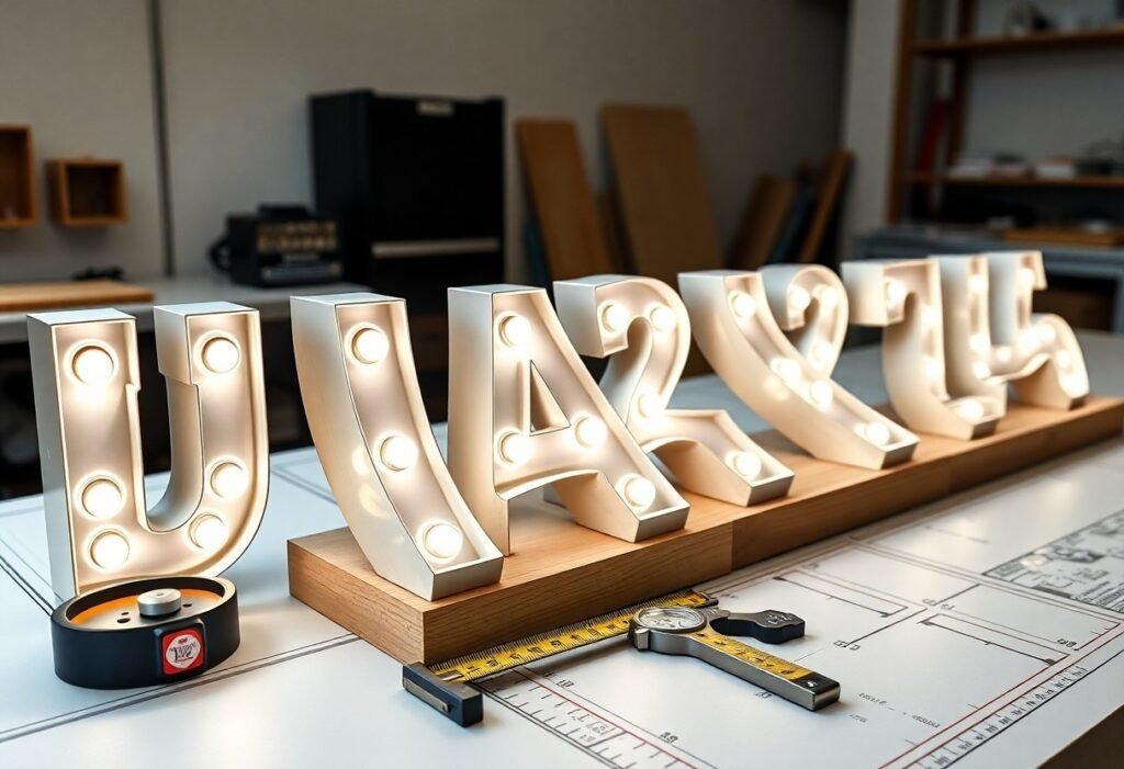
Types of Channel Letters
You’ll encounter several build styles that change brightness, installation needs, and cost; front-lit letters dominate daytime legibility, back-lit (halo) letters emphasize nighttime elegance, and open-face letters deliver bold, colorful impact. Specify letter depth (3-8 in), LED spacing (2-6 in), and mounting standoff (0-4 in) based on distance and facade material to hit both visual and budget targets.
| Front-Lit | Direct illumination, acrylic face, 3-6 in depth, ideal for daytime visibility |
| Back-Lit (Halo) | Reverse face or opaque face with halo glow, 4-8 in depth, premium nighttime presence |
| Open-Face | Exposed LEDs or neon, vibrant color, lower cost, requires diffusers for uniformity |
| Front/Back Combo | Front illumination plus halo effect, higher cost, used for 24/7 brand impact |
| Push-Through | Acrylic graphics pushed through returns, good for logos and multi-color branding |
- Front-lit: best for 1″ letter = 10 ft rule when daytime legibility matters.
- Back-lit: choose 2″-4″ standoff on textured surfaces to create a crisp halo.
- Open-face: space LEDs 6-12 in for even fill when you want bright color at lower cost.
Front-Lit Channel Letters
When you need the highest daytime contrast, front-lit letters use diffused acrylic faces with aluminum returns and LED modules typically spaced 2-4 in; a 12″ tall letter remains legible at about 120 ft using the 1″ = 10 ft rule, and depths around 3-6 in balance profile and structural strength for most storefronts.
Back-Lit Channel Letters
For subtle, upscale nighttime branding, back-lit (halo) letters hide LEDs inside an opaque face or reverse-mount and rely on a 2″-4″ standoff to cast even light on the wall; you’ll often choose 4-8 in depth to prevent hot spots and to ensure the halo reads cleanly on brick, stucco, or painted surfaces.
In practice, specify LED modules with a 30-60° beam and test at night: a 24″ letter with a 3″ standoff produces a neat 1-2″ halo on smooth masonry, while textured walls may require deeper returns or diffusing backer plates to maintain consistency across your signage.
Open-Face Channel Letters
You’ll pick open-face letters when vivid color and cost-efficiency matter; without a solid acrylic face, LEDs are visible so you must control spacing (often 6-12 in) and use louvers or diffusers for uniformity-this approach suits high-energy retail signs or entertainment venues where brightness is the priority.
Consider maintenance and glare: exposed LEDs mean easier servicing but can create hotspots at close range, so match LED type and diffuser strategy to viewing distance-use wider-angle LEDs for near-view signs and tighter beams for long-distance legibility to keep your message crisp.
Perceiving how each style interacts with your building materials, viewing distance, and brand intent lets you choose the right channel-letter type for maximum impact.
Factors Influencing Size Selection
Several variables determine ideal letter size: viewing distance, font weight, mounting height, illumination type and local sign codes – for example, a 12″ letter typically reads at about 120 ft while highway-facing letters often exceed 24″ for 240+ ft visibility. You should factor stroke width (roughly 10% of height), contrast, and driver speed when sizing letters. Perceiving depth, contrast and illumination often affects legibility more than modest size changes.
- Viewing distance – use 1″ of letter height per 10 ft of readable distance (e.g., 6″ ≈ 60 ft).
- Font and stroke – bold sans-serifs need less height than thin scripts.
- Mounting height/angle – second-story façades require much larger letters than street-level storefronts.
- Illumination – halo-lit or internally lit letters improve legibility at distance.
- Local codes & permits – some municipalities limit sign area, projection, or mounting height.
Visibility Distance
Apply the 1″ per 10 ft guideline: a 6″ letter reads at ~60 ft, 12″ at ~120 ft, and 24″ at ~240 ft; for roadside signs aimed at 45-65 mph traffic you should plan for 200-400 ft readability, often pushing you to 18-36″ letters. You should also increase size when using condensed fonts or when ambient lighting is poor, and validate with an on-site mockup at the intended viewing distance.
Installation Location
Your mounting surface, height and angle drive practical sizes: eye-level storefronts typically use 8-24″ letters, while second-story or highway-facing façades commonly require 30-48″ or larger to be effective from the street. You should account for nearby obstructions like awnings, trees or light poles that shorten clear sightlines.
For larger installs consider structural and environmental factors: letters over ~36″ often need engineered anchors, wind-load calculations and deeper returns (4-8″) for rigidity; recessed façades may force raceway mounts or backer panels, and many jurisdictions restrict projection or require permits, so verify local code and consult an installer for attachments and clearance.
Brand Guidelines
Your brand standards usually dictate minimum letter height, spacing, color (Pantone values) and logo proportions-chains often specify a minimum storefront height (commonly 12″+) and exact color recipes to maintain consistency across locations. You should confirm minimum x-height, clear space rules, and acceptable typeface substitutions before finalizing size.
When scaling a logo for signage request vector files and the brand’s signage spec sheet; test the scaled artwork at the actual viewing distance, preserve stroke-to-height ratios (aim for ~8-12% stroke width), and ensure contrast ratios meet legibility targets under both daylight and night illumination to avoid rework or brand compliance issues.
Step-by-Step Guide to Choosing Channel Letter Size
| Step | What to do |
| Assessing Your Needs | Define viewing distance, brand impact, day/night visibility, and target audience; use 1″ of letter height per 10 ft as a starting rule. |
| Measuring Available Space | Measure facade width/height, note obstructions, allow 6-12″ margins, and reserve 4-6″ depth for raceway/electrical. |
| Selecting the Right Size | Balance legibility with proportion, create scaled mockups, and verify against local sign code and illumination needs. |
Assessing Your Needs
You should begin by defining viewing distance, brand prominence, and lighting conditions; apply the 1″ = 10 ft guideline-so a 50 ft viewing distance suggests ~5″ letters-and factor in logo complexity, stroke width (often 1/6-1/5 of letter height), and whether the sign must read from a moving vehicle or pedestrian traffic.
Measuring Available Space
Measure the full facade width and usable sign zone, note windows, doors, awnings, and clearances, then subtract 6-12″ margins on each side to avoid crowding; also confirm raceway clearance of ~4-6″ behind letters for depth and wiring.
To be precise, measure horizontally and vertically at multiple points, record the shortest clear span, and create a simple elevation sketch with dimensions; for example, a 30 ft-wide storefront minus two 1 ft margins leaves ~28 ft for sign width, which you can divide by average letter width (roughly 60-70% of height) to estimate maximum letter height before scaling mockups.
Selecting the Right Size
You should choose letter height that balances visibility and proportion: for storefronts facing sidewalks 20-40 ft away, letters of 2-4″ per 20 ft (i.e., 2″ for 20 ft, 4″ for 40 ft) may suffice using the 1″ per 10 ft rule, while shopping centers and roadways often require 18-36″ or larger depending on setback.
In practice, build a 1:10 paper or digital mockup and view it from the intended distance; for highway-facing signs you might pick 24-72″ letters, use channel depth of 3-6″ for proper illumination, and specify LED modules spaced 2-4″ to achieve even lighting while meeting local sign-area and height restrictions.
Tips for Effective Channel Letter Display
You should align letter height to viewing distance-use the 1″ per 10 ft rule (for example, 12″ letters for ~120 ft readability), keep stroke widths ≥3″ for distance legibility, and allow 1.5-2× letter width for spacing; After testing at dusk, set LED brightness between 500-800 cd/m² for urban storefronts and reduce for residential areas.
- Match letter size to viewing distance (1″ = 10 ft)
- Maintain stroke width ≥3″ for legibility
- Use 500-800 cd/m² brightness for busy streets
Color and Font Considerations
You should prioritize high luminance contrast-white on navy or black on white works at 50-200 ft-aim for ≥60% contrast; choose bold sans-serif faces for quick recognition, avoid condensed or script fonts with strokes under 3″, and always mock up at full scale and test colors under both daylight and 10-15 lux nighttime conditions.
Placement for Maximum Impact
You want clear sightlines: for pedestrian storefronts place the sign centerline at about 66-72 in (5.5-6 ft); for motorists use larger letters (12″+ for 100-150 ft sightlines) and mount bottoms at 8-12 ft to avoid obstructions-tilt, halo lighting, or angled faces can boost effective visibility by roughly 10-15%.
Measure approach angles from primary viewing points (pedestrian, curbside, and driver at 30-40 mph), then mock up a life-size template on the façade to confirm readability; choose mounting (stud, raceway, or rail) to maintain consistent face plane and depth-4-6″ depth typically houses LEDs without hot spots-avoid placing letters behind architectural overhangs or glass reflections, and adjust contrast/illumination after a dusk test from the furthest intended viewing distance.
Local Regulations and Permits
You must check municipal sign codes early: most jurisdictions require a sign permit plus an electrical permit, reviews typically take 2-8 weeks and fees range widely ($50-$500+), and many areas limit illuminated hours, sign area, setbacks, and colors-submit scaled elevations, site plan, and electrical schematics to speed approval.
Contact the local planning or building department for the exact code sections and submittal checklist, verify zoning overlays or historic-district restrictions, and factor permit lead time into your project schedule; for larger, rooftop, or high-wind installations you’ll likely need structural calculations, sealed drawings, and an inspection sign-off-using a contractor familiar with municipal processes often shortens review and reduces revision cycles.
Pros and Cons of Different Channel Letter Sizes
When weighing size options, you need to balance visibility, cost, and installation complexity; for example, a 24″ letter is readable up to about 240 ft using the 1″ = 10 ft guideline, while a 6″ letter serves close-range storefronts. Use the Calculate Sign Letter Size: How to Choose the Ideal Height tool to convert viewing distance into recommended letter heights before finalizing design.
| Pros | Cons |
|---|---|
| Greater long-distance readability (e.g., 24″ ≈ 240 ft) | Higher fabrication and mounting costs (can increase 20-50%) |
| Stronger brand presence on highways and plazas | May require reinforced supports or structural review |
| Better nighttime legibility when backlit | Higher energy use and larger LED counts |
| Easier to read at vehicle speeds (improves legibility at 30+ mph) | Often triggers permit requirements or zoning limits |
| Improves wayfinding across large campuses or malls | More complex installation logistics (cranes, lifts) |
| Perceived higher value for premium brands | Longer lead times for fabrication and delivery |
| Reduces need for multiple secondary signs | Can overwhelm dense facades and nearby signage |
Advantages of Larger Sizes
You get superior sightline capture with larger faces: a 36″ letter can remain legible beyond roughly 360 ft, making it effective for arterial roads and parking-lot approaches. Installers recommend 18-36″ for storefronts visible from 100-500 ft, and larger sizes often boost brand recall and reduce the need for supplemental directional signage, delivering measurable impressions in high-traffic corridors.
Disadvantages of Smaller Sizes
You trade reach for economy with small letters: an 8″ letter is typically readable only to about 80 ft, so motorists and fast-moving pedestrians may miss your message. Small sizes suit tight storefronts but frequently force additional signs or window graphics to convey the same information.
In real-world applications, downsizing can cut visibility sharply-operators in strip centers report single-digit to low-double-digit drops in drive-by recognition when moving from 16″ to 8″ letters. Small channel letters also challenge lighting design: densely packed LEDs can create hotspots, increase maintenance intervals, and sometimes conflict with local minimum-height rules, so you should verify code compliance and lighting tests before committing.
Common Mistakes to Avoid
Overlooking Local Signage Rules
You should verify municipal sign codes for setbacks, maximum sign area, letter height and allowed illumination; many downtown districts cap sign faces around 32 sq ft and letter heights near 18 inches while suburban zones permit larger formats. Permit reviews often take 2-6 weeks and fees can range from $50-$500, so submit scaled elevations, site plans and lighting specs early to avoid redesigns, fines or removal orders.
Underestimating Package Visibility
You can’t rely on gut instinct for letter size-use the 1 inch per 10 feet viewing-distance rule as a baseline (so a storefront seen from 200 ft needs ~20-inch letters), then adjust for stroke width, contrast and mounting height; failing to do so makes letters unreadable to passing drivers and reduces customer recognition.
Further, account for viewer speed and sightlines: if most viewers are in cars at 30-40 mph, increase letter height 25-50% over pedestrian guidance, choose bolder strokes, tighten spacing to avoid ink-blot effects from distance, and test with a 1:1 paper mockup photographed from the intended vantage points before fabricating.
Ignoring Brand Identity
You must preserve font, color and proportion: use exact Pantone/PMS codes, avoid substitute fonts and maintain logo aspect ratio with minimum clear space of roughly 10-20% of logo height; inconsistent letterforms or hues instantly dilute recognition and make multi-site rollouts look amateur.
Also consider materials and illumination: vinyl, powder-coat and LED color temperature (e.g., warm vs cool LEDs) shift perceived hues, so specify Pantone plus finish and request a color proof or spectrophotometer reading; standardize channel depth and return treatment across locations to keep the logo’s perceived weight consistent.
Summing up
Following this, you can confidently select channel letter sizes that balance visibility, proportion, mounting constraints, and local regulations; you should test scale against viewing distance, use legible stroke widths, and coordinate with brand guidelines so your signage achieves optimal impact without overspending.
FAQ
Q: How do I determine the right channel letter size for visibility from different distances?
A: Choose letter height based on expected viewing distance: a common rule is roughly 1 inch of letter height per 10 feet of viewing distance (e.g., 12″ letters for ~120 ft readability). For close pedestrian traffic use 6-18″ letters; for storefronts visible from vehicles use 18-48″; for highway-scale signage use 48″ and up. Also factor in stroke width (thicker strokes improve legibility at distance), letter spacing, contrast, and ambient lighting. Mockups or scaled renderings help validate legibility at target distances.
Q: What local codes and permitting issues affect channel letter size?
A: Municipal sign codes typically regulate sign area (square footage), overall height above grade, setback, illumination hours, and placement in historic districts or specific zoning overlays. Many jurisdictions measure sign area by the outer perimeter of the letters or by the smallest rectangle enclosing the sign; others cap height or total frontage coverage. Illuminated signs often require electrical permits and inspections. Always check local zoning and building departments early and submit scaled drawings showing dimensions, mounting method, and electrical details.
Q: How do font style, proportions, and stroke width influence recommended letter dimensions?
A: Fonts with tall x-heights and simple shapes read larger at the same nominal height than decorative or condensed faces. Maintain adequate stroke width-generally at least 1″-2″ for small letters and proportionally thicker for larger letters-to house LEDs and keep uniform illumination. Avoid very thin or highly condensed fonts for distant viewing. Maintain clear counters and spacing so interior shapes aren’t lost; adjust size upward if letters have fine details or tight spacing.
Q: How should mounting height and installation method affect size choices?
A: Mount letters at a height appropriate for the primary viewer: pedestrian signage typically sits 5-7 ft above the walking surface; traffic-facing signs are higher. Mounting methods (flush to wall, raceway, or wireway) impact depth and required clearances-raceways can support larger/heavier letters but add bulk and may count toward sign area. Structural limits of the façade and wind load requirements may constrain maximum letter size; coordination with installers and structural engineers is recommended for large or heavy letters.
Q: How does letter size affect fabrication, costs, and maintenance?
A: Larger letters use more material, heavier framing, additional LEDs, and often require special shipping and cranes for installation, increasing fabrication and installation costs. Very small letters may need more precise fabrication and tighter tolerances, raising unit cost. Consider access for bulb/LED replacement and cleaning-larger or higher-mounted letters may need lifts for maintenance. Request detailed fabrication estimates that list material, lighting, electrical, mounting hardware, and installation labor to compare total project costs.