
Just choose signage that makes your services unmistakable and easy to act on: bold, legible storefront letters, illuminated signs for evening visibility, projecting signs for passing foot traffic, clear window graphics listing offerings and hours, and portable A-frame or digital displays for promotions. You should prioritize high-contrast typography, consistent branding, and appropriate size and placement for sightlines; compliance with local codes and easy-to-update messaging keeps your street presence effective.
Key Takeaways:
- Bold, readable branding: prominent business name and logo with simple fonts and high contrast for quick street recognition.
- Large, legible type sized for typical sightlines; use illumination (backlit or channel letters) for night visibility.
- Include core service keywords and crucial contact info (hours, phone/website or QR code) to convert passersby.
- Consistent colors and durable materials that match your brand and local streetscape for professionalism and longevity.
- Clear call-to-action or directional signage (e.g., “By appointment,” entrance arrow) while following local sign regulations.
Importance of Storefront Signs
First Impressions Matter
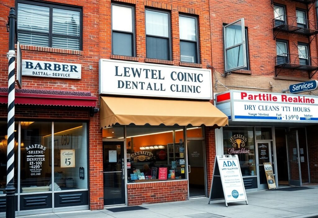
Your storefront sign is often the first interaction a potential customer has with your service-clarity, typography, and maintenance shape that impression. Studies show up to 60% of consumers say signage influences whether they visit a business, so a crisp logo, readable hours, and clean lighting reduce friction and inspire trust. For example, a well-lit awning and visible service list can convert curbside hesitation into walk-ins and phone inquiries within minutes.
Brand Visibility and Recognition
Consistent signage makes your brand recognizable across channels: channel letters, window graphics, and vehicle wraps reinforce the same colors and logo so you become familiar to passersby. Marketing research suggests effective repetition-roughly 5-7 exposures-builds recall, so repeated visual cues on your storefront and nearby directional signs increase the chance a customer remembers and chooses you when they need the service.
To act on that, use legibility rules and placement: aim for one inch of letter height per 10 feet of typical viewing distance, choose high-contrast color pairings, and prioritize backlit or halo-illuminated letters if you serve evening customers. Many service businesses report 10-20% increases in walk-ins after upgrading to professionally crafted, consistently branded signs, and you’ll shorten the path from awareness to booking when your exterior matches your promised service quality.
Effective Types of Storefront Signs
You’ll match sign formats to your service, location and budget to maximize walk-ins and inquiries; materials, contrast and mounting determine longevity and legibility. See practical specs and installation tips in Storefront Signs: The Ultimate Guide. Knowing which sign delivers visibility and conversion for your service helps prioritize placement, materials and hourly foot-traffic windows.
- Channel letters
- Illuminated signs
- A-frame / sandwich boards
- Vinyl banners
- Window graphics
| Channel letters | High-impact, 100-300 ft readable; metal/acrylic; lifespan ~8-15 years |
| Illuminated signs | LED modules last ~50,000 hrs; 50-70% lower energy vs older tech; ideal for night visibility |
| A-frame signs | 24-36″ widths; low cost ($50-$300); ideal for sidewalk promos and directional messaging |
| Vinyl banners | Low-cost ($30-$300); 13-18 oz PVC; 1-3 year outdoor life with UV lamination |
| Window graphics | Perforated or opaque films; 3-7 year durability; excellent for brand messaging and privacy |
Illuminated Signs
You should specify LED backlighting or halo-lit channel letters to extend visibility after dark; LEDs typically run ~50,000 hours and cut energy use by roughly 50-70% versus neon, with typical storefront installs ranging $600-$5,000 depending on size and custom fabrication.
A-Frame Signs
You can place A-frame (sandwich) boards directly on sidewalks to capture impulse foot traffic; standard units are 24-36″ wide, visible for 2-6 seconds to passersby, and cost roughly $50-$300-perfect for daily specials, appointment directions, or service highlights.
Choose durable materials like powder-coated steel or molded plastic and prefer models with weighted bases or non-slip feet to resist tipping; use interchangeable inserts or chalkboard vinyl for rapid daily changes, and confirm local ordinances and ADA clearance before placing the board in high-traffic areas.
Vinyl Banners
You can deploy vinyl banners for seasonal offers or events because they’re inexpensive and fast to produce; expect full-color CMYK printing on 13-18 oz PVC, grommets or pole pockets for mountings, and a typical outdoor lifespan of 1-3 years with UV coating.
Specify reinforced hems and wind slits for exposed locations, choose mesh vinyl for high-wind sites to reduce stress, and budget $60-$150 for common sizes like 3’x6′-use double-sided block-out material when you need visibility from both directions.
Design Elements that Attract Attention
Color Psychology
You should select colors that match your service: blue signals trust and is common for medical and financial services, green implies health or eco-focus, while red or orange can drive urgency for promotions. Use only 2-3 colors to avoid visual clutter and prioritize high contrast (dark text on light background or vice versa) so signage remains readable at 20-50 feet and under varied lighting conditions.
Font Choices and Readability
You’ll get the best legibility using sans‑serif display fonts for messages viewed from a distance; keep headlines bold with simple shapes and avoid condensed styles. Follow the 1-inch per 10-feet rule for letter height and cap lines at 7 words or fewer. Test contrast, stroke width, and kerning at full scale so you can read the sign comfortably from typical curbside distances.
For secondary copy choose a complementary font with lighter weight and increased tracking to improve short sublines; reserve scripts or decorative faces for logos only. You should avoid all-caps for sentences longer than two words, but use capitals for single-word shop names. Do mockups at real scale and view at 10, 25 and 50 feet-adjust x-height, spacing, and illumination (backlit vs painted) until legibility holds across distances and angles.
Local Regulations and Permits
Zoning Laws
Zoning codes determine where you can place wall, freestanding, awning, or sandwich-board signs and often set sign-area limits-many downtown commercial zones allow 32-50 sq ft while mixed-use or residential edges may cap signs at 6-16 sq ft. You’ll need to check setback, height, and visibility-triangle rules (commonly 10-25 ft at intersections) and apply for variances if your design exceeds local limits; permit review typically takes 2-6 weeks.
Signage Restrictions
Municipal rules frequently restrict illumination, motion, and color; for example, several cities ban animated LEDs on arterial corridors and require timers or dimmers for illuminated signs. You should expect limits on brightness, specified hours for lighting, and explicit bans in historic districts, and nonconforming electronic signage often needs a conditional-use permit or relocation to compliant zones.
Technical requirements often include electrical permits, structural notes, and an engineer’s stamp for projecting signs or those above roughly 50-100 sq ft or several hundred pounds. Permit fees usually range $25-$500, inspections add 1-2 site visits, and violations can cost $100-$1,000+ plus mandatory removal. Submit scaled plans, mounting details, and photometric data for LEDs to avoid delays and speed approval.
Placement Strategies for Maximum Impact
Position your signs where natural sightlines and traffic patterns converge: at corners, near crosswalks, or beside entry paths. Apply the 1 inch = 10 feet legibility rule for letter height so viewers can read from typical approach distances. Factor vehicle speeds (30 mph gives roughly 4-5 seconds of clear view) and peak pedestrian flows when choosing between wall, projecting, or sidewalk signage to maximize quick recognition and conversion.
Location Considerations
Choose locations that match how people approach your business: corners capture bi-directional foot and vehicle traffic, while mid-block storefronts benefit from window-level signs and sidewalk A-boards. If you face a transit stop or parking lot entrance, placing signage within 10-30 feet of those access points boosts visibility. Also assess competitor signs-offset yours higher or perpendicular to the street to avoid visual clutter and increase recall.
Height and Angle of Viewing
Mount pedestrian-facing signs around 4.5-5.5 feet to align with average eye level, and raise projecting or hanging signs to 7-8 feet to maintain sidewalk clearance. For motorists, increase letter height according to viewing distance using the 1″=10′ guideline-6″ letters for ~60 feet, 12″ for ~120 feet-so drivers can read at speed. Angle projecting signs perpendicular to traffic for best approach visibility.
Fine-tune angles by testing: stand at key approach points and note where text falls out of view; a 10-20° outward tilt can improve curbside readability without sacrificing pedestrian legibility. Also consider sight obstructions-parking meters, trees, and delivery vehicles-and adjust mount height or setback by a few feet to restore clear lines of sight and maintain consistent branding across multiple viewing distances.
Measuring Success and ROI
Measure ROI by tracking KPIs like incremental foot traffic, appointment bookings, conversion rate to purchase, average transaction value, and cost per new customer. Use a 30-90 day window after sign installation to compare your baseline and post-install data; a practical target is a 10-25% uplift in walk-ins or bookings. For example, a $3,000 exterior sign that drove an 18% revenue increase paid back within six months for a mid-sized salon.
Tracking Customer Engagement
Use QR codes, unique landing pages, and trackable promo codes to attribute leads directly to your signage and measure engagement. Integrate call-tracking numbers and POS data so you can see which signs drive bookings or higher spend, and compare matched 30-day periods before and after installation. Consider foot-traffic sensors or manual counts for high-volume locations, and don’t rely on a single metric-triangulate scans, calls, and transactions to get a full picture.
Adjusting Strategies Based on Feedback
A/B test message, color, and placement to see what moves your metrics-run each variant for 30-60 days and track lifts. Gather on-site feedback via quick surveys or staff reports and tie qualitative notes to quantitative results; one experiment showed a window CTA change yielding 30% more online bookings. Pivot quickly on low-performing designs and scale combinations that raise your conversion and average ticket.
Start with a clear hypothesis (e.g., brighter contrast improves legibility) and define thresholds you’ll accept-aim for at least a 10% relative lift or 100 incremental bookings for actionable results. Run tests changing only one variable, log outcomes in a simple dashboard, and allocate 10-20% of your signage budget for iterative tweaks like lighting upgrades or revised copy. Use documented winners to replicate successful elements across locations and campaigns.
Final Words
As a reminder you should prioritize highly legible, brand-consistent signs-clear type, concise service descriptions, and strong contrast-paired with illumination for night visibility. Combine a primary identifying sign with secondary wayfinding and informational panels, use durable materials, and consider digital displays for timely offers. That approach helps you attract clients and communicate professionalism from the curb.
FAQ
Q: What types of storefront signs work best for service businesses?
A: For service businesses, high-contrast, easily readable signs that convey business name and primary service work best. Channel letters or dimensional lettering mounted on the façade offer strong day/night visibility; illuminated cabinet signs or LED backlit panels are effective for 24/7 visibility; blade/projecting signs improve sightlines for pedestrian traffic; window graphics and vinyl lettering are low-cost ways to list services, hours, and contact info; awnings add shelter and brand presence for walk-in services. Choose one dominant element (façade sign or blade sign) and use secondary signage (window or door) for supporting info.
Q: How should I design a sign for maximum legibility and brand recognition?
A: Prioritize a simple hierarchy: business name first, short descriptor (e.g., “plumbing,” “salon”) second, and contact or hours last. Use sans-serif or clean serif fonts at sizes legible from typical viewing distances, keep contrast high (light text on dark background or vice versa), and limit colors to two or three from your brand palette. Avoid dense copy; use a single strong icon or logo to speed recognition. Test readability at distance and in low light before fabrication.
Q: Which materials and lighting options are best for durability and appearance?
A: Aluminum, routed acrylic, and polycarbonate are durable, lightweight options for exterior signs; stainless steel and painted metals suit upscale looks. For graphics, UV-stable vinyl and laminated prints resist fading. LED illumination is energy-efficient, long-lasting, and available as backlit, halo, or edge-lit solutions; acrylic faces with internal LEDs give even light, while front-lit cabinets provide bold visibility. Match material and finish to local weather: powder-coated metals and sealed LEDs resist corrosion and moisture in wet or coastal climates.
Q: What regulatory or location factors should I check before ordering a storefront sign?
A: Verify local sign codes, building department rules, and any landlord or shopping-center sign standards for size, height, setback, illumination hours, and mounting type. Confirm historic-district rules if applicable; some areas restrict colors, materials, and backlit signage. Permits often require a site plan, elevation drawings, and electrical inspection for powered signs. If you share a multi-tenant façade, coordinate with property management about sign alignment, spacing, and consistent branding bands.
Q: How can I measure and maintain sign effectiveness over time?
A: Track measurable signals: ask new customers how they found you, use unique phone numbers or landing pages on sign promotions, and monitor foot traffic before/after installation. Inspect signs quarterly for burned-out LEDs, faded vinyl, loose fasteners, and water ingress; schedule cleaning (glass, faces, and awnings) seasonally. Update signage content for major service changes or rebrands and refresh illuminated components every 7-10 years to preserve brightness and appearance. Keep a maintenance log and vendor contact to reduce downtime.