
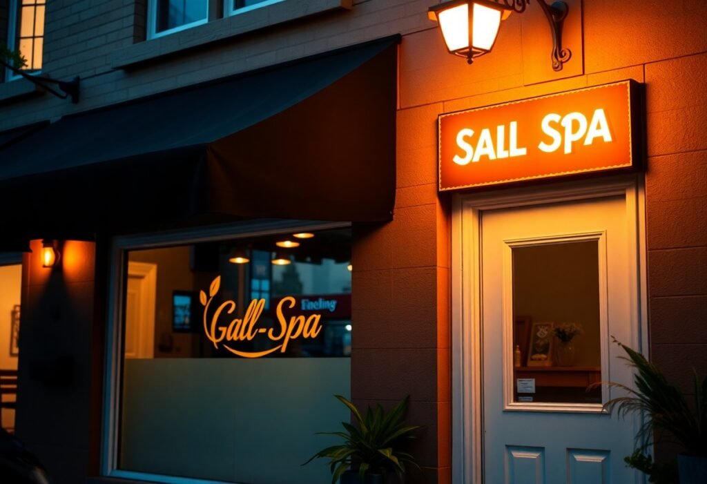
Many salons benefit from illuminated channel letters, projecting signs, and tasteful window graphics that boost visibility and convey your brand; you should choose durable materials, high-contrast lettering, and warm lighting to attract walk-ins, ensure legibility from the street and compliance with local codes, and match sign style and scale to your storefront to reinforce your spa or salon atmosphere.
Key Takeaways:
- High-contrast, large typography and simple icons ensure readability from the street.
- Sign design should reflect your brand’s aesthetic-colors, finishes, and typography that match the salon or spa vibe.
- Use lighting and strategic placement (blade signs, window vinyl, backlit panels) to boost visibility at different times and sightlines.
- Choose durable, low-maintenance materials suited to your climate to keep the sign looking professional long-term.
- Keep messaging minimal: a clear service highlight plus contact/booking info or QR code drives conversions.
Understanding the Importance of Signage
Your storefront sign functions as a continuous brand impression: it increases visibility, signals service level, and filters the right clientele. For example, a midtown salon that replaced a faded decal with illuminated channel letters reported noticeably higher evening walk-ins and stronger perceived quality. When you optimize placement, lighting, and legibility, your sign becomes an active marketing piece that sets expectations and drives first-contact decisions before customers enter.
First Impressions Matter
People decide in seconds whether your business is worth a closer look, so you must make that moment count with contrast, clean typography, and appropriate scale. Use the 1 inch per 10 feet legibility rule to size letters for typical viewing distances, choose high-contrast colors for quick readability, and consider a projecting sign for pedestrian traffic or backlit letters to stand out after dark.
Branding and Visual Identity
Your signage should reflect your salon or spa’s personality through color, type, and material choices. Limit fonts to one or two and a palette of two to three colors; for example, a luxury spa might use warm neutrals and brushed brass letters, while a trend-focused salon opts for bold saturated hues and neon LED accents. Match exterior sign finishes to interior decor so clients get a consistent experience from curb to chair.
Dive deeper by specifying clearspace and scale: give your logo 20-40% clear space and aim for the logo to fill roughly 30-60% of the sign face so text remains legible at distance. You should use Pantone or CMYK matches for consistency across print and vinyl, pick materials-acrylic for glossy modern looks or brushed aluminum for upscale-and verify local sign codes and illumination limits before committing to fabrication.
Types of Signs for Salons and Spas
You can mix illuminated channel letters, lightboxes, window graphics, A-frame sidewalk boards, and digital screens to cover visibility, promotion, and curb appeal; LED lightboxes deliver 24/7 visibility and can cut energy use by up to 75% versus incandescent fixtures, while window vinyl is low-cost for seasonal offers and privacy screening.
| Sign Type | Best Use / Notes |
|---|---|
| Channel letters | High-visibility branding, readable from 100-300 ft on busy corridors; ideal for storefront identity |
| Lightbox / Backlit sign | Even nighttime illumination, good for salons open evenings; pair with LEDs to reduce running costs |
| Window graphics | Promotions, service lists, and privacy films; inexpensive to update seasonally with vinyl prints |
| A-frame / Sidewalk | Drive impulse walk-ins and highlight daily deals; choose 24-36″ wide boards for pedestrian readability |
| Digital displays | Rotate multiple offers, upsell add-ons, and display wait times; integrates with POS for measurable promos |
- Prioritize a primary identity sign (channel letters or lightbox) for distance legibility and brand recognition.
- Use window vinyl to advertise services like “color from $80” and to present hygiene protocols clearly.
- Choose digital displays when you need rapid content changes and data-driven promotions tied to peak hours.
- Place A-frames near entrances with concise CTAs-2-3 lines works best for passersby.
- Perceiving how customers approach your storefront will guide placement, size, and illumination choices.
Traditional vs. Digital Signage
You should weigh upfront cost against flexibility: traditional options (painted signs, channel letters, vinyl) often have lower ongoing tech costs and strong brand permanence, while digital screens let you refresh content in seconds, run video loops of 15-60 seconds, and A/B test promotions tied to sales data; many salons combine both-static identity signs plus one interior or window screen for dynamic offers.
A-Frame Signs and Sidewalk Displays
You’ll get the most impact from A-frames when you keep messaging simple: use bold type, 2-3 lines, and prioritize a single offer or CTA; 24-36″ widths with lettering sized for 10-20 ft viewing distance perform well, and weatherproof materials (metal frames, PVC panels) extend lifespan on busy sidewalks.
For more detail, apply the 1-inch-per-10-feet rule for legibility (3-inch letters readable at ~30 feet), favor contrasts like white on dark or black on yellow, and rotate daily deals during peak foot traffic times (lunch and early evening). Also consider lockable, weighted bases for windy locations, use replaceable printed panels for quick swaps, and test handwritten chalk for boutique charm versus printed vinyl for consistency.
Content and Design Best Practices
Prioritize a bold, 3-5 word headline and a clear value cue so your sign is readable in 6-8 seconds; use the 1 inch per 10 feet rule for letter height (a 6″ letter reads at ~60 ft). Pair the headline with a short descriptor or phone/website, choose durable materials like acrylic or backlit channel letters for night visibility, and test sightlines from the curb to ensure contrast and placement drive foot traffic.
Font and Color Choices
Choose sans-serif faces (Helvetica, Futura, Proxima) for legibility at distance and serif options (Garamond, Baskerville) to signal luxury; keep type hierarchy to two weights and limit styles. Aim for high contrast-dark text on a light field or vice versa-and select palettes that fit your brand: calming teals/soft grays for spas, bold black/magenta/gold for modern salons. Test at full scale to confirm readability from 20-60 feet.
Imagery and Graphics
Use one dominant visual and one supporting icon or pattern to avoid clutter; photos for print should be 300 DPI in CMYK and logos supplied as vectors (SVG, EPS, AI) so they scale cleanly. Focus imagery on services-hair color swatches, massage stones, nail palettes-and prefer simple, high-contrast graphics that work under varied lighting and when viewed quickly from the street.
Provide designers vector logos and CMYK photos at 300 DPI, include a 0.125″ bleed for print files, and request proofs at full scale. Position the main visual center roughly 54-60″ above the sidewalk for average eye level, choose matte or low-gloss finishes to reduce glare, and specify UV-resistant inks or laminated vinyl for exterior durability so your imagery stays sharp for years.
Location and Placement Strategies
Position signs where they match how customers approach: mount the bottom edge around 7-10 ft for pedestrians and raise to 14-18 ft when visibility from a busy road matters. You should apply the 1 inch = 10 feet readability rule and test sightlines from parking stalls. For tailored sizing and materials, consider Custom Salon & Spa Signs – Enhance Branding and Style, which can match facade clearance and local code requirements.
Sign Placement Considerations
When deciding placement, factor in awnings, door swing, and neighboring signage that can block sightlines; center a 3-5 word headline within a 6-8 ft storefront span for balance. You should keep at least 7 ft of clear pedestrian height and verify mounting points can support illuminated channel letters or projecting signs. Permit setbacks often limit how far a sign can extend-confirm with your building owner or local planning department.
Local Traffic Patterns and Visibility
Account for vehicle speed and typical approach angles: at 25-35 mph drivers need letters roughly 8-10 inches tall to read from 150-300 ft, using the 1 inch per 10 feet rule; on slow, pedestrian-heavy streets 3-4 inch letters suffice. You should also orient projecting signs perpendicular to sidewalks to capture foot traffic and use backlit faces for dusk visibility.
More specifically, if average approach speed is 30 mph (about 44 ft/sec), a driver has roughly 4-6 seconds to notice and process your sign from 200-300 ft; that time window favors high-contrast, 3-5 word headlines and simple icons. Test visibility by standing at typical parking spaces and driving past at posted speeds-measure legibility distance and adjust letter height, illumination (LED vs. neon), and mounting height accordingly.
Compliance and Regulations
Navigating municipal codes and HOA rules keeps your sign project on schedule and avoids costly removals; many U.S. cities require a sign permit with review times of 2-8 weeks and fees commonly between $25 and $500. You should plan for electrical permits if you install illuminated channel letters or LED panels, and expect additional review in historic districts or downtown business improvement areas that can add 4-12 weeks to approval.
Sign Permits and Local Laws
You’ll typically submit a site plan, scaled elevation showing dimensions, materials list, illumination specs and owner consent for a permit application. Some jurisdictions require engineering for projecting signs over ~4 sq ft or attachments above the sidewalk, and turnaround varies: municipal offices often process routine permits in 2-6 weeks while design-review boards take longer. Factor permit fees and possible inspection appointments into your timeline.
Size and Lighting Restrictions
Your allowable sign area usually depends on zoning: many commercial zones cap frontage signage at roughly 20-50 sq ft, with height limits often 12-18 ft above grade. Lighting rules limit spill and brightness-municipal codes or BIDs may require dimmers or cap LED luminance (commonly cited ranges: 300-500 nits for digital faces) and restrict illuminated hours to reduce neighborhood glare.
Measure sign area by the smallest rectangle enclosing letters and logos; awning copy and attached blade signs are often included in total allotment. If you propose two-sided signs, some codes count one face if faces are back-to-back within 18 inches. Choose warm LEDs (2,700-3,500K) and photocell dimmers to comply with color and night-time limits, and confirm setback and mounting-height rules before fabricating.
Measuring Effectiveness
Track foot traffic, conversion rate, and time-of-day bookings for 30-90 days after a sign change to see impact; many salons see measurable shifts within the first month. Use simple tools: a door counter to log pedestrian vs. entrant ratios, POS tags to attribute walk-ins, and Google Analytics for geotagged searches. Aim to detect a 10-20% lift in targeted metrics before declaring success or rolling out a wider change.
Customer Feedback and Reaction
Solicit quick feedback with a 2-3 question survey via QR code on the receipt or waiting-room tablet, keeping completion under 30 seconds; ask visibility, appeal, and whether the sign influenced the visit. Track responses weekly and aim for an NPS above 30 as a benchmark; qualitative comments often reveal simple fixes like font size, color contrast, or wording that a count of walk-ins won’t show.
Adjusting Strategies based on Data
If one sign variant drives 12-15% more evening appointments, reallocate budget toward that design and test a second variable-lighting color or placement-for another 30-60 days. You should set minimum sample sizes (e.g., 200 storefront impressions or 50 attributed walk-ins) before changing strategy to avoid reacting to normal traffic variance.
Implement A/B tests: run two sign treatments simultaneously on similar-facing windows or rotate weekly, and log outcomes in a simple spreadsheet linking sign version, date range, foot-ins, conversions, and cost. Combine quantitative data (door counts, bookings, CPA) with qualitative notes from staff and customer surveys to prioritize tweaks with the highest ROI; for example, moving a projecting sign 3 feet closer to the sidewalk increased visible impressions by an observed 18% in one multi-location rollout, translating to an 11% rise in first-time bookings over eight weeks.
To wrap up
The best storefront signs for your salon or spa combine strong visibility with your brand’s aesthetic: a readable, stylish typeface, balanced color contrast, tasteful backlighting or halo-lit letters, and minimal text highlighting signature services or promotions so passersby instantly know what you offer. You should prioritize durable materials and strategic placement that meet local regulations while keeping signage consistent across windows, awnings, and online listings to build recognition and drive steady foot traffic.
FAQ
Q: Which storefront sign types work best for salons and spas?
A: Effective options include channel letters or dimensional letters for a professional, high-visibility facade; backlit lightboxes or illuminated cabinets for even nighttime visibility; halo-lit (reverse-lit) letters for an upscale look; large window graphics or full-window vinyl for promotions and brand imagery; awnings with your logo to add presence and provide weather protection; and portable A-frame sandwich boards for daily specials and walk-by engagement. Choose based on storefront architecture, street orientation, pedestrian vs. drive-by traffic, and brand positioning.
Q: How should I pick materials and finishes for a salon or spa sign?
A: Use durable materials suited to your climate: aluminum or stainless steel for longevity and modern finishes, acrylic for smooth illuminated faces, and high-quality vinyl for window applications. Powder-coated metals resist corrosion in wet or coastal areas; PVC or composite board is cost-effective for dimensional signs. Matte or satin finishes reduce glare for photography-heavy brands; brushed metal or backlit acrylic reads well in low light. Prioritize weather resistance, ease of maintenance, and how finishes reflect your salon’s aesthetic (luxury, natural, playful).
Q: What design principles ensure my sign is readable and on-brand?
A: Prioritize contrast, scale, and hierarchy: use high-contrast color pairs (dark on light or light on dark), limit fonts to one or two legible typefaces, and make the business name the largest element. For viewing distance, a common guideline is roughly 1 inch of letter height per 10 feet of expected viewing distance. Avoid ornate script for main copy-reserve it for accent words. Include a simple icon or logo for brand recognition and ensure spacing, stroke weight, and negative space keep letters distinct both day and night.
Q: What lighting and electrical options should salons and spas consider?
A: LED illumination is the best balance of longevity and energy efficiency; choose front-lit channel letters, halo-backlighting for a premium feel, or internally lit lightboxes for bright, even coverage. Exterior gooseneck spotlights work for non-illuminated signs or awnings. Use timers, photocells, or smart controllers to dim or schedule lighting. Consider heat dissipation and access for LED driver replacement when planning installation. For window displays, LED strip lighting highlights products without excess heat.
Q: What about permits, placement rules, maintenance, and budget considerations?
A: Check local zoning, building codes, and any historic-district or landlord restrictions before design-rules often dictate sign size, height, illumination, and setbacks. Factor permit timelines and application costs into your schedule. Budget broadly: vinyl window graphics can start in the low hundreds, A-frames a few hundred, lightboxes and channel letters typically range from a few thousand to several thousand dollars, and digital displays cost more. Plan routine maintenance-cleaning, repainting, replacing illumination components-and secure warranties and service access to protect visibility and ROI over time.