
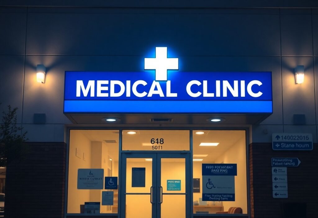
Just prioritize legibility, visibility, and trust when choosing storefront signs for your medical clinic; clear, sans-serif fonts, high-contrast colors, and professional medical symbols communicate competence and aid wayfinding. Opt for illuminated channel letters or backlit signs for nighttime visibility, non-reflective materials to ease readability, ADA-compliant directional and entrance signage, and consistent branding on awnings and window graphics. Your signage should convey professionalism, hours, and services plainly to patients arriving or passing by.
Key Takeaways:
- Prioritize readability: use large, simple sans-serif fonts, high-contrast colors and uncluttered layouts so names and hours are legible from typical approaches and driving speeds.
- Project professionalism and trust: display the clinic logo, consistent color palette and clean materials to reinforce brand and patient confidence while complying with local health-advertising rules.
- Maximize visibility with lighting and placement: choose illuminated channel letters, backlit panels or well-aimed spotlights and size signs for clear sightlines from the street and sidewalks.
- Support accessibility and wayfinding: include clear entrance labels, hours, directional arrows and ADA-compliant signage (height, contrast, tactile/Braille) for patients with mobility or vision needs.
- Choose durable, low-maintenance and adaptable options: weather-resistant materials (aluminum, acrylic, UV-stable vinyl) and interchangeable or digital panels simplify updates and upkeep.
Importance of Effective Storefront Signs
Well-designed storefront signs directly influence patient behavior: well-placed, legible signage can boost walk-ins by 15-30% and reduce late arrivals by clarifying hours and entrances. You should prioritize high-contrast palettes, backlit channel letters for night visibility, and uncluttered layouts so your name, specialty, and hours register within 2-3 seconds for passing traffic.
First Impressions Matter
Your exterior sign sets expectations about quality and safety; studies suggest a majority of consumers judge a healthcare provider’s professionalism by its storefront. Use matte finishes, simple sans-serif logos, and letter heights sized to viewing distance (rule of thumb: 1″ letter per 10′ of distance) so your clinic reads clearly from the curb and conveys trust at a glance.
Target Audience Considerations
Tailor signage to the demographics you serve: if many patients are older adults, increase letter size and contrast; in multilingual neighborhoods, include prominent bilingual text; for pediatric practices, incorporate friendly icons and lower-mounted wayfinding. Ensure ADA tactile characters (typically 5/8″-2″ high) and braille where required so you meet accessibility standards and serve all patients effectively.
For example, a pediatric clinic that added colorful, low-mounted directional signs and a mascot logo reported a noticeable uptick in new-family inquiries, while an urgent care that installed bilingual LED open/closed indicators and larger frontage letters saw weekend walk-ins rise about 15-20%. You should audit local patient age, language, and mobility statistics and test one change at a time to measure impact.
Types of Signage for Medical Clinics
You should select sign types based on frontage, traffic speed, and the services you offer: channel letters for highway visibility, lightboxes for 24/7 facilities, blade signs for sidewalks, window graphics for waiting-room privacy and promotions, and wayfinding plaques inside large buildings. Prioritize letter height (4-6″ for pedestrian, 12-18″ for curbside) and contrast so information reads at 30-100 feet depending on location. Recognizing how scale, material, and lighting combine will let you choose the right mix to boost visibility and trust.
- You can pair illuminated channel letters with a lightbox to cover day/night visibility.
- You should use perforated vinyl for promotional window coverage without blocking sightlines.
- You must confirm local sign codes and ADA requirements before fabrication.
- You should plan for 3-7 year material lifespans and easy maintenance access.
| Channel letters (illuminated) | High visibility from 100-200 ft; LED reduces energy use up to ~80% vs older lighting; ideal for freestanding façades. |
| Lightbox / cabinet signs | Even face illumination good for 24/7 clinics; allows full-face logos; common for shopping-center storefronts. |
| Blade / projecting signs | Pedestrian-focused; improves sightlines at sidewalk level; useful in urban strips and multi-tenant buildings. |
| Window graphics | Privacy frosting, hours, promos, and wayfinding; vinyl options include perforated solar films and opaque frosts lasting 3-7 years. |
| Wayfinding & plaques | Interior directional signs, suite plaques, and ADA-compliant tactile signs help patients navigate complex clinics efficiently. |
Illuminated Signs
You should favor LED-illuminated signs for clinics that need nighttime presence: channel letters, halo-lit logos, or lightboxes provide 24-hour branding and improve emergency visibility. LED modules typically offer 50,000+ hours of life and use far less energy than neon. Specify diffusers and even spacing to avoid hot spots, and plan installation height so letter sizes meet the recommended 12-18″ curbside visibility for drivers.
Window Graphics
You can use window graphics to balance privacy, branding, and promotion without heavy construction: perforated vinyl keeps outward visibility, frosted film creates private consultation zones, and applied vinyl displays hours and contact info in clear sans-serif fonts sized 4-6″ for walk-up legibility.
Materials matter: choose 3-7 year cast vinyl for exterior durability, or 1-3 year calendared options for short-term campaigns; use UV lamination to resist fading. For privacy combine 40-60% opacity frosting or 50/50 perforation to maintain daylight while obscuring interiors. Also check that graphics don’t obscure emergency exit signage and that you comply with local glazing and accessibility codes before applying full-coverage treatments.
Compliance and Regulations
You must navigate ADA requirements, local zoning, electrical permits and health-department rules when placing clinic signs; permit fees commonly range from $50-$400 and turnaround can be 2-8 weeks. Plan for tactile/Braille, illumination limits and historical-district restrictions, and coordinate with your landlord and city planner to avoid rework. For practical sign types and placement ideas tailored to medical offices, see 4 Business Signs for Medical Offices.
Zoning Laws
Your local zoning ordinance will typically control sign area, mounting height, setback and allowable illumination; many downtown commercial zones cap storefront sign faces between about 32-200 sq ft and limit height to keep sightlines clear. You should check tenant signage allowances in your lease and request a zoning verification letter from the municipality-cases where clinics mounted oversized illuminated cabinets without permits often required costly removal or modification.
Health and Safety Guidelines
You should choose signs with non-porous, easily disinfected materials (anodized aluminum, sealed acrylic) and finishes that tolerate hospital-grade cleaners, avoid fabric banners in clinical zones, and ensure illumination doesn’t produce glare in exam rooms. Also post required biohazard, hand-wash and masking notices where codes require them so inspectors can verify compliance during routine health reviews.
For room-identification and wayfinding, ADA specifics matter: tactile characters should measure 5/8″-2″ high with Grade 2 Braille, and the baseline of the lowest tactile line must sit between 48″ and 60″ above the finished floor. Additionally, emergency and exit signage often must be battery-backed or photoluminescent per local fire codes, and you should avoid flashing or strobing lights that could trigger patient conditions.
Design Elements That Attract Patients
Color Psychology
Color choices set expectations immediately: blue communicates competence, green signals health, teal reduces anxiety, and red is best reserved for emergency cues. Studies suggest color influences up to 90% of first impressions, so you can use muted blues and greens for primary panels and a warm accent to draw attention to phone numbers, open-hours panels, or urgent-care labels.
Font and Typography Choices
Choose a high‑x‑height, sans‑serif typeface with open counters for long‑range legibility and tight kerning for compact signs. Industry rules of thumb say 1 inch of letter height per 10 feet of viewing distance-so if your sign faces traffic 100 feet away, you’ll want roughly 10‑inch letters. Avoid thin strokes and ornate scripts that blur when backlit.
Use heavier weights for the clinic name, mid weights for specialty services, and regular for contact details to create clear hierarchy; limit yourself to one type family with varied weights to maintain brand recognition across exterior and digital signage. Also test construction methods-channel letters, flat-cut vinyl, and backlit faces-because many clinics report improved wayfinding after switching to illuminated, high‑contrast lettering.
Technology Integration in Signage
Integrating digital tools into your signage lets you update hours, display wait times and push emergency alerts remotely. Indoor displays typically run 300-700 nits; outdoor units need 700-2,500 nits and 1080p-4K resolution for legibility at distance. Expect small indoor screens to cost $1,000-$5,000 and outdoor LED walls $10,000+, with average energy draws of 100-400W. Use scheduling, A/B testing and analytics to measure engagement uplifts of 20-40%.
Digital vs. Traditional Signs
Digital signs offer dynamic content, targeted messaging and remote updates, while traditional channel letters and illuminated panels deliver long-lasting brand presence and lower ongoing costs. Channel letters often last 10-20 years with minimal maintenance; digital displays typically need replacement or upgrades every 5-7 years. Choose digital for rotating services and promotions, and traditional when you prioritize uninterrupted identity at night or face zoning limits on motion or brightness.
Interactive Displays
Touchscreen kiosks and interactive wayfinding let patients self-check-in, select language options and find providers, often reducing front-desk time by 20-40%. Deploy 10-22″ anti‑glare screens, integrate with your scheduling/EHR systems, and position units within ADA reach (forward reach max 48 in, side reach max 54 in). Protect PHI with session timeouts, encrypted networks and privacy filters.
Design hardware and UX for fast flows: target 1-3 taps to finish common tasks, use 1080p resolution for legible fonts at arm’s length and include tactile controls for accessibility. Opt for antimicrobial glass on high-touch surfaces, add receipt or badge printing when needed, and consider card readers or NFC if payments or identity verification are required. Pilot a single kiosk for 4-8 weeks to measure adoption, error rates and average transaction time before scaling.
Case Studies of Successful Signage
- 1) Urban Multispecialty Clinic – Installed 20 sq ft backlit channel letters mounted 18 ft above sidewalk; new patient inquiries rose 28% over 4 months and nighttime visibility metrics improved by 65% (measured by foot-traffic counts), payback estimated at 9 months.
- 2) Suburban Family Practice – Added internal wayfinding and 3 exterior window graphics; missed appointments dropped 12% in 6 months, front-desk calls for directions decreased 40%, project cost $2,800.
- 3) Rural Community Health Center – Erected a 12-ft pylon with LED message center; drive-by referrals increased 35% year-over-year, average monthly new patients up from 45 to 61, installation $15,200 including permitting.
- 4) Pediatric Clinic – Implemented high-contrast, playful façade signage plus exterior mural; parent-reported comfort in surveys rose to 92%, pediatric visits increased 20% in the first quarter after installation.
- 5) Highway-adjacent Urgent Care – High-mounted LED cabinet visible at 55 mph; night-time walk-ins grew 42%, overall annual visits up 18%; zoning approval took 7 weeks, total project $28,000.
- 6) Dermatology Specialty Center – Replaced faded painted sign with illuminated aluminum letters and ADA-compliant tactile wayfinding; online bookings climbed 14% in 3 months and patient satisfaction scores rose 9 points.
Local Clinic Examples
You can apply small, targeted changes: in a 25,000-population suburb a 10-ft illuminated sign increased curb recognition by 30% within two months, and a community clinic that added clear directional plaques reduced first-time visitor confusion by 48%-both projects cost under $6,000 and required permits that took 3-6 weeks to secure.
Lessons Learned from Community Feedback
You’ll find that legibility, lighting, and proximity drive most positive comments; surveys from three clinics (n=1,200) showed 87% of respondents could read high-contrast signs from 30 ft, and reported directional signs cut wayfinding calls by 41%.
Digging deeper, community feedback revealed specific preferences: 67% favored sans-serif fonts at minimum 6-in letter height for storefront names, 54% used digital message boards to confirm hours and wait times, and 31% relied on window graphics for service cues. You should budget for anti-glare finishes, plan permits 4-12 weeks in advance, and run a 30-90 day pilot on messaging to collect quantitative data before finalizing large-scale installs.
Final Words
From above, you should choose clean, high-contrast, well-lit storefront signs-backlit channel letters or illuminated cabinet signs-that prioritize legibility, ADA accessibility, and consistent branding; durable materials and clear wayfinding help patients find your clinic quickly and convey professionalism, while simple typography and restrained color palettes reinforce trust and make your clinic approachable.
FAQ
Q: What storefront signs improve visibility for medical clinics?
A: High-contrast, legible signs with generous letter height and clean typefaces improve visibility. Use sans-serif fonts, bold weights and a contrast ratio that makes text readable from the intended viewing distance (a common rule is roughly 1 inch of letter height per 10 feet of viewing distance). Include your clinic name and a simple descriptor (e.g., “Family Medicine” or “Urgent Care”) so passersby immediately understand the service. Position signs at eye level and above entrances for maximum sightlines, and avoid cluttered graphics that reduce legibility.
Q: Which materials and finishes are best for clinic storefront signage?
A: Durable, low-maintenance materials work best: aluminum with powder coating, acrylic for lightboxes, dibond or solid composite panels, and high-density PVC or routed foam for dimensional letters. Choose UV-stable inks and anti-graffiti coatings in high-traffic areas. Matte or low-glare finishes help readability in daylight and under lighting; glossy finishes can reflect and reduce legibility. For hygienic environments pick non-porous, easy-to-clean surfaces and sealed edges to resist moisture and frequent disinfection.
Q: How do I ensure signage meets accessibility and local regulations while staying professional?
A: Follow local zoning and sign-permit rules for size, placement and illumination, and incorporate accessibility standards for interior and exterior wayfinding. For tactile and directional signage use ADA-compliant character sizes, tactile lettering with Grade 2 Braille, and proper mounting heights where required. Use universally recognized symbols (entrance, restroom, accessible parking) and clear, unambiguous wording. Consult local code offices or a sign professional before fabrication to confirm illumination, setback and size limits.
Q: What lighting and illumination options are most effective for a medical storefront?
A: Even, energy-efficient lighting improves nighttime visibility and conveys professionalism. Options include LED backlit channel letters, halo-lit lettering, front-illuminated cabinet signs, and illuminated blade signs for pedestrian angles. Specify neutral white color temperatures (around 3500-4000K) for a clinical but welcoming appearance. Avoid flicker or uneven lighting; use diffusers or baffles in lightboxes for uniform brightness. Ensure illuminated elements comply with local ordinances on brightness and hours of operation.
Q: How should signage support patient experience and wayfinding around the clinic?
A: Create a clear signage hierarchy: primary exterior ID (clinic name/logo), secondary directional signs (entrance, parking, drop-off), and tertiary informational signs (hours, phone number, check-in instructions). Use consistent branding, color palette and iconography so patients can follow visual cues from the curb to the reception. Provide accessible paths with visible, high-contrast signage for ramps and accessible entrances, and include multilingual or pictogram signs in diverse communities to reduce confusion and speed up arrival and check-in.