
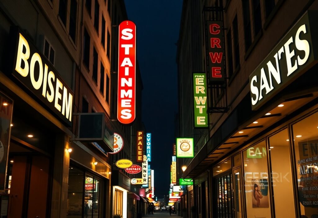
You need a sign that’s legible in bright daylight and equally readable at night; high-contrast colors, anti-glare finishes, and energy-efficient LED backlighting or halo illumination provide consistent visibility, while durable weather-resistant materials and clear typography keep your message sharp; consider channel letters, lightbox signs with translucent faces, or edge-lit acrylic panels to balance daytime presence with nighttime impact.
Key Takeaways:
- Use backlit/illuminated signs (LED channel letters, lightboxes) for consistent visibility both day and night.
- Choose high-contrast colors and bold, simple typography to maximize legibility in bright daylight and under illumination.
- Incorporate adjustable brightness and appropriate color temperature with anti-glare finishes to reduce washout and nighttime glare.
- Place signs for clear sightlines and proper scale-height, angle, and distance affect daytime readability and nighttime prominence.
- Specify durable, weather-resistant materials and energy-efficient LEDs for low maintenance, long life, and reliable nighttime performance.
The Importance of Effective Storefront Signs
Effective storefront signs shape how your business is perceived at a glance: clarity of copy, contrast, and illumination determine whether passersby recognize your brand within 1-2 seconds. Use durable materials like aluminum or acrylic with LED illumination for consistent color and longevity, and apply the 1 inch = 10 feet rule for letter height so your main message reads from the distance where customers decide to stop or walk past.
Visibility and Branding
High-contrast color schemes and consistent typography extend your brand identity into the streetscape; for example, warm 3000K LED lighting suits cafés while neutral 4000K reads crisply for professional services. Choose halo-lit or face-lit channel letters for logo prominence, and keep the icon or wordmark at least 30% taller than supporting copy so your brand anchors the sign both day and night.
Customer Attraction
Dynamic content and clear calls-to-action convert attention into visits: short, rotating messages-8-12 seconds each-highlight promos, menu items, or opening hours and trigger impulse decisions. You should place primary messaging at eye level for pedestrians, use bold sans-serif fonts for quick legibility, and reserve motion or color changes for one element so your sign draws focus without creating visual clutter.
For measurable impact, size and placement matter: if you want text readable from 100 feet, use at least 10-inch letters and mount the sign where it’s visible from the main approach. Combine an illuminated logo with a programmable LED strip for targeted offers after sunset, and test two variations for a month to compare foot traffic or redemptions-small A/B tests reveal what exactly drives more customers through your door.
Types of Storefront Signs
When you pick a sign, balance visibility, budget, and maintenance: channel letters and lightboxes perform well after dark, while routed or painted signs save energy and reinforce brand texture. Use materials like aluminum, acrylic, or canvas depending on exposure; LED lifespans average ~50,000 hours and can extend night visibility to 200-300 ft. Choose letter heights with the 1 inch = 10 feet readability rule to target passing traffic effectively.
- Channel letters – individual illuminated letters (LEDs) that read crisply from 100-300 ft and cost roughly $800-$6,000 for a typical storefront.
- Lightbox/backlit signs – even illumination for logos and menus; ideal for 24/7 visibility and retail strips.
- Neon or LED neon – high-contrast, distinctive colors; LED neon flex lowers energy use compared with glass neon.
- Routed/dimensional & painted signs – excellent for texture and heritage brands, durable 5-10+ years with proper finish.
- Assume that awnings combine signage with weather protection and are typically visible from 30-80 ft while adding curb appeal.
| Channel Letters | LED illuminated, 50k-hour life, high night visibility, good for 100-300 ft |
| Lightbox / Backlit | Even logo illumination, $1,000-$7,000 typical, best for logos and directories |
| Neon / LED Neon | Iconic color, lower-energy LED neon options, striking at night but higher initial cost |
| Routed / Dimensional / Painted | Non-illuminated texture, long lifespan with coatings, cost $200-$3,000 depending on material |
| Awnings & Canopies | Dual function: signage + shelter, adds depth to facade, visible from sidewalk and nearby streets |
Illuminated Signs
You should favor LEDs for efficiency: channel letters and lightboxes using LEDs provide uniform illumination, often rated at 50,000+ hours and visible up to 300 feet under street lighting. Install 3000-5000K color temperatures to maintain brand colors without glare; plan for 5-10 year maintenance cycles for drivers, transformers, and weather seals. Small businesses typically spend $1,000-$6,000 for durable illuminated storefronts.
Non-Illuminated Signs
You can achieve strong daytime presence with routed aluminum, painted wood, or high-contrast vinyl; apply the 1 inch = 10 feet readability guideline so a 6″ letter reads at ~60 ft. These options cut energy costs and often require only periodic repainting or laminates; expect material lifespans from 5 to 15 years depending on finish.
For additional depth, consider mounting and finish: hardware-mounted routed letters reduce wind load and improve shadowing, while anti-graffiti laminates and UV-stable paints extend outdoor life by several years. If you pair a non-illuminated sign with external facade lighting (6-12W LED flood fixtures), you can boost night legibility by 30-50% without converting to internal illumination.
Daytime Signage Strategies
During daylight hours, maximize contrast and letter size while minimizing glare: choose matte faces, anti-glare acrylics, and UV-stable inks rated for 5-7 years. Position signs to avoid direct sun when possible-awnings or recessed mounts help-and design for viewing distance using the 1 inch per 10 feet rule (12-inch letters for 120-foot visibility). Consider durable substrates like high-pressure laminate or aluminum composite for consistent daytime performance and lower maintenance.
Color and Contrast
You should choose colors with high luminance contrast-aim for a contrast ratio of at least 4.5:1 and 7:1 for long-distance legibility. Classic pairs such as black on yellow or white on navy maintain readability, while red-on-white often drops off beyond 30-40 feet. Avoid red/green combinations for color-blind viewers and add bold borders or subtle drop shadows to separate text from busy backgrounds.
Font and Message Clarity
You should use simple, sans-serif faces with generous x-height and 100-200% tracking for distance legibility; fonts like Helvetica Bold, Futura, or Frutiger work well. Keep copy terse-aim for 3-6 words-and place your primary message in the top third of the sign. For every 10 feet of viewing distance, design letters 1 inch high so a storefront 60 feet away needs 6-inch characters; avoid thin strokes or tight spacing that blur in bright sun.
You should establish a clear typographic hierarchy: make your primary word or logo roughly 50-100% larger than supporting text-for example, 24-inch brand letters with 12-inch secondary copy. Use mixed case for multiword copy to preserve word shapes, while all-caps suits short, single-word signs. Display critical details like address and hours in plain numerals scaled to viewing distance and avoid decorative digits that lose clarity in daylight glare.
Nighttime Signage Considerations
After establishing basic visibility principles, focus on nighttime specifics: you should balance brightness, color temperature and contrast so signage remains legible without causing glare; aim for 50-200 lux on the sign face depending on storefront distance and local codes. Use LEDs for efficiency – they consume roughly 50-70% less energy than neon – and favor 3000-4000K for neutral warmth that preserves brand colors while minimizing blue‑light scatter. Also factor in ambient street lighting and local light‑trespass restrictions when placing fixtures.
Light Sources and Brightness
Choose between direct LED modules, edge‑lit acrylic, backlit fabric faces or legacy neon-style tubes based on uniformity and maintenance: you should keep hotspot ratios below 3:1 using diffusers or micro‑prism optics. For digital or changeable displays, program automatic nighttime dimming and target roughly 200-800 nits at night to stay visible without producing glare. Also consider beam angles and IP ratings for fixtures exposed to weather.
Reflective Materials
Reflective sheeting and high‑contrast paints boost visibility without continuous power; you can apply micro‑prismatic vinyl (for example, 3M Scotchlite or Avery Dennison grades) to projecting signs, awnings and directional boards. These materials return light toward the source, improving legibility under car headlights or street lamps, so they’re especially useful where full illumination isn’t allowed by local code or where energy savings matter.
Specify grade by viewing distance and regulation: engineer‑grade for short-range storefronts, high‑intensity prismatic for medium distances, and diamond‑grade for long sightlines and roadside exposure. You should pair reflective panels with low‑level accent LEDs to maintain contrast from multiple angles, mount reflective surfaces perpendicular to expected approach paths, and clean them quarterly to preserve retroreflected luminance. Verify ASTM D4956 compliance and local sign ordinances before final selection.
Case Studies of Successful Storefront Signs
Several real-world projects show how balanced day/night design moves the needle-see Storefront Signs: The Ultimate Guide for deeper methods. The examples below include installation costs, measurable lifts in evening and daytime sales, visibility distances, and ROI timelines so you can compare what suits your storefront and budget.
- 1) Urban boutique (Austin): Replaced painted flat sign with halo-lit aluminum channel letters; evening sales +18% and foot traffic +27% over 6 months; install cost $6,500; legible at 150 ft; payback ≈ 8 months.
- 2) Neighborhood coffee shop (Portland): Installed edge-lit lightbox with anti-glare face and warm 3000K LEDs; morning visibility improved, daytime sales +12% and nighttime revenue +22%; installed for $3,200; energy use down 45% vs neon.
- 3) Medical clinic (Denver): Upgraded to reverse channel letters with soft halo and backer panel; appointment bookings +30% and after-hours calls +40% in 4 months; project cost $7,800; perceived professionalism rating rose in local surveys by 15 points.
- 4) Fast-food franchise (Phoenix): Standardized high-contrast cabinet signs with 5000K LEDs and matte faces; sales lift +9%; energy savings ≈ $2,400/year (65% reduction vs previous lighting); complied with municipal brightness cap of 800 cd/m².
- 5) Regional grocery (Seattle): Added large-format digital LED fascia for promos readable at 250 ft; impulse purchases +7% and ad recall +34%; capital cost $45,000; content updated weekly; payback ~18 months from promotional lift.
Retail Examples
You can apply these outcomes directly: a clothing shop that prioritized contrast and letter size achieved an 18% evening sales lift, while a café that chose warm 3000K edge-lit boxes saw nighttime revenue jump 22%; in both cases, visibility distance (120-250 ft) and matte faces reduced glare and boosted legibility during sunny afternoons and late evenings.
Service Industry Examples
You should favor restrained color palettes and softer halo illumination for professional services; the clinic case above saw a 30% rise in bookings by switching to halo-lit reverse letters and a muted backer that read well by day and felt trustworthy at night.
For more detail, you’ll want to specify maintenance windows, expected LED lifespans (8-12 years typical), warranty terms, and local ordinance limits when planning service-industry signage; those constraints often determine whether you choose halo, reverse-channel, or low-profile illuminated cabinets to balance legibility, cost, and long-term uptime.
Tips for Maximizing Sign Effectiveness
Minor refinements make big differences: increase letter height by about 20% when typical viewing distance exceeds 20 ft, choose 3000-4000K LEDs for natural color, and limit copy to three words for instant recognition; verify legibility with a photometric test at 50 ft.
- Prioritize 50-70% contrast between copy and background
- Use matte faces or anti-glare acrylic to cut reflections
- Install auto-dimming controllers to avoid over-brightness at night
The best-performing storefronts use 8-12 in letters, 3000-4000K LEDs, and scheduled testing.
Placement and Positioning
Place your sign so the primary viewing angle aligns with the main approach: mount pedestrian-facing signs 8-12 ft above the sidewalk and ensure letter height follows the 1 in per 10 ft rule for legibility (so 5 in letters for a 50 ft view). Angle corner signs 30-45° to capture cross-traffic, keep sightlines free of awnings or trees within a 10-15 ft radius, and position illumination to avoid backlighting that reduces contrast.
Maintenance and Upkeep
Set a simple maintenance plan: clean sign faces monthly, inspect seals and electrical connections quarterly, and log failures; LED modules typically last ~50,000 hours (about 5-6 years continuous), so check drivers every 2 years and replace modules when output drops below ~70% of initial lumen output.
Stock spare modules and a basic parts kit to cut downtime, use remote monitoring or smart controllers to detect dimming or failures in real time, and schedule a full contractor inspection annually; tracking runtime and lumen depreciation (L70) helps you plan replacements and keeps your sign consistently readable day and night.
Conclusion
Summing up, the most effective storefront signs for both day and night combine high-contrast, legible typography, balanced illumination (backlit or halo-lit LEDs), and durable weather-resistant materials; strategically positioned signs and consistent branding ensure visibility and recognition, so you boost foot traffic and reinforce your professional image around the clock.
FAQ
Q: What design features make a storefront sign readable in both daylight and at night?
A: High contrast between text and background, simple sans-serif or block fonts, and appropriately large letterforms are the foundation for day/night legibility. Use backlit or front-lit illumination to preserve contrast after dark, and choose diffusers or halo lighting to avoid hotspots and glare. Positioning (height, angle, setback) and unobstructed sightlines matter as much as type: test legibility at likely viewing distances and angles during both bright daylight and after sunset.
Q: Which illumination technologies perform best for both daytime visibility and nighttime impact?
A: LED solutions-backlit channel letters, illuminated cabinet signs with even LED arrays, and edge-lit acrylic panels-strike the best balance of brightness control, color consistency, and energy efficiency. Halo-lit (reverse-lit) channel letters add a daytime silhouette and a soft nighttime glow. Traditional neon is visible day and night but is less energy-efficient and harder to maintain; digital LED displays can excel if they have high-brightness modules, anti-glare treatment, and automatic dimming for nighttime compliance.
Q: Can non-illuminated or reflective signs work as 24-hour storefront signage?
A: Yes, but with limitations. High-contrast, retroreflective materials or photoluminescent lettering can improve night visibility when external lighting (streetlights, vehicle headlights) is present. For consistent, branded nighttime visibility in areas without reliable ambient light, integrating low-profile illumination or adding targeted flood or accent lighting is preferable to relying solely on passive materials.
Q: What materials and finishes hold up best while maintaining visibility in changing light conditions?
A: UV-stable acrylics and polycarbonate with matte diffusers provide even illumination and resist yellowing; powder-coated aluminum housings prevent corrosion and heat buildup. Use sealed LED modules with appropriate IP ratings for moisture protection and quality diffusers to avoid hotspots. Anti-reflective coatings on face panels reduce daytime glare while preserving nighttime brightness.
Q: How should I balance energy use, maintenance, and local regulations when choosing a sign for day and night use?
A: Prioritize energy-efficient LEDs with dimming controls, timers, or ambient-light sensors to reduce power use after hours and comply with local brightness limits. Design for easy access to LED modules and drivers to simplify maintenance and lower long‑term costs. Check municipal sign codes for illumination hours, maximum luminance, and color/placement restrictions before finalizing materials and fixtures to avoid costly rework.