
With the right font, you can project your brand’s personality and ensure legibility at a distance; choose bold sans-serifs for clear, modern visibility, refined serifs for heritage and trust, or restrained scripts for boutique charm, while prioritizing scale, contrast, and spacing so your sign reliably attracts and informs customers.
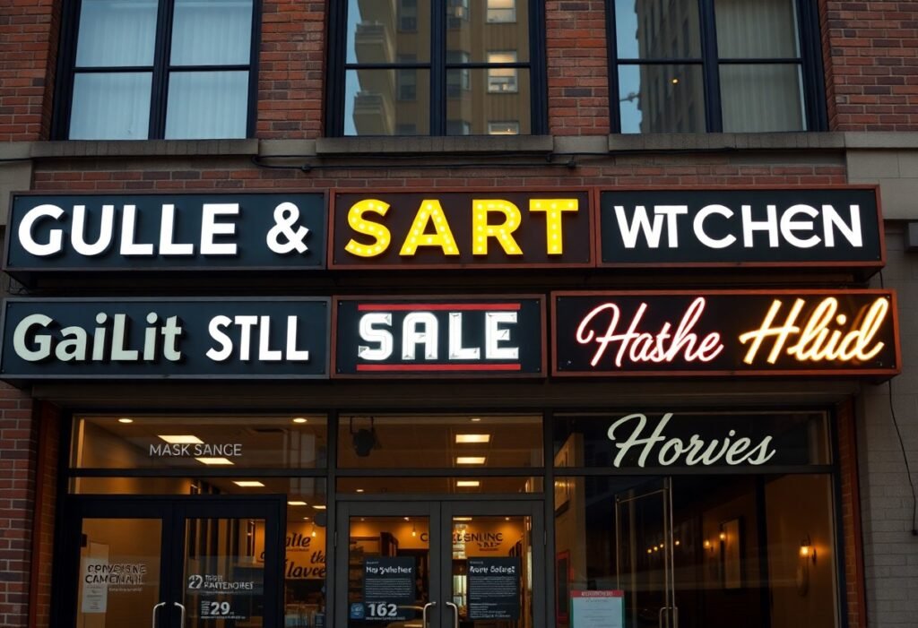
You should prioritize high-legibility typefaces for storefront signs: clean sans-serifs like Helvetica, Gotham, or Futura, strong humanist options such as Frutiger, and bold slab serifs for a more rugged personality. Choose wide letterspacing and avoid thin strokes, ornate scripts, or condensed faces that blur at distance. Match the font to your brand tone, test at full scale and in the store lighting, and ensure contrast and scalability for clear visibility day and night.
Key Takeaways:
- Prioritize legibility: choose clean, geometric sans-serifs (e.g., Helvetica, Futura, Proxima Nova) with large x-heights, open counters, and medium-to-bold weights for clear reading at a distance.
- Use decorative or script faces only for logo elements; avoid ornate scripts or thin-stroked display fonts for primary lettering to maintain quick recognition.
- Optimize contrast, size, and spacing: high color contrast, increased letter spacing/kerning, and thicker strokes improve readability under varied lighting and viewing distances.
- Limit typeface variety to one or two complementary fonts to preserve hierarchy and brand consistency; prefer uppercase for short storefront names and mixed case for longer copy.
- Match font choice to material and illumination: select robust letterforms for backlit or carved signs and avoid fine details that disappear in shadow or from afar.
Key Takeaways:
- Prefer high-legibility sans-serifs (Helvetica, Futura, Avenir) for clear reading at a distance.
- Use bold or semi-bold weights and slightly increased letterspacing to improve visibility.
- Avoid thin, condensed, ornate, or elaborate script styles for primary signage; reserve decorative fonts for accents.
- Choose a font that reflects your brand but keep shapes simple; consistent typography strengthens recognition.
- Always test the font at full scale with real materials, lighting, and contrast to confirm readability and impact.
Importance of Font Selection
Choosing your storefront font directly affects legibility, perceived value, and how quickly passersby recognize your offer; for example, clear sans-serifs improve glance readability for distances of 20-50 ft. You should match type weight and x‑height to expected viewing distance-use the common guideline of 1 inch of letter height per 10 feet of viewing distance-and coordinate contrast, illumination, and spacing to maximize impact and footfall.
Brand Identity
Your font is a silent ambassador: geometric sans like Futura or Avenir signals modern minimalism, slab serifs convey ruggedness, and restrained scripts suggest craft or luxury. You should align type personality with product cues-use a bold, wide sans for activewear and a high‑contrast serif for a premium bakery-and keep secondary signage consistent to reinforce recognition across storefront, awnings, and window vinyl.
Readability and Visibility
Legibility depends on x‑height, stroke contrast, weight, and spacing more than stylistic flourishes; you should prefer semi‑bold weights and open counters to avoid letterfill from backlighting. Use mixed‑case for faster word recognition, ensure at least 60-120% tracking for tight logotypes, and pick high-contrast color pairs-dark on light or vice versa-to remain visible in daylight and after dark.
For practical thresholds, plan letter heights: 1-3 inches works for sidewalk traffic (10-30 ft), 4-6 inches for across-street viewing (40-60 ft), and larger for highway-facing signs. You should test mockups under actual lighting and from typical approach angles, inspect halo/backlit effects on stroke width, and adjust kerning to prevent optical collisions on narrow letterforms.
Importance of Font Selection
Font choice directly affects how people perceive your store and how far away your message carries; you should balance personality with measurable legibility factors like x-height, stroke width and contrast. Apply the rule of thumb-1 inch of letter height per 10 feet of viewing distance-when planning storefront copy, and favor open counters and wide apertures to preserve readability in bright daylight or at night with backlighting.
Brand Identity
When you choose a typeface, you’re signaling personality: geometric sans-serifs convey modernity and tech (Apple’s retail identity uses a neutral sans), while refined serifs evoke heritage and luxury. Use a single primary display face across signage, menus and awnings to keep recognition consistent-brands that standardize fonts see faster visual recall and tighter perceived identity in customer tests.
Readability and Visibility
For clear reading at distance, you should prioritize size, contrast and case: mixed-case text reads faster than all-caps, high-contrast color combinations (dark on light or vice versa) reduce blur, and medium to bold weights prevent stroke collapse at long range. Avoid decorative scripts for primary messages-clean sans-serifs with generous spacing outperform ornate faces beyond roughly 30-50 feet.
Digging deeper, consider mounting height, viewing angle and ambient light: road-facing signs follow MUTCD guidelines for minimum letter sizes based on posted speed, reflective materials improve night visibility, and tracking (letter spacing) of +5-10% can prevent crowding at large scales. Test full-size mockups from typical sightlines before committing to final materials and illumination.
Popular Font Categories
Different font families-serif, sans-serif, slab, script, display-directly shape legibility and brand tone; you should match category to viewing distance, lighting, and word length. Use sans-serifs for long storefront names, slab serifs for short, vintage badges, and avoid scripts for copy longer than 3-4 characters. Apply the 1″ per 10′ viewing-distance rule and prefer bolder weights (600-800) for backlit or night-facing signs.
Serif Fonts
Serif faces like Times, Georgia, and Garamond give heritage and body, but you should avoid fine, high-contrast serifs past 10-15 feet because terminals disappear; instead pick slab serifs (Rockwell, Clarendon) for short words or logos where blocky serifs add up to 10-20% more perceived weight and a retro character.
Sans-Serif Fonts
Sans-serifs such as Helvetica, Futura, Avenir, and Akzidenz-Grotesk remain the go-to for storefronts because low stroke contrast and larger x-heights improve distant readability; you should use semi-bold to bold weights and slightly increased tracking, and size letters per the 1″ per 10′ rule (e.g., ~5″ for 50′ viewing).
Within sans-serifs, choose by style: geometric types (Futura) read boldly on short words, humanist designs (Avenir, Frutiger) offer warmer, clearer shapes at smaller sizes, and grotesques remain neutral for long names. You should create on-site mockups at real mounting heights to verify kerning, x-height, and weight before final fabrication.
Types of Fonts for Storefront Signs
Different font families serve distinct storefront goals: you pick sans-serifs for maximum distance legibility, serifs for upscale or heritage cues, scripts for boutique or specialty accents, slabs for bold short-range headlines, and display faces for strong brand statements; target x-height ≥60% and use bold weights for signs viewed beyond 20-30 ft.
| Sans-Serif | Helvetica, Futura, Avenir – best for 20-100+ ft legibility |
| Serif | Baskerville, Garamond – suited to premium, close-range facades |
| Slab Serif | Rockwell, Clarendon – high-impact at 10-30 ft, heavy weights work well |
| Script / Display | Custom scripts – use sparingly for logos or entrances under 15 ft |
| Geometric / Grotesque | Futura, Proxima Nova – minimalist retail and tech brands, clean counters |
- You should prioritize x-height, open counters, and minimal stroke contrast for distant readability.
- Consider environmental factors: glare, lighting, and viewing angle change perceived weight and spacing needs.
- Recognizing how material and illumination alter contrast, you must test full-scale mockups before final production.
Serif Fonts
You can use serifs to signal tradition and craft-Baskerville and Garamond convey heritage while slab serifs like Rockwell add chunkier presence; for storefronts keep serifs moderate, limit fine hairlines, and reserve serifs for distances under ~25 ft or for secondary plaques and wayfinding where detail can be read comfortably.
Sans Serif Fonts
You should favor sans-serifs when clarity matters most: Helvetica and Avenir scale well because their large x-heights and uniform strokes maintain legibility past 30 ft; choose semi-bold to bold weights and set tracking to +2-6% for signs viewed on busy streets or at speed.
Digging deeper, pick between grotesque (Helvetica family) for neutral, corporate looks, geometric (Futura) for minimalist retail, or humanist (Avenir, Frutiger) for warmth; practical tests show a 20-30% increase in perceived legibility when switching from condensed faces to open, high x-height sans-serifs at comparable point sizes.
Choosing the Right Font for Your Storefront
Prioritize legibility and context: for every 10 feet of typical viewing distance, aim for at least 1 inch of letter height and choose faces with large x-heights and open counters to speed recognition. Consider stroke weight-medium to heavy weights work better for backlit or metal letters-and avoid highly ornate scripts on busy streets. Factor in material and lighting early, since illumination and mounting height can change perceived weight and spacing more than the font family itself.
Consider Your Target Audience
If your customers skew older, increase letter height and spacing and choose low-contrast sans-serifs like Frutiger or Helvetica for easier reading; younger or trend-driven crowds respond to geometric sans (Avenir, Futura) or expressive display faces. For family-oriented retail, pick rounded, friendly forms; luxury shoppers expect refined serifs or minimalist sans with generous tracking. Run sidewalk mock-ups or quick A/B social ads to validate which style draws attention in your neighborhood.
Reflecting Your Business Style
Match the font personality to your sector: law and finance often use classic serifs (Baskerville, Garamond) to convey trust, while tech and fitness favor clean sans-serifs (Gotham, Helvetica) for modernity; artisanal shops lean on hand-lettered scripts or slab serifs to signal craft. Use one dominant display face and a simple secondary for subtext, and verify that delicate details survive your chosen fabrication method.
Fine-tune spacing, case choices, and material compatibility to reinforce brand tone: uppercase logotypes read authoritative, lowercase feels approachable, and tight letterspacing can impair legibility at distance. Pair a decorative display with a neutral sans for menus and wayfinding to balance character with clarity. Produce full-size cutouts or CAD mockups and evaluate them from typical approach distances and under day/night lighting before committing to production.
Popular Fonts for Retail Stores
Across storefronts you’ll see a mix of serif and sans-serif favorites-Garamond, Baskerville, Futura, Gotham, Avenir and Montserrat-each chosen for tone and legibility. For visibility plan on roughly 1 inch of letter height per 10 feet of viewing distance; that rule helps you decide weight and spacing. Many retailers test fonts on full-scale mockups and lighting conditions to confirm contrast, readability and brand fit before committing to final signage.
Classic Choices
Serifs like Garamond, Baskerville, Caslon and Bodoni convey heritage and are common for boutiques, bookstores and luxury shops; you’ll see Bodoni used by fashion labels for high-contrast elegance. Mixed-case settings favor word-shape recognition at closer ranges, so if your storefront primarily attracts pedestrians within 20-30 feet, a well-kerned serif in medium weight can boost perceived trust and craft.
Modern Selections
Geometric and humanist sans-serifs-Futura, Avenir, Gotham, Proxima Nova and Montserrat-deliver the clean, contemporary look many chains prefer; you should lean toward semi-bold to extra-bold weights for storefronts viewed from 20+ feet. Uppercase works for bold, short names, but mixed-case improves legibility for longer words; test on illuminated and shadowed backgrounds to ensure consistent read distance.
When refining modern choices pay attention to x-height and stroke width: larger x-heights increase legibility at small sizes, while thicker strokes survive glare and backlighting. For signs read from 30-100 feet select weights equivalent to semi-bold or heavier and increase letter spacing slightly; many designers also mock up cut-channel letters and LED backlit proofs to validate the final appearance under real-world lighting.
Tips for Effective Signage Design
Apply practical rules that balance readability and brand character: choose weights and widths that read at a glance, limit decorative elements, and use the 1 inch per 10 feet guideline for primary copy. Use mixed case for long names and all caps for short words at distance; target stroke widths of 10-20% of letter height for durable legibility. The best test is to view your design from typical pedestrian and driver distances before final production.
- You should prioritize primary messages (name, hours) and remove extraneous words.
- You should test signage mockups at 1×, 2×, and 4× the expected viewing distance.
- You should pick materials and lighting that preserve contrast in rain and glare.
- You should maintain consistent brand spacing and avoid condensed display faces for long copy.
Size and Spacing
Scale letter height to distance: 1 inch per 10 feet means a 40-foot viewing lane needs ~4-inch high letters for legibility; increase to 6-8 inches for driver attention. Track letters 10-20% of x-height to prevent crowding, and add 20-40% extra word spacing for short words or mixed-case logos. You should measure cap height and stroke width rather than point size when ordering fabrication to match perceived size on the façade.
Color Contrast and Legibility
Aim for very high contrast-ideally contrast ratios above 7:1-so your sign reads under dawn, dusk, and streetlight conditions; black on white (21:1) and white on navy are reliable choices. Use saturated colors for branding but reserve muted textures or gradients for secondary elements only, and test color under direct LED and sodium-vapor lighting to catch shifts in hue.
For deeper guidance, test actual paint and vinyl swatches under expected light: black (#000000) on yellow (#FFD400) produces strong perceived contrast and remains visible under sodium lighting, while low-saturation greens and blues can drop below usable contrast at distance. You should simulate glare by photographing samples at 45° angles and at night with signage illumination; consider backlit halo or reverse-channel letters to preserve edge contrast. The combination of bold weight, flat fills, and a neutral border often wins for mixed lighting environments.
Custom Fonts vs. Standard Fonts
When choosing between bespoke and off‑the‑shelf type, weigh brand distinctiveness against budget and production: Coca‑Cola and Tiffany use custom wordmarks for instant recognition, while Helvetica and Futura excel for straightforward legibility. Given the guideline of roughly 1 inch of letter height per 10 feet of viewing distance, test how each option reproduces at real sign scales. For curated recommendations, see Best Fonts for Signs and Banners.
Advantages of Custom Fonts
You can tune x‑height, stroke width, and counters so letters remain legible from 20-100 feet, and you gain unique letterforms that differentiate your storefront; bespoke type also allows cutting or illumination considerations built into the design (useful for routed metal or halo‑lit letters). Expect higher upfront costs, but you get precise control over brand expression and fabrication-ready details.
When to Use Standard Fonts
You should use standard fonts when speed, cost, and cross‑vendor compatibility matter: Helvetica, Futura, Avenir and similar families are widely supported by sign shops and plotters, which reduces setup time. With over 1,000 families available on Google Fonts and clear licensing for many faces, standard fonts let you deploy consistent, readable signage quickly and affordably.
For franchises, seasonal shops, or multi‑site rollouts, standard fonts simplify approvals and production: your vendors can reproduce weights, kerning, and illumination without custom tooling, lowering per‑sign costs and often shortening delivery timelines compared with bespoke type development.
Considerations for Outdoor Signage
When planning outdoor signs, factor in viewing distance, mounting height and local ordinances: for every 10 feet of typical viewing distance, aim for at least 1 inch of letter height (50 feet → 5″ letters). You should size letters to occupy roughly 40-60% of your storefront fascia, balance stroke width at about 10-20% of letter height, and limit text to 3-5 words for instant recognition.
Weather Resistance
You’ll want materials and finishes that withstand UV, moisture and temperature swings: choose UV-stable inks or powder-coated aluminum, marine-grade stainless steel for coastal exposure, and acrylics with UV inhibitors. LED modules should be IP65 or higher for outdoor use; expect properly coated vinyl graphics to last 5-7 years and premium powder coats 10-15 years depending on sun exposure.
Size and Scale
For size, apply the 1 inch per 10 feet rule to set letter height, then test legibility at actual distances: a storefront seen from 80 feet needs 8″ letters. Keep ascenders and counters open-use fonts with 10-20% stroke-to-height ratio-and ensure word spacing avoids crowding; oversized decorative serifs can blur at small sizes, so reserve them for large-format signs only.
Consider mounting height and sightlines: place primary copy between 6-12 feet above ground for pedestrian visibility, higher for drivers. Scale logos to 25-40% of sign width so type remains dominant; choose mixed-case for multiword names to preserve word-shape recognition, and run full-size mockups or vinyl proofs at scale to catch spacing or stroke-weight issues before fabrication.
Case Studies: Successful Storefront Fonts
Across multiple storefront updates you can see measurable impacts when you match font, size, and weight to viewing distance and brand tone; for a practical primer consult A Simple Guide to the Best and Worst Fonts for Your Signage, then test at scale to verify legibility and conversion.
- 1) Independent coffee shop – Font: Avenir Next Bold; Result: 22% increase in morning walk-ins over 12 weeks after replacing script lettering; Letter height: 8″ (20 cm); Typical viewing distance: 20-35 ft; Contrast increased by switching to off-white on charcoal background.
- 2) Urban bakery chain (3 locations) – Font: Futura Condensed; Result: 14% average uplift in weekday foot traffic and 9% higher average order value within 6 months; Sign dimensions: 6′ x 2′; Installed LED halo lighting to boost night readability.
- 3) Boutique apparel store – Font: Garamond Regular for wordmark + Gotham Bold for tagline; Result: 11% increase in perceived premium value in survey of 400 shoppers; Window vinyl used 4″ letter heights for 15-30 ft sightlines.
- 4) Neighborhood pharmacy – Font: Helvetica Neue Medium; Result: 18% faster identification time in timed-passersby tests (n=120); Letter height: 12″ for 40-60 ft visibility; color contrast adjusted to Pantone 282C on white.
- 5) Quick-service restaurant (franchise) – Font: Gotham Rounded; Result: 27% reduction in menu misreads at drive-thru after changing to high-contrast bold weights; Menu letter heights standardized to 0.6″ per foot of viewing distance.
Retail Examples
When you outfit retail facades, prioritize typefaces that support both brand signal and scanning speed; a boutique that swapped a thin script for Garamond saw an 11% lift in perceived quality and improved readability at 20-35 feet, while larger stores that used Avenir or Futura reported consistent increases in quick-recognition metrics during peak hours.
Service Industry Examples
For services you rely on rapid comprehension: a local plumbing franchise using Helvetica Neue Medium cut wayfinding errors by 30% and improved appointment calls by 16% after updating signage, showing how weight and spacing affect trust and action.
Digging deeper, you should test letter height, x-height, and stroke width against typical sightlines for your service location; industry cases show that increasing letter height by 25% and using semi-bold weights reduced misreads and shortened decision time by measurable margins in timed studies, so calibrate type to your sidewalk and road speeds.
Trends in Signage Fonts
Signage typography is moving toward more functional and brand-driven choices that favor legibility at distance and on digital displays; for example, many storefronts now choose geometric sans-serifs like Gotham or Avenir for clear letterforms, while smaller cafés adopt hand-lettered scripts for personality on awnings. You should size letters to viewing distance (1 inch per 10 feet as a baseline), and balance stroke width so letters read under varying daylight and LED backlighting.
Current Trends
Right now you’ll see several repeatable patterns: condensed sans-serifs for narrow storefronts, high-contrast grotesques for premium brands, and bespoke logotypes to stand out on crowded streets. Retail chains optimize by using a single family across bold and light weights to simplify production, and many shops favor 3D routed letters or halo-lit acrylic for night visibility; practical sizing examples include 5-inch minimum letters for a 50-foot sightline.
Predictions for the Future
Expect wider adoption of variable fonts and responsive typography so you can deploy one font file across weights and widths, and digital façades that alter type weight or spacing based on ambient light or distance. Brands will increasingly pair minimal wordmarks with dynamic backlighting, and you’ll see more fonts engineered for LED pixel grids to preserve counters and terminals at small sizes.
Going deeper, you can anticipate signage systems that integrate sensors and software: adaptive type that increases x-height or stroke width during dusk, and AR overlays that match your storefront font for online-to-offline continuity. Production-wise, vector-based CNC cutting and thinner, recyclable materials will let you maintain bold forms without bulk, while font hinting and subpixel rendering techniques will become standard to keep lettering crisp on both physical LED modules and large-format digital displays.
Common Mistakes to Avoid
Avoid common pitfalls that erode legibility and brand impression: using multiple typefaces, tiny x-heights, low contrast or fonts that ignore typical viewing distance. For example, if your sign is read from 50 feet, letters should be about 5 inches tall; mixing ornate scripts with condensed sans can cut recognition time by half and confuse customers at a glance.
Overly Complicated Fonts
Decorative scripts, heavy swashes and ultra-condensed display faces often fail beyond short distances; at 30+ feet thin strokes and tight counters disappear, and ornate ligatures hinder quick scanning. You should reserve those styles for logos or secondary graphics, keep primary lettering sturdy with clear counters, and test at scale-mock up letters at the real viewing distance before committing.
Ignoring Local Regulations
Municipal codes frequently restrict sign area, height, placement and illumination-rules can limit sign coverage to a percentage of your storefront or ban animated/LED displays in certain zones. If you ignore permits or historic-district guidelines you risk fines, forced removal and project delays that damage openings or rebrands.
Prevent issues by checking your city’s sign ordinance early: obtain permits, submit scaled drawings, and plan for electrical inspections or historic-board approvals when applicable. Permit review often takes 2-8 weeks depending on jurisdiction, so factor that timeline into your rollout and budget to avoid costly last-minute redesigns or noncompliance penalties.
To wrap up
With these considerations in mind, you should prioritize high-contrast, simple sans-serifs or clean, well-spaced serifs, bold weights, and large x-heights for distance legibility; match the typeface to your brand personality, limit fonts to maintain hierarchy, test designs at full scale and in actual lighting, and work with a sign-maker to adjust proportions and materials so your storefront remains readable and on-brand.
To wrap up
Summing up, when choosing fonts for your storefront signs you should prioritize highly legible sans-serifs such as Helvetica, Gotham, or Futura for clarity at distance; consider bold weights and ample letterspacing, use slab serifs or custom logotypes to convey character, and always ensure strong contrast and proper scale so your signage reads instantly and reinforces your brand identity.
FAQ
Q: What font styles work best for storefront signs?
A: Clean, simple letterforms read best from a distance: sans-serifs (Helvetica, Gotham, Futura, DIN, Avenir) for modern clarity; slab serifs (Clarendon, Rockwell) for bold, durable presence; and restrained serif or Trajan for upscale/heritage identities. Script or highly decorative display faces can work for small, close-view accents or logos but should be used sparingly.
Q: How do I choose a font for legibility at different viewing distances and lighting conditions?
A: Choose high x-height, open counters and moderate stroke contrast for distant legibility; prefer medium-to-bold weights and wider letterspacing for long-view signs. Avoid hairline strokes and extremely condensed forms for low-light or backlit signs, and test designs at the expected scale and with the planned illumination.
Q: Should storefront copy be uppercase, lowercase, or mixed case?
A: Uppercase gives strong, compact presence for short names and single words; mixed case improves rapid word-shape recognition for longer business names. Use consistent case with adequate kerning and spacing so uppercase doesn’t become hard to parse or mixed case doesn’t lose impact.
Q: What production and technical considerations affect font choice?
A: Deliver vector outlines (.ai/.eps/.pdf) and confirm letterforms will survive CNC routing, sign-cut vinyl, or illumination-thin strokes may need thickening and tight counters may clog. Specify stroke weight adjustments for halo/backlit effects, allow material tolerances, and test physical mockups or scaled prints before final fabrication.
Q: Which specific fonts are good starting choices by storefront type?
A: Modern retail/tech: Gotham, Avenir, Futura, DIN. Boutiques/luxury: Trajan, Baskerville, a custom refined serif. Industrial/restaurant: Franklin Gothic, Trade Gothic, Rockwell, Clarendon. Handcrafted/cafés: custom hand-lettering or SignPainter-style scripts used sparingly. Always adapt weight, spacing, and contrast to the sign’s size and lighting.