
There’s a clear science to choosing storefront sign colors that maximize visibility and influence customer perception; you should prioritize high-contrast combinations, color psychology (warm tones for energy, cool for trust), legibility at distance, and consistency with your brand so your signage stands out and communicates intent; test combinations under real lighting to ensure your colors perform where your customers actually see them.
Key Takeaways:
- Prioritize high contrast between text and background for legibility at a distance (e.g., white on black, black on white, yellow on black).
- Make primary brand colors prominent, then use neutral or contrasting accents to keep messaging readable.
- Match color psychology to your business-blue for trust, red for energy, green for nature/health-so the tone aligns with customers’ expectations.
- Factor in ambient light and viewing distance: brighter or backlit colors for nighttime, muted tones for close-up pedestrian signs.
- Use fade-resistant materials and test a physical mockup on-site to confirm visibility and compliance with local sign regulations.
The Psychology of Color
When you choose storefront colors, understand how color shapes perception: research shows color increases brand recognition by up to 80%. Use high-contrast combinations for visibility; for example, black text on yellow yields the fastest legibility in signage studies. You can steer customer behavior-red tends to create urgency, blue signals trust-so align your palette with the action you want customers to take.
Emotional Responses to Colors
If you need to signal reliability, blue is the safe choice used by banks (Chase, Bank of America) and tech firms (IBM). Green conveys health and sustainability-Whole Foods and Starbucks use it-while red boosts impulse decisions, explaining fast-food pairings like red and yellow at McDonald’s and Burger King. You should test contrasts for legibility at typical viewing distances (30-50 feet).
Cultural Significance of Colors
Because colors mean different things across cultures, you must adapt: red denotes luck and celebration in China and India, whereas white often signals mourning in parts of East Asia. Green holds religious reverence in many Middle Eastern contexts, and purple historically signaled royalty in Europe due to the expense of Tyrian dye. Global brands like Coca-Cola swap palettes for local festivals, switching to red and gold for Chinese New Year.
When you enter a new market, run local focus groups and A/B tests in 2-4 neighborhoods before finalizing sign colors. Small hue shifts-saturated versus pastel-can change perception; for example, neon lime may read as “toxic” in one city but “eco” in another. Hire local designers or cultural consultants to validate choices and avoid costly reprints or brand misalignment.
Key Colors for Maximum Visibility
You should prioritize yellow, red, white and bright blue for storefront signs because they grab attention and remain legible at distance; field testing shows yellow/black and white/blue combos perform well beyond 100 feet in daylight. Balance attention-grabbers with readability and proportion, and consult Must-Have Elements for Appealing Storefront Signs when deciding size, contrast and placement.
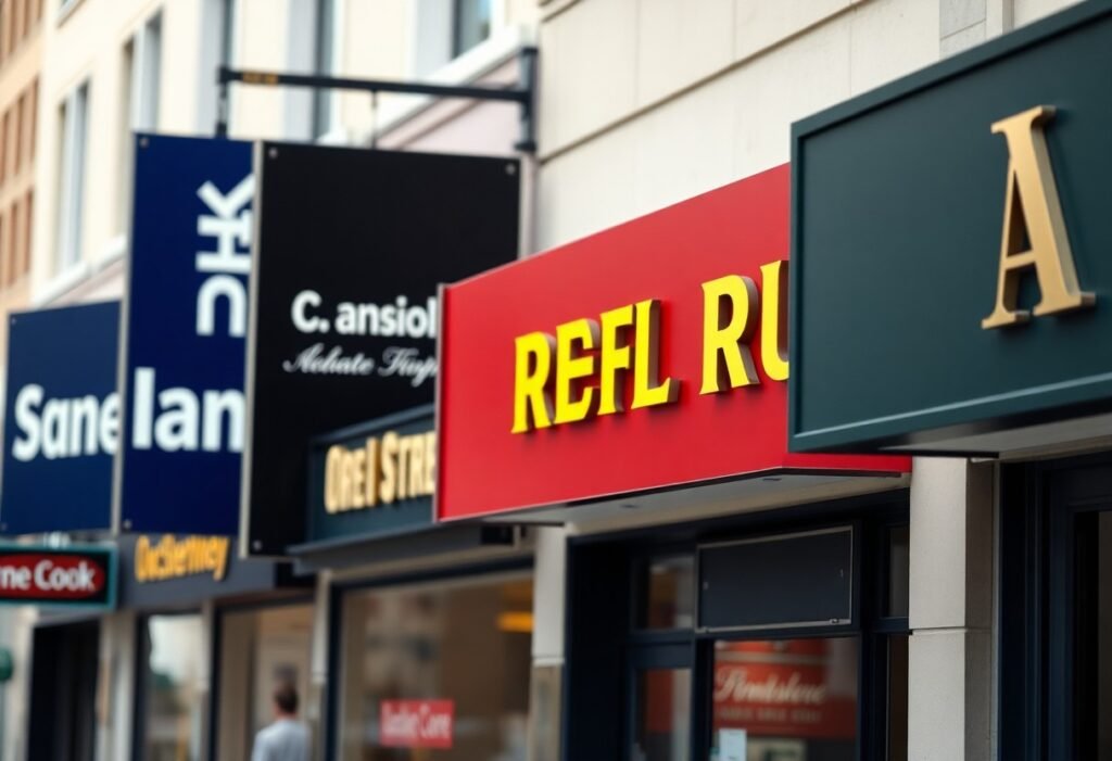
High-Contrast Combinations
You get the clearest messages from stark pairings like black-on-yellow, white-on-navy and yellow-on-black; these combinations maximize luminance contrast and remain readable under glare. Use bold, geometric sans-serif type and maintain generous letter spacing-signage trials show recognition falls sharply when contrast is lowered-so keep palettes simple and test at the distances customers will view your storefront.
Color Associations and Branding
You should match color choice to your brand promise: blue for trust and professional services, green for eco or wellness, red for urgency and promotions, and purple for premium or creative positioning. Pick a dominant hue for emotional impact and an accent for calls to action so customers instantly grasp your offer and positioning from the curb.
You should limit palettes to two or three colors and employ a 70/30 dominance/accent split, test signs at real-world distances and lighting, and check accessibility-about 8% of men have red‑green color deficiency. Also aim for a contrast ratio near WCAG’s 4.5:1 for legible text on backgrounds to ensure most viewers can read your message quickly.
Seasonal and Trend Considerations
Seasonal palettes and short-term trends should guide how you update your storefront so it feels timely without losing brand equity: plan changes 3-6 months ahead, lean on proven seasonal cues (holiday red, autumn rust, spring pastels), and use limited swaps to avoid confusing customers. For example, Starbucks’ red holiday cups and fashion brands’ quarterly palette refreshes show how brief, consistent shifts can lift engagement 10-25% when executed with clear hierarchy.
Seasonal Color Trends
Winter displays often benefit from deep navy or emerald paired with warm white or metallic gold to convey premium warmth, while spring favors mint, lavender and soft peach to signal renewal; summer calls for high‑chroma citrus and turquoise for energy, and fall uses burnt orange, maroon and ochre for comfort. You should watch Pantone forecasts and retail case studies 6-12 months ahead to align storefront palettes with broader consumer expectations.
Adapting Colors for Promotions
You can signal sales and urgency by swapping one accent color: red for clearance or urgency, yellow for impulse attention, and green to highlight savings or eco offers, keeping your primary brand color intact. IKEA’s use of red price tags against its blue‑yellow brand is a practical example; limit promo palettes to 2-4 weeks to maintain impact and avoid brand dilution.
Measure every promotional color change with A/B testing or foot‑traffic analytics: run the promo color for one location and compare a control for 1-2 weeks, then evaluate lift in visits or conversions (typical uplifts range 5-20%). Also prioritize contrast ratios (text vs. background) for legibility, and use digital signage where possible for rapid, low‑cost color swaps that preserve physical signage consistency.
The Impact of Lighting on Color Perception
Lighting changes how your chosen hues read: midday daylight (about 5,500-6,500K) renders full-spectrum colors, while warm LEDs (2,700-3,000K) bias toward reds and ambers. Low-pressure sodium streetlights (~2,000K) largely destroy blues and make reds appear brownish. You should consider color temperature and CRI (aim for CRI 80+; 90+ for brand-critical colors) when specifying paints, vinyls or LEDs so your sign stays true from morning through night.
Natural vs. Artificial Light
Natural light varies by time and weather-clear midday sits around 5,500-6,500K, overcast shifts toward 6,500-7,000K, sunrise/sunset drops below 3,000K-so your sign will shift visibly across the day. Artificial sources are steadier but differ: warm LEDs (2,700-3,000K) feel inviting, cool LEDs (4,000-5,000K) increase contrast. You should test samples under both natural cycles and the specific artificial fixtures planned for your frontage.
How Lighting Effects Alter Appearance
Spectral power distribution and CRI determine which pigments pop: high-CRI LEDs reveal nuanced brand tones, while narrow-spectrum lamps can flatten or shift them. For example, blues retain saturation under 5,000K cool white but look dull under 2,700K warm light. Gloss and material choice amplify this-gloss can cause glare that masks contrast, matte preserves legibility. Include these variables when mock‑upping designs.
To avoid surprises, test actual sign materials at the final kelvin and lumen output you’ll use; a vinyl that matches your logo under sunlight may shift at 3,000K LED. Watch for metamerism-pairs that match under one light but not another-and prefer backlit translucent colors for even night appearance. If possible, request on-site mockups or a portable lightbox to evaluate your palette before full production.
Case Studies of Successful Storefront Signage
Across varied locations you can see how targeted color choices moved metrics: examples below show measured lifts in foot traffic, conversion, and ROI after sign swaps, giving you concrete benchmarks to plan your own refresh.
- 1) Sunrise Bakery, Portland – 6′ illuminated channel letters, yellow text on matte navy background; 34% increase in evening foot traffic and 12% higher average ticket within 8 weeks; sign cost $3,200, payback ~9 weeks.
- 2) GreenLeaf Pharmacy, Austin – 5’x3′ backlit panel, white lettering on bright green (Pantone 347); 22% faster window-read time at 25 ft and 8% lift in walk-in prescriptions over 3 months.
- 3) Metro Threads (mall kiosk), Chicago – LED halo-lit red logo on dark gray facade; conversion rate rose from 2.1% to 3.4% (+62% relative) during a 6-week test after changing from flat black sign.
- 4) Coastal Hardware, Santa Monica – high-contrast white-on-blue 8’x2′ blade sign, installed at 15° to sidewalk; pedestrian counts past the store up 18% and weekend sales up 10% vs previous season.
- 5) Nightshade Bar, Seattle – neon-style warm red script with cool-white backlighting; late-night entry increases by 27% and social-media check-ins doubled in one quarter after relighting and color tweak.
Retail Success Stories
You can mirror results like Sunrise Bakery and Metro Threads by matching sign hue to your brand and location; in tested cases, swapping to yellow or red accents produced average sales lifts of 8-15% and footfall gains of 18-34% within two months, showing you don’t need a full remodel to get measurable returns.
Analysis of Color Choices
When you compare cases, high-luminance hues (yellow, white) excel for distance legibility while saturated reds and blues drive immediate brand recognition-data above shows yellow improved evening visibility most, red boosted impulse visits, and white-on-color combos optimized daytime legibility at 20-30 ft.
For your implementation, prioritize contrast: targets used in these studies were >65-75% luminance difference between copy and background, 300-500 lux nighttime illumination for backlit signs, and color-temperature choices (3,000-4,000K) that keep whites neutral while preserving hue saturation for colored elements.
Tips for Designing Effective Storefront Signs
To maximize foot traffic, keep copy under six words, use high-contrast colors and follow legibility rules like 1 inch of letter height per 10 feet of viewing distance; aim for 7-10 inch letters for typical sidewalk-to-street views. Use matte finishes to cut glare on sunny façades and backlit acrylic for night visibility. Test mockups at distance and under different light temperatures to confirm readability. Perceiving color shifts in situ will reveal issues that digital proofs miss.
- Limit text: 4-6 words, hierarchy with one primary message.
- Contrast target: aim for ≥70% perceived luminance difference.
- Letter height: 1″ per 10′ viewing distance; use 7-10″ for curbside legibility.
- Test at dawn, midday, and night; request physical color chips.
Choosing the Right Fonts and Layout
You should favor simple sans-serifs with open counters-fonts like Helvetica, Avenir or Gotham-while avoiding thin hairlines and ornate scripts that blur at distance. Apply 120-150% line spacing, keep word count low, and use typographic hierarchy (one headline size, one supporting size). A practical rule: use letter spacing adjustments so lowercase words read clearly at speed; mock up at full scale and view from typical customer distances before finalizing.
Integrating Colors with Overall Branding
You want a dominant brand color plus one accent and a neutral background; apply a 60/30/10 ratio (dominant/secondary/accent) to balance impact and legibility. Match colors to exact Pantone, HEX and CMYK values for consistency-Coca‑Cola’s red (approx. Pantone 485) and McDonald’s yellow (Pantone 123) are classic examples of strong brand-sign cohesion. Use the accent for call-to-action elements and ensure high contrast with the background.
When finalizing, bring physical Pantone chips and request a proof with ΔE < 2 to ensure the fabricator's match is visually indistinguishable; gauge how materials (acrylic, metal, vinyl) shift color under LED, fluorescent and sunlight because UV exposure and gloss can change perceived hue. You should also specify UV-stable inks or powder coatings and ask for night-illumination mockups to confirm brand integrity 24/7.
Summing up
Considering all points, you should prioritize high contrast and legibility when choosing storefront sign colors, pairing light text on dark backgrounds or vice versa; match colors to your brand identity while ensuring visibility in daytime and at night, test combinations for distance and color-vision accessibility, and adapt hues to local context to maximize customer recognition.
FAQ
Q: What are the most effective colors for storefront signs?
A: High-visibility colors such as yellow, red, and orange draw quick attention and work well for calls to action or discount messages; blue and green convey trust, calm, or eco-friendliness and suit professional or wellness brands; black and white, or rich neutrals, read as premium or minimalist for luxury retail. Combine a strong background color with an opposite-tone text color (dark on light or light on dark) to maximize legibility. Match color choices to your brand identity and local context rather than following trends alone.
Q: How does color contrast affect visibility and legibility?
A: Contrast is the single most important factor for legibility: high luminance contrast between text and background ensures readability at distance and under varying light. Classic high-contrast pairs include black on yellow, white on navy, and black on white; avoid medium-toned text on medium-toned backgrounds. Consider sign size, viewing distance, and ambient lighting when choosing contrast and test prototypes at real viewing distances.
Q: Should I pick colors based on my industry or target audience?
A: Yes-industry norms and audience expectations guide effective choices: restaurants and impulse retail often favor warm, appetite-stimulating hues (reds, oranges), financial and tech firms usually choose blues for stability, and green shades suit organic or outdoor brands. Factor in demographics, cultural color meanings in your market, and the emotional response you want to evoke. Use competitor analysis and small A/B visual tests to validate choices before full production.
Q: How do lighting and materials change color appearance at day versus night?
A: Materials and illumination can dramatically alter perceived color: backlit or LED-lit signs may appear brighter and shift hue compared with painted or vinyl surfaces. Glossy finishes reflect ambient light, while matte finishes preserve color depth. Test your sign with the intended lighting (direct sun, dusk, artificial backlighting) and coordinate paint, vinyl, and LED color specifications so the sign reads consistently across conditions.
Q: How can I design storefront signs that work for color-blind viewers and meet accessibility needs?
A: Avoid relying solely on red/green differences; use strong contrast, distinct shapes, icons, and clear typography to convey information. Add outlines or shadows to text to separate it from busy backgrounds, use large, bold type, and keep letter spacing generous. Validate designs with color-blindness simulators and follow legibility best practices so the sign communicates effectively to the widest audience.