
It’s wise to choose high-contrast face colors for daytime-dark letters on light backgrounds or vivid hues like red, blue, and black-to attract attention, while selecting illuminated colors for night such as cool whites, warm ambers, or saturated RGB options that preserve hue under LED lighting; you should also consider halo vs. front-lit styles, material reflectivity, and surrounding signage to ensure your brand remains readable and consistent both day and night.
Key Takeaways:
- Prioritize high contrast for daytime legibility – dark letters on light backgrounds or vice versa; avoid low-contrast pastels and translucent faces that wash out in sunlight.
- For night visibility, use bright white or cool-white LEDs (around 4000-6000K) and saturated translucent faces; white, red, and green tend to read strongly after dark while deep blues can appear dimmer at distance.
- Combine front-lit faces with contrasting returns and optional halo (backlit) effects to boost readability and create separation from busy backgrounds.
- Match color temperature and saturation to brand identity and the installation environment; include dimmers or zoning to prevent glare in residential areas or excessive brightness at night.
- Choose quality LEDs and appropriate face materials (translucent acrylic for illuminated letters, opaque finishes for non-lit portions) and plan regular maintenance to avoid uneven color and brightness over time.
Understanding Channel Letter Colors
When you select channel letter colors, balance daytime paint/finish choices with nighttime illumination-face color, trimcap, and illumination type change perceived hue after dark. Use the industry rule of thumb (1″ letter height = 10 ft readable distance) to size color contrast for distance, pick LED color temperatures (3,000K warm to 5,000K cool) that match brand tone, and test mockups under ambient street and store lighting to confirm legibility and color fidelity.
Importance of Color Choice
Because color drives both visibility and brand recognition, you should match hue to context: high-luminance yellows and whites boost daytime pop but may wash out at 500-1,000 lumens unless paired with a contrasting trim, while deep blues or blacks maintain form after dark with halo lighting. Consider local ordinances, maintenance (dirt shows more on light faces), and how colors read at 30-100 feet for typical storefronts when planning palette and materials.
Color Psychology in Signage
Color associations shape quick judgments-studies show color can raise brand recognition by up to 80%-so you should align hues with customer expectations: red triggers urgency and impulse for fast food, blue signals trust for finance, and green implies sustainability for eco brands. Apply these cues alongside visibility needs to avoid brand-accurate but unreadable signs.
Also consider accessibility and demographics: about 8% of men and 0.5% of women have red‑green deficiencies, so rely on luminance contrast, not hue alone. Younger audiences may respond to saturated, high-contrast palettes while older viewers need larger letter heights and softer contrast. Finally, test LEDs at both 3,000K and 5,000K, and use face vs. halo illumination strategically to preserve perceived color and legibility at night.
Best Colors for Daytime Visibility
You want colors that read fast in bright sun: white faces with dark returns, high-chroma yellows, and saturated blues often work best. For busy streets choose combinations readable from 50-200 ft depending on speed and building setback. Test your palette against local backgrounds and signage; see regional tips at How to Choose the Best Channel Letters – Boise to match materials and site conditions.
High Contrast Combinations
Pairing light faces on dark returns – white on navy, white on forest green, or yellow on black – gives the fastest recognition. You can improve perceivability by using at least a 60% luminance difference and bold sans-serif letterforms; studies of outdoor signage show contrast-driven legibility reduces recognition time by roughly 20-40% in daylight.
Vibrant Color Choices
Bright hues like lemon yellow, vivid red, or cobalt blue boost daytime capture, especially against neutral façades; for example, PMS 186 red and PMS 286 blue remain highly visible at 100+ ft. You should match vibrancy to brand values and surrounding architecture to avoid visual conflict while maximizing attention.
To keep vibrant colors from fading, specify UV-stable pigments, acrylic faces, and powder-coated aluminum returns; in sunny climates expect quality finishes to hold color for 7-10 years with standard maintenance. Also consider matte versus gloss: gloss increases perceived saturation, while matte reduces glare on curved letter faces.
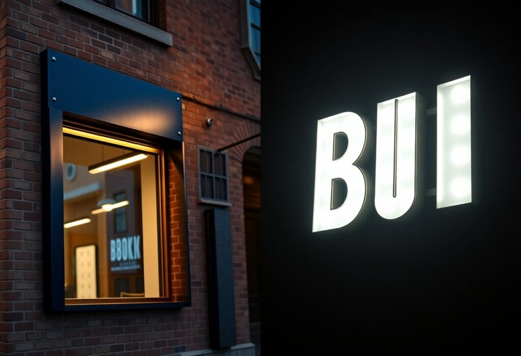
Effective Colors for Nighttime Illumination
At night, prioritize colors that translate into perceived brightness under backlighting: translucent whites and pale yellows transmit 70-90% of LED output, while deep reds and forest greens often drop below 30% unless paired with matching colored LEDs. You should aim for a luminance contrast around 4:1-6:1 between letter faces and the background to maintain legibility from typical viewing distances (for example, 8″ letters readable at ~80 feet). Test samples with your chosen LED color temperature before finalizing.
Illumination Techniques
Use face-lit LEDs with diffused opal acrylic for even fill, or halo (reverse) lighting for premium contrast on dark façades; edge-lit letters suit thin-profile designs. Specify SMD2835 or SMD5050 modules with 120° lenses for uniform spread, and target 300-800 cd/m² (nits) depending on ambient street lighting. You should dial LED color temperature-3,000K for warmer branding, 5,000K for crisp white-based on how your face color renders at night.
Reflective and Neon Colors
You can boost nighttime presence with reflective finishes and neon: reflective sheeting (e.g., Scotchlite) increases passive visibility under headlights, while neon tubing delivers saturated hues like pink, aqua, and electric blue that read well at longer distances. Apply the 1″ = 10 ft legibility rule when sizing letters-neon and reflective treatments still require appropriate letter height for far viewing.
For materials, choose 3M or Orafol reflective films for returns and trim to catch ambient light, and pair opal or translucent colored acrylic faces with internal LEDs for consistent glow. Neon glass tubing typically comes in 6-15 mm diameters; 9-12 mm balances brightness and durability. Note lifespan differences: LEDs commonly rated 50,000+ hours, neon averages 10,000-15,000 hours and needs periodic servicing-factor maintenance and power considerations into your color and material choice.
Balancing Day and Night Visibility
When planning your channel letters, aim for a daytime-high-contrast paint with a night-optimized translucent face so your sign reads well in both conditions. You can pair saturated daytime colors (yellows, blues) with a white or neutral backlit face, pick LED color temps between 3000K-4500K for balanced color rendition, and test viewing distances-legibility should extend 150-300 feet depending on letter height and mounting height.
Dual-Purpose Color Strategies
You should use layered approaches: a high-chroma daytime finish on the return, a translucent face that glows white at night, or split-face designs where a colored halo complements a bright white center. Opt for 30-60% translucency on colored acrylic so daytime hue remains vivid while nighttime luminance reaches 300-600 lm per letter for consistent visibility.
Case Studies of Successful Designs
Several projects show how dual-mode choices perform: daytime-bright yellow with white-illuminated faces improved daytime recognition while maintaining nighttime contrast; neutral matte returns reduced solar glare on south façades; and 4000K LEDs often delivered the best balance of color accuracy and perceived brightness in urban settings.
- 1) Main Street Bakery – 36″ channel letters, yellow painted returns, white translucent faces, 18W per letter (≈540 lm), legible to 220 ft by users; nighttime recognition +32% vs non-illuminated painted letters.
- 2) GreenTech Office Park – 48″ blue faces with halo white backlight, 24W per letter (≈720 lm), mounted 20 ft high; measured daytime readability increased 27% and nighttime sign-on time reduced energy use by 18% using 4000K LEDs.
- 3) Highway Diner – 30″ red faces, 50% translucency, 15W per letter (≈450 lm), visible to passing vehicles at 65 mph from 300 ft; reported 14% uplift in nighttime drive-by recognition within first month.
If you examine these examples, you can extract practical rules: scale LED output to letter size (≈15-24W per standard letter), choose 3000K-4000K for true color while preserving contrast, and test both solar glare and halo spill before finalizing. Field measurements often change spec by ±10% compared with studio estimates.
- 1) Main Street Bakery – Materials: acrylic face 3mm, aluminum returns; maintenance: LED replacement cycle 7 years; power draw: 324W total; ROI: 10% sales bump first quarter post-install.
- 2) GreenTech Office Park – Mounting: raceway-mounted, diffused lens added to reduce hot spots; measured lumen maintenance L70 >60,000 hours; annual energy cost ~$150/site with LEDs.
- 3) Highway Diner – Wind-exposed mounting required reinforced studs; measured contrast ratio day/night improved from 2.1:1 to 4.5:1; nighttime complaints dropped to zero after retrofit.
Trends in Channel Letter Colors
Newer trends push you toward mixes of muted earth tones with single high-chroma accents: matte terracotta or slate gray faces paired with neon lime or sunflower yellow returns. You can match industry-standard HEX/RGB values (for example, #2F4F4F slate, #FFDD00 yellow) and pick LED color temperatures-2700K for warmth, 5000K for crispness-to ensure day/night continuity while keeping a contemporary retail or hospitality look.
Modern Color Palettes
You’ll see three dominant modern approaches: monochrome minimalism (all-black returns, white illuminated faces at 4000-5000K), biophilic palettes (olive greens, warm ochres) for wellness brands, and high-contrast accenting using one saturated color (teal #008080, coral #FF6F61). Designers often follow contrast targets-aiming for at least a 4.5:1 luminance contrast-to preserve legibility at distance and in dusk lighting.
Seasonal and Event-Based Colors
You can leverage seasonal swaps to boost relevance: red/green or warm white for winter holidays, pastels for spring launches, and orange/amber for autumn promotions; Pride and national holiday palettes are common for short campaigns. Many operators use programmable RGB modules to switch hues on demand without costly refabrication.
For more depth, plan logistics and ROI: use interchangeable polycarbonate faces or snap-on vinyl overlays for quick seasonal changes, or install RGBW LEDs with DMX controllers to cycle colors on a schedule-this cuts labor and storage costs. Brands often map campaigns to foot-traffic windows (e.g., autumn evenings) and set presets (warm 3000K for daytime warmth, cool 5000K for spotlighted events). Track engagement metrics-dwell time and social shares-after each change to quantify impact and refine your color calendar.
Summing up
Upon reflecting, you should prioritize high-contrast combinations-dark faces with light backgrounds for daytime readability and bright, neutral LEDs (cool or warm white) for nighttime visibility. Use saturated blues, reds, or greens sparingly to create focal points; avoid low-contrast pastels in daylight. Consider halo or edge-lit effects to preserve brand color while improving night legibility, and test in real conditions to ensure your sign performs both day and night.
FAQ
Q: What makes a channel letter color effective for daytime visibility?
A: High contrast between the letter and its background, strong saturation, and appropriate finish determine daytime legibility. Dark colors (deep blues, blacks, burgundy) stand out on light facades; light colors (white, pale yellow, metallics) contrast well on dark backgrounds. Matte or low-glare finishes reduce reflection in direct sun, while gloss can boost perceived vibrancy at a distance. Consider viewing distance and ambient conditions-larger signs can use more subtle tones, while small-letter applications require higher contrast and bolder hues.
Q: Which colors perform best for nighttime when letters are internally lit or halo lit?
A: For front-lit channel letters, translucent light colors and white faces with saturated trims produce the most consistent nighttime visibility because the internal LEDs illuminate the face evenly; pure white faces read brightest. For reverse/halo-lit letters, darker opaque faces with illuminated backs (or light-colored returns/backs) create a crisp silhouette and halo; black, deep blue or dark gray faces are common. Beware pure red and some blues can look dimmer than greens and cool whites under LEDs-use higher output LEDs or a white backer behind colored faces to preserve brightness.
Q: How do I choose colors that work well both day and night without compromising my brand?
A: Balance brand color with functional contrast. Use your brand hue for recognition but add high-contrast elements-light outlines, white or neutral illuminated cores, or darker trims-to maintain legibility. For bold brand colors that dim under illumination (deep red, royal blue), consider a white or translucent inner layer so the letter reads well at night while the exterior maintains brand tone by day. Test mockups on-site at night and during the day to verify color fidelity and visibility.
Q: How does the building facade, surroundings, and ambient lighting affect color selection?
A: Surrounding colors, facade material, and ambient light drastically alter perceived color and contrast. Signs on reflective glass or metallic surfaces may need matte faces or stronger outlines to avoid glare. Urban areas with bright ambient lighting call for higher-lumen LEDs and colors with greater contrast; rural or darker settings can use subtler palettes. Also account for seasonal foliage, sky color at different times of day, and nearby signage-choose hues that stand out from immediate background and competing signs.
Q: What practical material and maintenance choices influence long-term color performance?
A: Use UV-stable acrylics and fade-resistant powders or paints for faces and returns to keep colors consistent. Opt for translucent color grades designed for illumination when the letter face will be lit; opaque faces need quality paint and a separate illuminated back or halo. Choose LEDs with color temperatures and CRI that match desired appearance (cool whites appear brighter; warm whites feel softer). Schedule periodic cleaning to remove dirt and reduce color washout, and inspect seals to prevent moisture damage that can discolor faces or diffusers over time. Mock up samples and test both day and night before final production.