
ADA sign installation requires you to follow specific technical standards-placement height, tactile characters, Braille, contrast, mounting location, and finish-set by the ADA and local codes; you must mount signs so tactile characters are 48-60 inches above the finish floor, provide Grade 2 Braille, ensure non-glare contrasting colors, and avoid obstructions to clear sightlines at your facility while verifying state or municipal amendments before final installation.
Key Takeaways:
- Permanent room signs must provide raised tactile characters and Grade 2 Braille; tactile characters are uppercase and typically 5/8″ to 2″ high.
- Mounting height: the baseline of the lowest tactile character must be between 48″ and 60″ above the finished floor; place signs on the latch side of the door or adjacent wall when possible.
- Visual requirements: high contrast between characters and background and a non‑glare finish are required for legibility.
- Pictograms may be used but must be accompanied by corresponding tactile text and Braille and meet clear-field and sizing requirements in the standards.
- Follow the ADA 2010 (ADA/ABA) signage provisions and applicable local codes for materials, placement, Braille format, and inspection documentation.
Understanding ADA Regulations
You must follow the 2010 ADA Standards for Accessible Design when installing signs: tactile characters 5/8″-2″ high, Grade 2 Braille, raised characters and pictograms, uppercase sans‑serif lettering, non‑glare backgrounds with high contrast, and tactile baselines mounted 48″-60″ above the finished floor. Room identification and restroom signs require tactile copy and Braille, while directional signage may require pictograms; verify each sign’s size, mounting height, finish, and contrast to meet inspection criteria.
Overview of the ADA
You’re bound by the Americans with Disabilities Act (1990) and the 2010 ADA Standards (effective 2012), which govern Title II (state/local government) and Title III (public accommodations) signage. These federal rules determine when tactile copy, Braille, pictograms, and directional signs are required, and they generally supersede local codes for accessibility features in public buildings, schools, hospitals, and hotels.
Importance of Compliance
You reduce legal risk and improve access by complying: the DOJ and private litigants enforce sign standards, and noncompliance frequently leads to corrective orders or settlements. Compliant signage lowers accommodation requests, improves wayfinding for customers and staff, and prevents operational disruptions that arise when signs must be retrofitted after occupancy.
You should budget for retrofit costs-typically $300-$1,000 per sign depending on materials and Braille-and plan early because alterations trigger upgrades to the path of travel and related signage under the 2010 Standards. Enforcement actions and settlements often require system‑wide replacements, monitoring, and maintenance plans, so integrating compliant signage at design stage saves time and can avoid expensive, disruptive corrections.
Signage Requirements
You must meet specific ADA provisions for identification signs: tactile characters 5/8″-2″ high with at least 1/32″ projection, Grade 2 Braille directly below the copy, uppercase sans-serif lettering, non‑glare finish and high contrast, and signs placed on the latch side of doors whenever possible. Follow 2010 ADA Standards §703 for pictogram centerlines and tactile placement to avoid noncompliance fines and accessibility failures.
Visual and Tactile Elements
You should specify raised characters (minimum 1/32″ projection) between 5/8″ and 2″ tall, uppercase sans‑serif font, and Grade 2 Braille immediately below the tactile text. Use non‑glare surfaces and strong light/dark contrast so characters meet visual detection-this is why healthcare facilities often use 1/8″ stroke widths and matte backgrounds to reduce glare while preserving legibility.
Mounting Height and Location
You must mount tactile signs so the baseline of the lowest tactile character is between 48″ and 60″ above the finished floor, and position signs on the latch side of the door when feasible. For pictograms, centerlines are typically set at 60″ to align with visual scanning; transit hubs and airports commonly standardize at 60″ to aid wayfinding.
When space or door configuration limits placement, measure from the baseline of the lowest tactile character to the finished floor to ensure 48″-60″ compliance; for double doors place the sign on the active leaf, and avoid mounting on doors or in areas blocked by furniture or handrails. If an adjacent wall must be used, add directional arrows or supplemental signage so users can locate rooms from the required approach side.
Types of ADA Signs
You will encounter five primary sign types that affect compliance and placement:
- Identification (room names/numbers)
- Directional (wayfinding arrows, maps)
- Informational (hours, policies)
- Pictogram (restroom, accessible symbols)
- Regulatory (exits, warnings)
Recognizing these categories lets you apply tactile, Braille, size, contrast, and mounting rules correctly.
| Identification | Room names/numbers; tactile characters 5/8″-2″ high, Grade 2 Braille required, baseline 48″-60″ above finish floor |
| Directional | Wayfinding arrows and maps; use high-contrast text/pictograms and place at decision points for clarity |
| Informational | Hours, policies, schedules; non-permanent content typically not required to have tactile/Braille unless it identifies a permanent room |
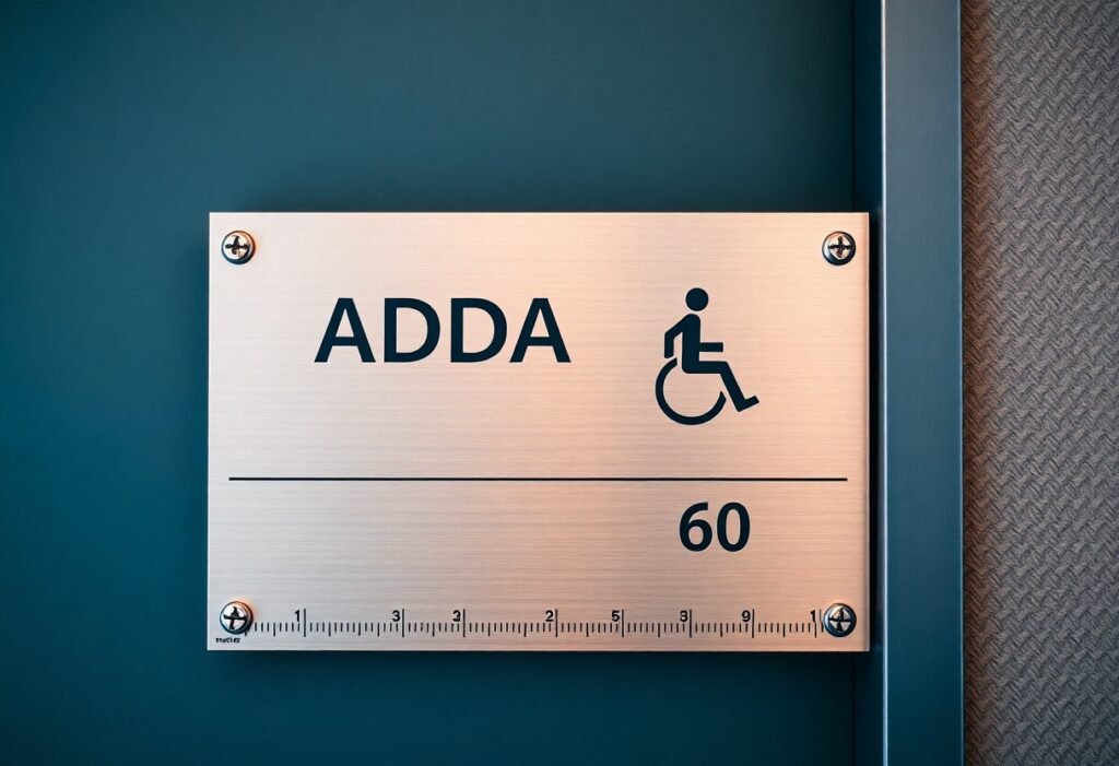
| Pictogram | Pictogram field minimum 6″ high; must have equivalent raised text and Braille directly below the field |
| Regulatory | Exit/no smoking signs; maintain legibility, contrast, and coordinate with life-safety codes |
Informational Signs
You should differentiate informational signs that convey schedules or temporary notices from identification signs: if the content is transient you are not required to provide tactile characters or Braille, but if the sign identifies a permanent room or facility function it must meet tactile height (5/8″-2″), Grade 2 Braille, and mounting height rules (baseline 48″-60″).
Directional Signs
You depend on directional signs to guide users through complex layouts; arrows, short text, and pictograms work best, and when used permanently they should meet contrast and mounting guidelines-place them at decision points to reduce wayfinding errors.
For more detail, you must use uppercase tactile characters for permanent directional plates when text is required, provide Grade 2 Braille directly below the raised text, ensure non‑glare finishes and 70%+ contrast for readability, and coordinate placement so signs appear at corridor junctions and major nodes to prevent disorientation in buildings over several thousand square feet.
Braille and Pictograms
Braille Standards
You must use Grade 2 Braille on tactile room-identification signs per ADA guidance; tactile characters typically range from 5/8″ to 2″ high with stroke widths around 1/10-1/6 of the character height, and braille dots should be rounded and centered directly below the corresponding text. Mount the sign so the tactile baseline is readable from the approach path, ensure dot spacing and height support legibility, and engage a certified braille transcriber to verify translations and formatting.
Use of Icons
When you add pictograms, provide a pictogram field at least 6″ high and keep the symbol simple-single-color, high contrast (dark-on-light or light-on-dark) with stroke widths proportional to the field. Place tactile copy directly below the field and use standard symbols (e.g., ISA wheelchair, restroom silhouettes) to reduce confusion. Test icons with low-vision users and maintain a consistent icon library across the facility for reliable wayfinding.
You should scale icons to viewing distance-6″ fields work for near signs, while 10-12″ fields suit corridors and lobbies viewed from 15-25 feet. Keep a clear field margin (about 1/8 of the field size), use vector artwork for clean scaling, and avoid shadows or gradients that reduce legibility. Prototype full-size panels and run quick user checks with people who have low vision or cognitive disabilities before final production.
Installation Best Practices
Site Assessment
Survey the doorway and wall conditions before ordering signs: you should measure the mounting surface, confirm the tactile character baseline will sit between 48 and 60 inches above the finished floor, and verify latch-side placement or the nearest accessible location for double doors. Note surface material (drywall, glass, masonry) to choose anchors-use stainless-steel #8 screws for drywall or concrete anchors for masonry-and check sightlines and lighting so pictograms and contrast meet visibility needs.
Regular Maintenance
Establish an inspection schedule: you should check tactile characters and Braille for wear, fasteners for looseness, and surface corrosion at least annually indoors and quarterly for exterior or high-traffic areas. Clean signs with mild soap and water; avoid solvents or abrasive pads that can flatten Braille or strip high-contrast finishes. Log each inspection with location, condition, and corrective action (for example, replace signs within 90 days if unreadable).
When you perform maintenance, use a concise checklist-verify tactile height and spacing, Braille legibility, mounting torque, pictogram centerline (60 inches), lighting (aim for 50-200 lux on sign faces), UV damage, delamination, and vandalism. Replace any sign with flattened Braille or illegible copy; many facilities plan exterior sign replacement every 5-7 years. Keep two spare signs per 100 doors and use tamper‑resistant stainless fasteners to reduce downtime and theft.
Common Mistakes in ADA Signage
Frequent errors you’ll encounter include incorrect mounting heights, poor contrast, and improper placement that violate the 2010 ADA Standards; tactile characters must be 5/8″-2″ high with their centerline 48″-60″ above the finished floor. When you need step‑by‑step guidance to avoid rework, consult ADA‑Compliant Signage Installation resources that cover measurements, fonts, and Braille spacing.
Inadequate Visibility
You often see signs with low luminance contrast, glossy finishes causing glare, or text too small for low‑vision users; aim for matte finishes and high contrast (many facilities target ≥70% luminance contrast) and ensure character proportions remain legible at typical viewing distances of 3-6 feet. Also verify lighting levels-40-60 lux over sign fields improves legibility without creating hotspots.
Misplacement of Signs
Placing a room‑identification sign on the wrong side of the door is a common violation: you must mount the sign on the latch side or the nearest adjacent wall when a latch side isn’t available, and centerline height must stay between 48″ and 60″ AFF. Avoid mounting on the door face, on glass, or behind a door swing where the sign becomes inaccessible when the door is open.
More detail: for double doors, place the sign on the active leaf’s latch side or on the nearest adjacent wall if neither leaf has a clear latch side; when a wall is too narrow (<18" clear), ADA permits locating the sign on the nearest adjacent wall with clear approach. You should also confirm the sign doesn't conflict with handrails, fire extinguisher cabinets, or other wall‑mounted objects that could block tactile reach or visual line of sight during an accessibility audit.
Summing up
On the whole you must follow ADA sign rules: mount tactile characters with their baselines between 48 and 60 inches above the finished floor, place signs on the latch side of the door, provide raised characters and Grade 2 Braille, ensure high contrast and non‑glare surfaces, use legible character sizes and pictograms where required, and position signs consistently so your users can predict their location and read them easily.
FAQ
Q: Which rooms and locations require ADA-compliant signs with tactile characters and Braille?
A: Signs that identify permanent rooms and spaces must provide tactile characters and Grade 2 Braille when the space is required to be identified by sign under the ADA Standards. Common examples include restrooms, permanent rooms (offices, conference rooms, classrooms), stairways, exits, and service rooms. Directional or informational signs that do not identify a specific permanent room are not always required to have tactile copy, but may be covered by local accessibility rules.
Q: What are the tactile character and Braille specifications I must follow?
A: Tactile characters must be raised, in uppercase, and use a simple sans-serif or simple serif style. Character heights must be between 5/8 inch (0.625″) and 2 inches measured from the baseline to the top of the character. Characters must be raised to a minimum depth (ADA specifies a minimum raised stroke depth) and have appropriate stroke width and spacing so they are legible to touch. Braille must be Grade 2 (contracted) and placed directly below the corresponding tactile text, with spacing consistent with Braille standards so each cell is distinguishable by touch.
Q: Where and at what height should ADA signs be mounted?
A: Identification signs with tactile characters must be mounted so the baseline of the lowest tactile character is between 48 inches and 60 inches above the finished floor. Signs are normally located on the wall adjacent to the latch side of the door; if that location is not available or visible, place the sign on the nearest adjacent wall or other location that provides the required mounting height and is readily visible to building users.
Q: What are the rules for pictograms, visual contrast, finish, and readability?
A: When pictograms or symbols are used, they must be accompanied by tactile text placed directly below the pictogram so people who read by touch are provided the same information. Sign faces and tactile characters must have a non-glare finish and sufficient contrast between characters/pictograms and background (light on dark or dark on light) to maximize visual legibility. Avoid backgrounds or textures that obscure tactile edges; tactile elements must be crisp and easy to feel.
Q: What common installation errors should I avoid and how do I verify compliance?
A: Common errors include mounting signs too high or too low (outside the 48″-60″ baseline range), placing signs on the door instead of the adjacent latch-side wall, omitting Grade 2 Braille or tactile text when required, using low-contrast or glossy finishes, and using fonts or decorative strokes that cannot be read by touch. Verify compliance by checking the ADA Standards for Accessible Design (current edition) and any applicable local codes, confirming tactile and Braille placement and measurements on-site, and, if needed, consulting an accessibility specialist or certified inspector before final installation.