
signage in your facility must comply with ADA interior standards to ensure accessibility; you should provide tactile characters with Grade 2 Braille, clear pictograms where required, appropriate mounting heights and locations for reach, and high-contrast, non-glare finishes for legibility. You must use standardized fonts and spacing, place signs at room entries and key points, and maintain unobstructed sightlines so your visitors who are blind or have low vision can navigate independently.
Key Takeaways:
- Permanent room identification (restrooms, exits, rooms, stairwells, etc.) must have tactile signs with raised characters and Grade 2 Braille.
- Tactile character specs: uppercase, sans‑serif type, 5/8″-2″ high (per ADA ranges), minimum stroke and projection requirements, and Braille positioned below the text.
- Mounting: place signs on the latch side of the door (or nearest accessible approach); centerline of tactile characters must be 48″-60″ above the finished floor.
- Visual requirements: high contrast between characters and background, non‑glare finish; pictograms require a minimum 6″ field and must be accompanied by tactile text.
- Scope and enforcement: requirements apply to new construction and alterations under the 2010 ADA Standards; confirm state/local codes and consult an accessibility professional for complex installations.
Understanding ADA Signage Requirements
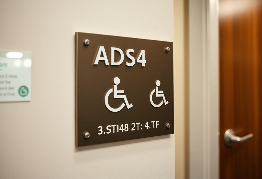
You must follow the 2010 ADA Standards for Accessible Design: permanent room identification needs tactile signs with raised characters 5/8″-2″ high and Grade 2 Braille, mounted so the baseline of the lowest tactile character is 48″-60″ above the finished floor. Pictograms require a minimum 6″ symbol field and an accompanying tactile description, and all signs must have a non-glare finish and clear visual contrast; common examples include restrooms, exits, stairwells, and conference rooms.
Overview of the ADA
The ADA was enacted in 1990 and updated with the 2010 Standards, which set technical requirements for accessible design that you must apply to facilities open to the public. The Department of Justice enforces the rules, while states and local codes can impose stricter provisions, so you should check both federal standards and any local amendments when planning signage.
Key Terminology
Tactile signs are those with raised characters and Braille; Grade 2 Braille is the required contracted Braille used on interior signs. Pictograms are symbolic graphics used for accessibility (for example, a toilet symbol for restrooms). Baseline refers to the line from which character height is measured, and the tactile field and pictogram field denote minimum clear areas for touch and sight.
For clarity: tactile characters must be uppercase and measured from the baseline to the cap line, Braille is placed directly below the tactile copy, and the baseline of the lowest character must sit 48″-60″ AFF. Pictogram symbol fields must be at least 6″ high and include a tactile description; in practice, you’ll often see a restroom sign with an embossed pictogram, uppercase tactile lettering, and Grade 2 Braille immediately underneath.
Types of Required Signage
You must provide several internal sign types-permanent room identification, restrooms, exits, directional/informational, and pictograms-each with specific tactile, Braille and visual standards; for instance, permanent signs require Grade 2 Braille and raised characters 5/8-2 inches tall, typically centered 48-60 inches above the finished floor; directional signs often rely on high-contrast visuals and arrows but become tactile when they identify rooms, so plan procurement and placement accordingly.
| Sign Type | Key Requirements |
| Permanent Room Identification | Raised characters, Grade 2 Braille, 5/8-2″ character height, raised 1/32″ min, centerline 48-60″ AFF |
| Restrooms & Exits | Tactile text with pictograms for restrooms; exit signs must be visible from travel routes and use clear pictograms when required |
| Directional/Informational | High-contrast visual text and arrows; tactile only if identifying a permanent room or facility feature |
| Pictograms | Accompany tactile text unless the pictogram meets all identification criteria; 6″ field commonly used for clarity |
- Permanent room identification
- Restroom and exit signage
- Directional and informational signs
- Pictograms and symbols
- Temporary notices (visual only unless otherwise required)
Permanent Room Identification Signs
You must install these for restrooms, exits, stairwells and classrooms with raised characters and Grade 2 Braille; characters typically range from 5/8 to 2 inches, with a minimum raised stroke of 1/32 inch, and the tactile character centerline is mounted 48-60 inches above the finished floor, ensuring legibility and uniformity across your facility.
Directional and Informational Signs
You can use high-contrast visual signs with arrows for wayfinding in corridors, lobbies and large spaces; they should feature clear typography and repeat at decision points-such signs are not required to be tactile unless they serve as permanent room identification, in which case tactile text and Braille become mandatory.
In practice, hospitals and universities supplement tactile room signs with larger visual directional panels-often 1-2″ character heights or greater-placed at corridor junctions and repeated every 40-60 feet in complex layouts to reduce wayfinding errors; you should coordinate materials, contrast ratios and mounting so visual routes align with tactile cues for consistent navigation.
Thou must verify your signs meet tactile and Braille requirements, character-height ranges and the 48-60 inch centerline mounting during final inspections.
Design Specifications
You must provide tactile characters and Grade 2 Braille for permanent rooms and directional signs; tactile letter heights range from 5/8″ to 2″ and the baseline of the tactile text is typically mounted between 48″ and 60″ above the finished floor. Signs need a non‑glare finish, high visual contrast, and durable materials so your signage remains legible over time in high‑traffic areas.
Font Size and Type
You should use uppercase tactile characters and simple, open letterforms-sans‑serif fonts like Helvetica or Arial work well-for clear recognition. Tactile sizing follows the 5/8″-2″ rule; for visual-only signs apply the 1″ letter per 10′ viewing‑distance guideline, adequate stroke weight and spacing, and avoid decorative or condensed fonts that reduce legibility.
Color Contrast and Materials
You need light-on-dark or dark-on-light contrast with a non‑glare surface so characters and Braille stand out; common material choices include engraved or painted metal, sandblasted or routed acrylic, and high-density plastics. Examples that work: white copy on navy acrylic for hospitals or black paint on brushed stainless in corporate lobbies-both provide durable, readable contrast.
For practical implementation test signs under the actual lighting you have: matte finishes reduce specular glare, and contrast should remain clear under fluorescent and LED fixtures. Use 1/8″-1/4″ acrylic or 0.040″-0.125″ metal substrates for longevity, ensure Braille dots are well-formed and contrast with the field, and select tamper‑resistant fasteners or adhesive systems so your sign maintains legibility for 7-10 years in heavy-use locations.
Braille and Tactile Elements
When you specify tactile signage, include raised characters and Grade 2 Braille per ADA requirements; tactile letter heights must range from 5/8″ to 2″ and characters need a non‑glare, high‑contrast finish. You should follow detailed installation guidance – see the ADA Guide for Interior Signage – INDOX Services for templates, mounting examples, and dimensional charts to ensure compliance and legibility.
Importance of Accessibility
You make navigation possible for people with vision loss by providing tactile cues and Grade 2 Braille; ADA signage reduces wayfinding errors and legal exposure. Studies and field experience show tactile signs speed room identification in hospitals and transit hubs, so ensure your signage program serves users, meets ADA specs, and integrates with pathfinding strategies for all visitors.
Placement and Specifications
You must mount tactile signs with the tactile character centerline between 48″ and 60″ above the finished floor and place the sign on the latch side of the door or nearest adjacent wall. Keep Braille positioned directly below the raised characters, use 5/8″-2″ character heights, and ensure characters contrast sharply with the background and have a non‑glare finish.
For practical application, specify a consistent centerline height (for example, 54″ AFF) across similar rooms, mark the latch side in your door schedules, and document exceptions for double doors or glass walls. Use templates that show exact offsets so fabricators produce tactile text, Grade 2 Braille, and mounting holes that align with your field conditions.
Compliance and Enforcement
You should expect enforcement from the Department of Justice under Title III, state attorneys general, and private complaints; enforcement focuses on bringing facilities into compliance with the 2010 ADA Standards. Agencies typically seek injunctive relief, corrective plans, and periodic reporting rather than criminal penalties. If your signage fails basic specs-tactile characters 5/8″-2″, Grade 2 Braille, mounting baseline between 48″ and 60″-you can be required to replace signs and document remediation timelines.
Common Violations
You often encounter missing Grade 2 Braille, tactile characters outside the 5/8″-2″ range, signs mounted below 48″ or above 60″, low visual contrast or glossy finishes, pictogram fields smaller than the required minimum (field centered at 60″ for pictograms), and placement on the wrong side of doors. Temporary paper signs used for permanent room identification also trigger frequent complaints during accessibility audits and DOJ reviews.
Steps to Ensure Compliance
You should begin with a comprehensive signage audit against the 2010 ADA Standards: verify tactile character height (5/8″-2″), Grade 2 Braille, mounting baseline 48″-60″, pictogram field sizing and centerline, and high visual contrast. Then engage a certified accessibility consultant, select fabricators experienced with ADA specs, document as-built measurements, and include compliance clauses and inspection milestones in renovation contracts to prevent drift from standards.
You should maintain a signage inventory with room IDs, sign types, installation dates, and compliance checklists, perform annual or post-renovation audits, train facilities staff to verify mounting heights and tactile/Braille readability, retain photographic records and supplier certifications, pilot-test new designs with low-vision users, and include signage in your ADA transition plan and budget to streamline remediation if a complaint arises.
Best Practices for Implementation
Prioritize high-traffic and life-safety signs-restrooms, exits, stairwells-then phase directional and room identification replacements to limit disruption. You should mount tactile baselines 48-60 inches above the finished floor, use tactile character heights between 5/8 and 2 inches, and include Grade 2 Braille. Pilot a sample run on 10-20 doors, document locations with photos, and conduct user testing with people who have low vision to confirm legibility and placement before full rollout.
Conducting an Accessibility Audit
When auditing, create a room-by-room checklist that verifies mounting height, tactile character size, Grade 2 Braille, latch-side placement, and continuous wayfinding along primary routes. You must photograph each sign, note noncompliant items, and measure contrast and mounting clearances; log deficiencies with estimated remediation time and cost. Include user testing-5-10 participants with vision impairments-to validate real-world readability and adjust priorities based on safety and traffic volume.
Consulting with Experts
Engage an accessibility consultant and an experienced tactile-sign fabricator early to interpret the 2010 ADA Standards, review drawings, and prevent costly rework. You’ll gain a compliance plan, material recommendations (matte, high-contrast substrates), and mounting templates that streamline installation and speed permit approvals.
Expect the consultant to produce a prioritized remediation report with code citations and a field-verified punch list; the fabricator should provide graded Braille samples, exact character dimensions, and pre-drilled mounting templates for each sign. Coordinate this team with your architect or facility manager, pilot install 3-5 signs, then roll out using a numbered schedule and quality-control sign-off for each zone.
Summing up
The ADA requires that your interior signage include tactile characters and Braille, meet mounting-height and character-size rules, provide high-contrast, non-glare backgrounds with legible fonts and pictograms, and be positioned at entries, rooms, restrooms, and along accessible routes; you must also keep signs unobstructed and maintained to ensure people with vision or mobility impairments can navigate your facility independently and in compliance with the 2010 ADA Standards.
FAQ
Q: What interior signs must businesses provide under the ADA?
A: The ADA requires identification signs for permanent rooms and spaces that are normally identified by name or number-examples include toilet rooms, bathing rooms, conference rooms, offices, elevators, stairwells, and exit access doors. Temporary signs, room-name plates that can be changed without tools, and signs on doors that are not used to identify a permanent room are generally exempt. Local building codes can add requirements beyond the federal standards.
Q: What are the tactile character and Braille specifications?
A: Signs that identify rooms must have raised (tactile) characters and Grade 2 Braille placed directly below the corresponding tactile text. Tactile characters must be uppercase, sans-serif, and typically range from 5/8 inch to 2 inches high. Braille must be contracted (Grade 2) and positioned so it is associated with the matching tactile text. Punctuation is not required unless needed for clarity; spacing and dot sizing must follow Braille convention.
Q: Where and at what height must ADA interior signs be mounted?
A: Identification signs should be mounted on the wall adjacent to the latch side of the door. If there is no wall space on the latch side, mount on the nearest adjacent wall. The baseline of the lowest tactile character must fall within the ADA-specified mounting range (commonly cited as between 48 inches and 60 inches above the finished floor), so that tactile text and Braille are reachable from a standing position.
Q: What are the requirements for pictograms and restroom signs?
A: Where pictograms are used (for example, for restrooms or accessible routes), the symbol must be accompanied by tactile characters and Braille text. The pictogram field is typically a minimum height (commonly 6 inches) and the tactile text must be located directly below the pictogram field. Pictograms should be simple, high-contrast, and not contain extra text inside the pictogram field; a raised border around the pictogram field is required when a pictogram is used as the primary identifier.
Q: What visual and material qualities must interior ADA signs meet?
A: Signs must have a non-glare finish and high contrast between characters and background (light-on-dark or dark-on-light) so characters and pictograms are readily visible. Characters should be sans-serif, upper case, with stroke widths and spacing that ensure legibility. Materials should be durable and maintained so tactile surfaces and Braille remain readable. Verify local or state accessibility codes for any additional color-contrast or material specifications.