
You must follow ADA braille sign rules that define tactile letter size, spacing, contrast, and the mounting height of signs to make wayfinding accessible; these standards specify raised characters, Braille cell dimensions, stroke thickness, and the baseline height above the finish floor so your signage is readable and compliant.
Key Takeaways:
- Applicability: Permanent room-identifying signs (rooms, restrooms, exits, elevators, and other designated spaces) must include raised tactile characters and Braille per ADA signage requirements.
- Braille: Grade 2 (contracted) Braille is required and must be positioned directly below the corresponding raised text with proper dot format and spacing per standards.
- Tactile character height: Raised letter height is specified as a range-minimum 5/8 inch (16 mm) to maximum 2 inches (51 mm), measured from the baseline to the top of the character.
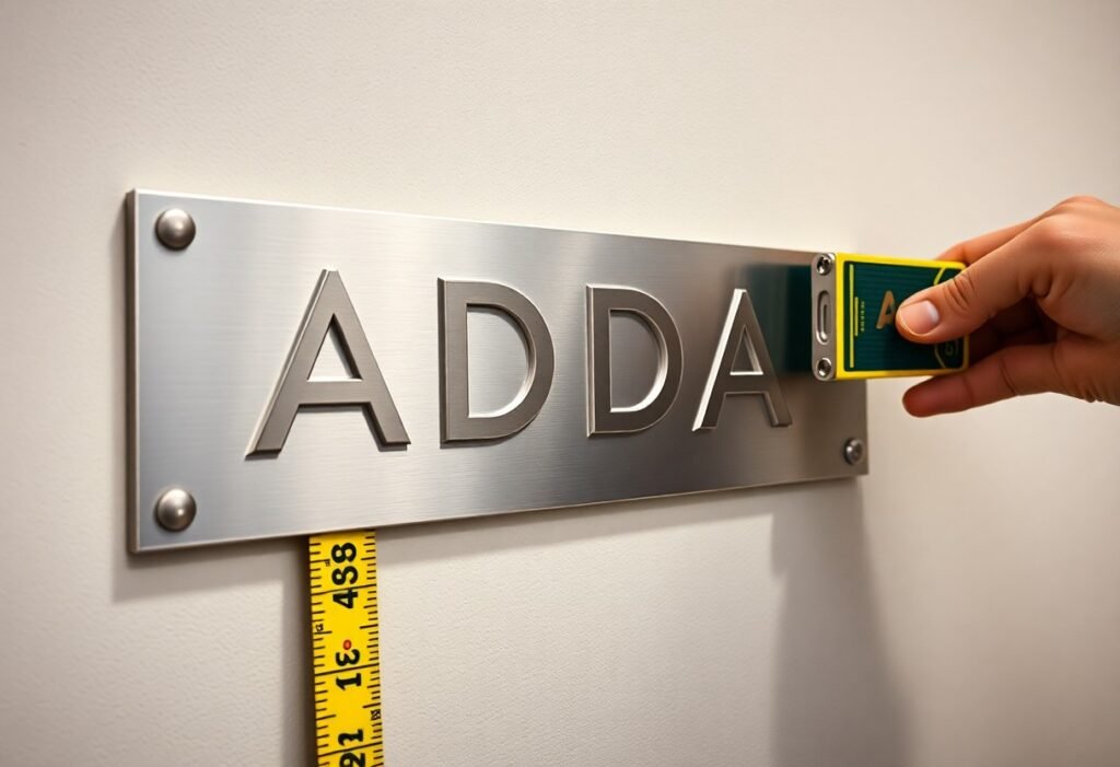
- Mounting location and height: Signs must be located on the latch side of the door (or nearest approach) and the baseline of tactile characters must be mounted 48-60 inches above the finished floor.
- Design, contrast, and placement: Raised characters should be uppercase sans-serif, non-glare, high-contrast, and have the required tactile projection and spacing; Braille must align directly beneath the text and meet dimensional standards.
Overview of ADA Regulations
You’ll rely primarily on the 2010 ADA Standards for Accessible Design, especially Section 703, which governs raised tactile characters and braille on signs. The standard specifies where tactile signs are required, acceptable materials and finishes, and minimum tactile character sizes-commonly 5/8″ to 2″-to ensure legibility for people who are blind or have low vision. Case law and DOJ guidance also clarify enforcement for Title II (government) and Title III (public accommodations) facilities, so your signage program must align with both technical specs and legal expectations.
Purpose of the ADA
The ADA aims to give you equal access to public spaces by eliminating barriers, including on signage. It makes sure people with visual impairments can identify rooms, exits, and services independently; Title II and Title III require permanent room identification signs to include tactile text and Grade 2 braille. You should treat signage as part of the accessibility plan-noncompliant signs can trigger remediation orders and fines in enforcement actions.
Key Definitions
You need to know these terms: “tactile characters” are raised letters or numerals, generally 5/8″-2″ high; “braille” refers to Grade 2 (contracted) braille placed below the tactile text; “pictogram” means a raised symbol conveying information without words; and “non-glare finish” is a required surface treatment to improve tactile and visual legibility. These definitions determine which signs must be altered and how you measure compliance.
For practical guidance, tactile character height is measured as the uppercase character height, and stroke width, character spacing, and contrast are all specified to ensure usability. In real-world installs you’ll often see interior room ID signs using 5/8″-1″ tactile characters with braille directly beneath; exterior and directional systems may use larger tactile sizes up to the 2″ maximum where visibility from a distance is needed.
Braille Sign Requirements
ADA signage must use Grade 2 Braille and tactile characters that you can read by touch: uppercase, sans-serif tactile copy raised at least 1/32 inch above the surface, with character heights between 5/8 inch and 2 inches. Braille cells are required directly below their corresponding tactile text, and the baseline for tactile characters generally must fall between 48 inches and 60 inches above the finished floor to ensure consistent reach and sightlines.
Tactile Letter Specifications
For tactile letters you should specify 5/8″-2″ character height measured from the uppercase letter body; 5/8″ is common for room numbers, 1″-1½” for suites or directional signs. Surface finish must be non-glare and high contrast so you can detect shape and edges by touch, and the tactile copy must be permanently raised a minimum of 1/32″ to meet accessibility sensing requirements.
Height and Location Guidelines
Mounting height matters: position the baseline of the lowest tactile character at least 48 inches and no more than 60 inches above the finished floor, and place signs adjacent to the latch side of doors for room identification. When pictograms are used, center the symbol field at 60 inches above the floor so you encounter a consistent reference point across a building.
In practice you should standardize mounting across corridors and departments-hospitals often use a 60″ pictogram centerline and 48″ tactile baseline for patient-room consistency. For double doors, install signs on the approach side(s) where users first encounter the room; aligning braille directly below tactile text and keeping spacing uniform helps blind and low-vision users navigate reliably.
Braille Transcription Rules
For transcription you must use Grade 2 (contracted) Braille per the 2010 ADA Standards, following Braille Authority conventions for contractions, capitalization and punctuation; the six-dot cell is standard and numbers require a number sign. You should transcribe exact door names and room numbers (e.g., “ROOM 101” uses the number sign before 101) and avoid abbreviations unless they match spoken/printed copy. Maintain consistent line breaks so tactile readers encounter the same sequence as sighted users.
Font and Size Considerations
You must use uppercase, sans‑serif tactile characters with heights between 5/8″ (16 mm) and 2″ (50 mm) based on viewing distance, per ADA 703; stroke widths should be proportional for legibility. For Braille, follow standard cell geometry-six-dot cells with common center‑to‑center spacing ~2.5 mm and dot diameter about 1.5 mm-so your vendor produces reliably readable dots and consistent tactile contrast against the background.
Placement of Braille
You should place Braille directly below the corresponding tactile copy, aligned consistently so a user can sweep fingers from raised letters to the Braille line; for example, door ID signs center the Braille under the label, while directional panels may left-align Braille under the first line. Also follow ADA mounting: the tactile characters’ baseline centerline should be 48-60 inches (1220-1525 mm) above the finished floor.
When multiple text lines exist, stack Braille lines directly beneath each printed line with uniform interline spacing; maintain the standard intercell and interword spacing so words and numbers remain distinct. If space is constrained, consider a separate Braille panel or shorten nonnecessary wording rather than compressing cell geometry, and test prototypes with blind readers to confirm tactile readability.
Signage Visibility Standards
To ensure tactile and visual legibility, you must control contrast, mounting height, unobstructed sight lines, and glare; per ADA Section 703 these factors affect how users locate and read signs. For practical examples and dimensional diagrams consult the Quick reference guide to ADA signage, which shows placement, character sizing, and common mounting errors you should avoid.
Color Contrast
You should specify light-on-dark or dark-on-light combinations that maximize readability; many accessibility standards and jurisdictions recommend a 4.5:1 contrast ratio or about 70% luminance difference as a practical target. Use matte or low-gloss finishes to reduce specular reflection, test samples under corridor lighting, and avoid patterned backgrounds that break up tactile character edges.
Lighting and Readability
You must use even, diffuse illumination so tactile copy and Braille remain legible without harsh shadows or backlighting that washes characters out; neutral color temperatures (around 3000-4000K) help maintain perceived contrast. Position fixtures to prevent direct glare on sign faces and ensure sightlines from typical approach distances (4-10 ft) stay unobstructed.
For implementation, perform on-site checks with a lux meter and a tactile inspection: verify uniform luminance across the sign, shield fixtures to eliminate hotspots, and pilot signs with low-vision users. When using internal illumination, select diffusers and non-reflective materials so raised characters cast subtle, consistent tactile shadows that aid fingertip reading.
Common Compliance Challenges
You encounter compliance failures most often when design intent meets field realities: signs mounted outside the 48-60 inch baseline range, tactile characters below the 5/8-2 inch height window, or Grade 2 Braille omitted or poorly formed. Photometric glare, low contrast, and door hardware blocking reach paths also cause violations, and missed details during retrofits can turn a single noncompliant sign into a systemic ADA risk.
Frequently Encountered Issues
You’ll see recurring problems such as baselines installed below 48 inches or above 60 inches, tactile copy that’s undersized or lacks the required serif-free style, Braille printed instead of embossed, and signs placed where door swings or furnishings obstruct tactile access; maintenance lapses and inconsistent vendor specifications often account for 60-70% of these defects in building surveys.
Solutions and Best Practices
You should standardize on ADA 2010 Section 703 specs during design, require Grade 2 Braille and tactile heights of 5/8-2 inches, and verify contrast and unobstructed mounting during installation. Also schedule annual audits and tactile testing by someone who reads Braille to catch errors early and document compliance for inspectors.
Implement a three-step control: (1) approve vendor mock-ups-measure tactile height and Braille placement on sample panels; (2) require as-built photos with ruler-based verification at installation; (3) run an annual compliance checklist covering 48-60 inch baselines, embossed Grade 2 Braille, character proportions, contrast, and pathway clearance-this reduces rework and litigation risk, as shown in municipal retrofit programs that cut violations by over half within a year.
Resources for Compliance
Consult the primary standards and trusted experts to apply the rules correctly: the 2010 ADA Standards for Accessible Design, technical guides from the U.S. Access Board, and ANSI A117.1 are the baseline references you should have on hand. Your local building codes and state accessibility offices often add requirements, so cross-check those; for example, the ADA specifies Grade 2 Braille and mounting centerlines between 48 and 60 inches for room identification signs.
ADA Guidelines and Standards
The 2010 ADA Standards for Accessible Design and U.S. Access Board advisories are your definitive legal and technical sources. They spell out Grade 2 Braille, tactile character specs, and mounting height ranges (centerline 48-60 inches). You should keep the ANSI A117.1 standard nearby for additional technical tolerances and consult the Access Board’s diagrams and scoping tables when confirming sign placement or when local codes appear to differ.
Professional Assistance
You should engage experienced sign fabricators, ADA compliance consultants, or accessibility firms for complex projects. Ask vendors for Grade 2 Braille certification, tactile samples, and proof layouts; request on-site mounting checks to verify the 48-60 inch centerline and sightline constraints. Typical consults run from a few hundred to a couple thousand dollars depending on scope, and documented sign-off helps at inspections.
When hiring, require a written scope that lists standards referenced (2010 ADA Standards, ANSI A117.1), sample braille cell embossing, tactile stroke widths, and material specifications. Have the provider produce a physical tactile sample and a scaled mock-up for stakeholder review-including at least one blind user test-before full production. Maintain records of approvals and shop drawings; they streamline permitting and protect you during audits or renovations.
To wrap up
Upon reflecting, you should know ADA braille sign rules require raised tactile letters and accompanying Grade 2 braille, specify minimum and maximum character heights for legibility, set dot and spacing dimensions, mandate uppercase tactile characters with clear stroke and contrast, and govern the vertical placement of characters and braille so your signs are reachable and readable by people who are blind or have low vision.
FAQ
Q: Which sections of the ADA Standards cover tactile letters and braille on signs?
A: The ADA Standards for Accessible Design (2010) address signage in Section 703 (Signs). Section 703 covers tactile characters, braille requirements, mounting location and contrast; it also references technical guidance in ICC/ANSI A117.1 for detailed dimensions and braille cell specifications.
Q: What are the ADA requirements for tactile letters (case, font, height, and projection)?
A: Tactile characters must be uppercase, sans-serif or simple stroke style, and free of decorative elements. Character height shall be between 5/8 inch (16 mm) and 2 inches (51 mm) measured as specified by the standard. Characters must be raised above the sign surface (minimum projection specified by the standard), have stroke width and spacing proportional to the character height, and be non-glare with high contrast against the background.
Q: How does the ADA require braille to be presented on signs (type, placement, and relationship to tactile copy)?
A: Braille on identification signs must be Grade 2 (contracted) braille and placed directly below the corresponding tactile characters. The ADA specifies braille cell geometry, dot shape and spacing; braille must be tactile (domed or otherwise raised), properly aligned with the text it transcribes, and located so it is readable by touch without interference from edges or mounting hardware.
Q: What mounting heights does the ADA require for tactile characters and braille on signs?
A: For room identification signs and similar fixed signs, the ADA requires the tactile characters and braille to be located so the baseline of the lowest tactile character is between 48 inches (1220 mm) and 60 inches (1525 mm) above the finished floor. This height range ensures reachability for most users; specific exceptions and applications are described in Section 703 and related provisions.
Q: What common compliance issues should be checked when producing ADA braille/tactile signs?
A: Verify uppercase sans-serif tactile copy within the 5/8″-2″ height range, required minimum projection, correct Grade 2 braille and alignment below text, proper mounting height (baseline 48″-60″), non-glare high-contrast finish, and adherence to the detailed cell/dot dimensions and spacing in ADA Section 703 and ICC/ANSI A117.1. Use a qualified braille transcriber and consult the standards for precise dimensional tolerances before fabrication.